


__twocolumncontent.jpg)


At Plenty there’s a constant quest for the best. The pursuit of creative abundance summarizes the philosophy of this Buenos Aires-based design studio.
Founded in 2010 by Mariano Farias and Pablo Alfieri, who had been colleagues at another design firm, Plenty was born in a tiny studio apartment. In just three years, united by a passion for design, they formed a team of 25 people and grew into 2700 square-foot office. “Plenty is more than enough,” says Farias, CEO of Plenty and currently the only partner. “The idea of the concept is that whoever wants to work with us, both we and the clients, have to feel fulfilled. We work very hard to deliver more than what is expected, to go further and enter unknown fields.”
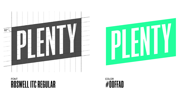
The logo—an ascending diagonal—is designed to denote this spirit of doing more than enough, always moving forward and up.
The First Years
The studio’s first brand project was a graphic package for Fox Italia’s travel channel Nat Geo Adventure. It was a very conceptual stop-motion spot featuring a bunch of destinations.
That same year, the piece Bicentenario for MTV Latinoamérica—celebrating the 200 years of independence of Argentina, Chile, Mexico and Colombia—put the studio on the map.
Plenty based its concept on the clash between European and indigenous Latin American cultures.
“We used abstract elements to represent the pre-Columbian era and the figure of the conqueror,” says Farias. “We used softer movement to display the indigenous culture more organically, and how it’s rooted to the land. The conqueror was designed to be a little more aggressive, with polished forms made of gold and sharp tips, but there was no prejudice towards him. His animated movements were more developed and mechanized [than those of the depicted natives] to show how more prepared he was with more history and tools,” he says.
As the piece progresses, both designs come together in a kind of ritual and a third character emerges.
“It’s a mix of the two, and that’s us, today’s Latinos,” he says.
Plenty’s work with Fox Life marked another turning point for the company. The studio was asked to redesign the channel’s global image, which had different programming in Europe and Latin America.
In Latin America, the channel was “more dedicated to reality shows, and in Europe to series,” says Farias. “The redesign had to work well in both cases, so we created a very flexible and modular system that included typography as well as 2D and 3D objects.”
International Milestones
Plenty’s first major international pitch was for Canal+ in Spain, where it worked with the Erretres studio in Madrid.
The challenge was to create an image that connected 14 different stations.
“We incorporated the whole theme of emoticons, hashtags and memes, which for 2014 was quite a novelty,” says Farias. “We guided Canal+ toward a significant visual overhaul.”
This way, the entire animation is inspired by the navigation through a digital platform where the symbol +—the channel’s icon—marks the pace.
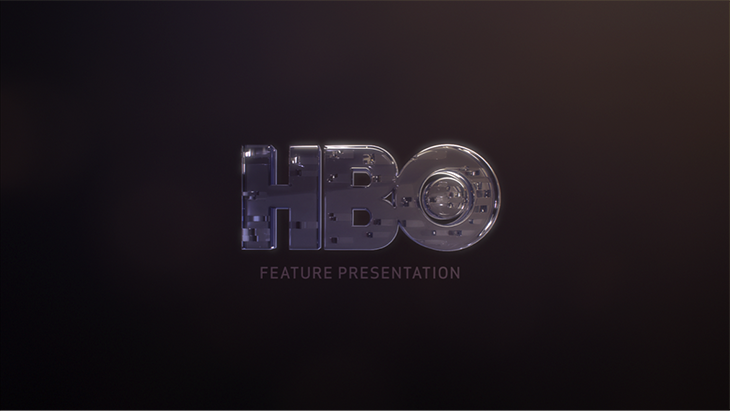
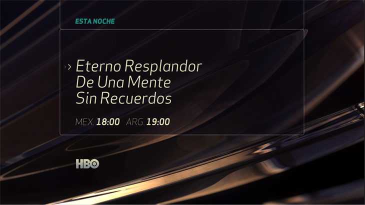
HBO Latin America also has been another important client for the studio. Plenty created two rebrands. The first took place in 2013.
“At that time, Plenty was the smallest and least experienced studio. However, the pitch was excellent and the energy put into the presentation ended up convincing us,” says Jesús Martínez, senior art director at HBO Latin America. “We had a clear idea of certain visual features that had to maintain the characteristics that have always defined HBO as a brand, such as the level of quality and originality, but we gave the studio total creative freedom to develop the image.”
With that in mind, Plenty created something rather non-obtrusive, using just typography and a box, and adding a glassy texture to the IDs, placing the content at the channel’s center. The studio also chose a gradual pace for the animation.
“Something we learned is that premium [often] means going slow,” says Farias.
“Plenty’s creative contribution was interpreting—with a very simple, direct and neat identity—the characteristics of HBO as a premium channel in the region,” says Raúl Hernández Mezerhane, VP, creative / on-air HBO Latin America. “The concept always was oriented toward HBO’s quality content at the center, with the brand standing behind it. The glass texture added a 3D element, that gave the identity an elegant and clean touch.”

The Recreation of Rio
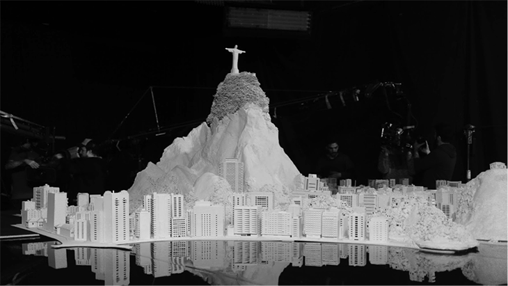
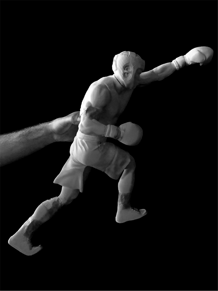
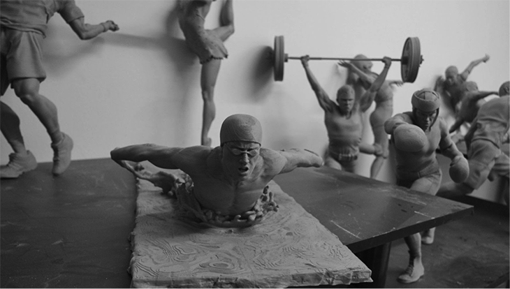
Another milestone for Plenty was the below DirecTV spot for the 2016 Olympic Games in Brazil.
The work was inspired by Greece, birthplace of the Olympics, and specifically the art from the Parthenon in Athens.
“The Parthenon’s sculptures are impressive and strong and the details of these statues’ movements and muscles are incredible,” says Claus Cibils, creative director and executive producer at DirecTV Latin America, who was involved with the project at the time. “We wanted to mix all this cultural, artistic and historical part of Greece and the Olympics with the high-tech concept of DirecTV, showing how technology allows us to have a different experience of sports and the event.”
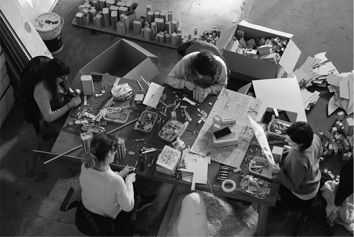
Based on the premise of creating 3D printed statues, Plenty proposed recreating the entire city of Rio de Janeiro.
“It was crazy,” says Farias.
“We did three months of research on how the human body moves and what objects the players use,” says Cibils. “In addition, Plenty attained the statues’ look by—rather than making them resemble marble—using the different textures and thicknesses of the 3D print threads. We then covered and filled them with plaster to create the feeling that there was something technological behind their appearance.”
RELATED: HOT SPOT: Plenty Recreates Rio for DirecTV
Plenty Today
Recently, the studio created a new brand image for Nat Geo Kids in Latin America.
RELATED: Plenty of Fun for Nat Geo Kids
One of the challenges was to keep the brand’s yellow frame while designing a vibrant look that would appeal to kids.
“It’s a rather unappealing rectangle for children,” says Farias. “We wanted it to be made of rubber, to bend and move and then finish as a rectangle so it had that playful, kid-friendly element, but at the same time had to be within the frame of National Geographic’s rigid brand manual.”
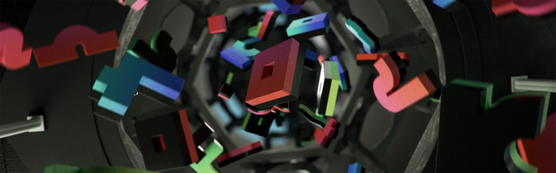
Another important project was the opening credits of The Birth of Total Design for the 2017 Brief Festival in Madrid.
“The title refers to a new era in which graphic designers start to design objects, spaces and textures that are able to push the limits because they don’t have to be replicated in real life, so they can design almost anything for communicational, non-functional purposes,” says Farias.
In this way, the piece presents four stages of a creative process: the brief, where symbols representing ideas and constructional concepts are discussed; the void, where the symbols develop into different forms; the structure, where the ideas continue to evolve in ways that interrelate; and the light, where all the symbols combine into a graphic illustration of the “B” from the original brief.
This project also showcases the studio’s growing advertising arm as it sticks to its mission of continuing to grow creatively, having recently opened an office in New York to expand in the U.S. market.
“In each field, we have a vision that helps us relate to the other side,” says Farias. “In advertising, we are used to thinking strategically since we get immersed in branding projects for which we have to think about what the brand is. In branding, we can deliver quality products after having met high standards in complex advertising and commercial campaigns.”
Version español : Creative Review: Plenty
Tags: