


__twocolumncontent.jpg)


At the age of six, Sebastián Collazo was drawing TV logos in his school notebooks.
A few years later—when he got his first computer—he explored 3D software with which he spent time idly rendering imitations of HBO’s ID from the ‘80s. His interest in graphic design blossomed throughout his studies of audiovisual and graphic design and, later, through his professional television projects.
In 2006, after having worked as a freelancer for post-production firms, a couple of advertising agencies encouraged Collazo to open his own company. Feels would turn out to be one of Chile’s first motion-graphics studios.
“The agencies were happy to find creatives that allowed them to move away from the cinematographic format, and incorporate new languages coming from motion graphics and VFX, which mixed with post-production,” he says.
While Collazo chose a career path that spoke to him intuitively, it was also marked by fate and the context of his home country, Chile.
“There was a paradigm shift: customers’ confidence began to move away from the extremely expensive software of Silicon Graphics machines to desktop computers, which were centered on design,” says Collazo, Feels’ CEO as well as creative and art director.
‘Cooking’ Gourmet Design
Feels is based in Providencia, a district in Santiago de Chile famous for its many parks. Its meeting room is a kind of communal kitchen, where Collazo himself brews coffee.
“We like to think we are an artsy cuisine restaurant, where there are few tables and booking is required, where you can come and ‘cook’ your ideas, have a glass of good wine, and enjoy the experience of growing something together,” he says.
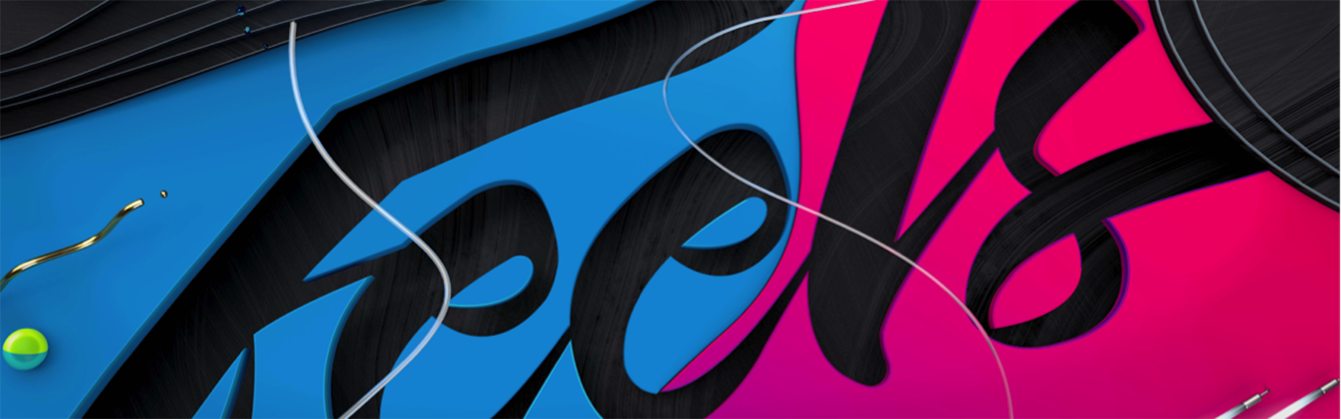
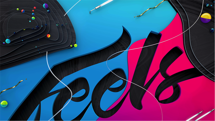
With a design based in typography, the Feels logo is similar to a signature, therefore reinforcing the idea of “auteur,” through which an artist leaves his or her defining stamp on a project.
“In a country where collaborations are unusual, the logo represents our desire to cultivate a close relationship with our customers and to see ourselves reflected in that relationship,” says Collazo.
In fact, the name itself refers to an authentic intention.
“We are called Feels because we want to resonate with what we do and translate that sensitivity into audiovisual design.”
Taking a Chilean Approach
Feels’ first projects were based on program IDs and graphic packages for local channels. The company then moved on to developing full branding packages. Among them are the spots below: the first one made for Chilevisión, part of Turner Broadcasting System and the second for TVN—where Chileans are represented from diverse points of view.
Feels also produced branding for Canal 13, which emphasized a sense of continuity regarding the brand’s identity.
“We are a local cable channel, transmitting the culture of the country and of the entire world, through a language that is simple, artistic and magical, always presenting different perspectives,” says María Teresa Valdivieso, vice manager of marketing at Canal 13. “Feels succeeded in developing a handmade artistic concept, which refreshed the on-air image, while adding energy and movement. This resulted in a unique proposal that set the channel apart from the competition.”
Entering HBO’s World
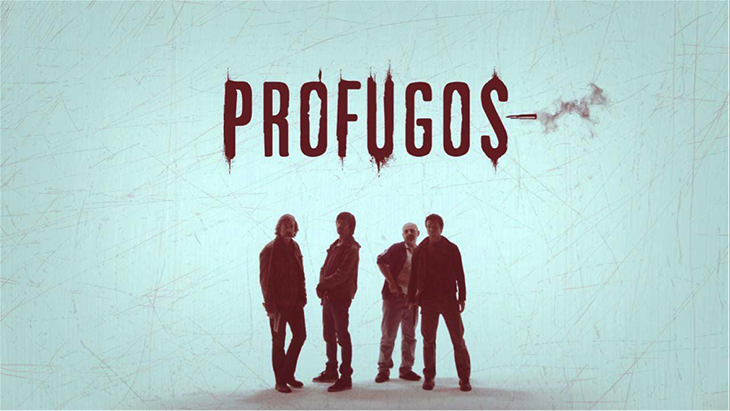
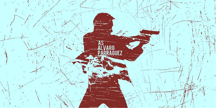
One of the turning points in the studio’s history was the creation of the visual identity for HBO Latin America’s series Prófugos (Fugitives), following an invitation to collaborate from producers Fábula Producciones.
In the opening credits, a bullet is used as a conceptual element to convey how the characters are in constant flight.
“It is a bullet that destroys, not only literally breaking the logo, but also representing how the characters break themselves on the inside with their stories,” says Collazo. “The monochrome tone evokes the barrenness of the characters—their loneliness and the desert that is present in a good part of the plot. We wanted to give it a very subtle Chilean feeling through rustic elements that relate to the land and the folklore,” he says.
After Prófugos, Feels began working with HBO Creative Services to create the campaigns’ assets. Collazo, who as a young man created renderings of HBO’s ‘80s ID for fun, fulfilled his first professional dream.
“We literally became a duo, not only contributing on a graphics and post-production level, but also creatively speaking,” says Michelle Brin, creative director at HBO Latin America. “This dynamic resulted in all-around perfect campaigns, many of which have won awards, where concept and execution go hand-in-hand, as we are one team, with the same goal.”
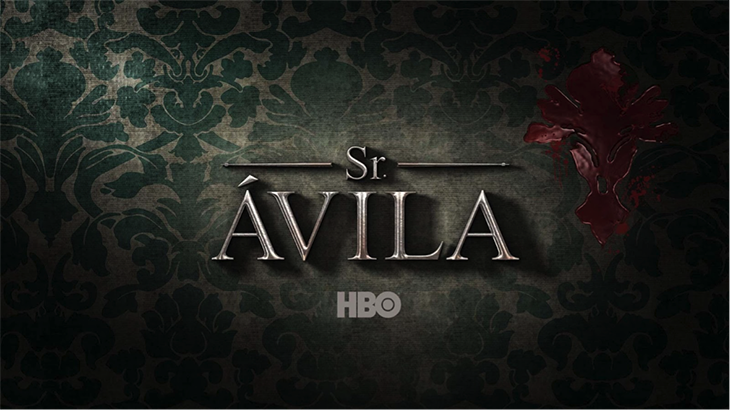
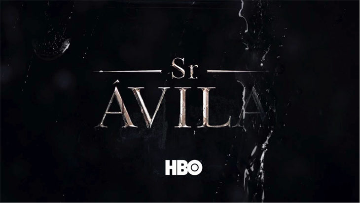
During this stage, Feels also created the opening titles for Sr. Ávila. In this case, the creative concept evolved throughout each of the three seasons of the series, following the early glamorous life of the lead character as well as his journey to his dark side.
“In the first season, the wallpapers in his house are intact, with the brand name appearing in a perfect shiny metal. Then, in the second season, rain washed away all of his morality, exposing his true colors. In the third season, the series of openings ends with a cold confined marble logo, immersed in a chilling, funeral atmosphere, showing that the character is empty inside,” says Collazo.
Another good example is the opening of Ps!, through which the title layouts as well as their vanishing points evoke a labyrinth of the mind.
“We show a therapist [the main character], walking down the streets of his patients’ psyche in a fantasy tone and a daily São Paulo setting. This is why we arranged the type across disparate planes, eliminating the linear structure with the horizon line always changing,” says Collazo.

“In both series, Feels executed an idea that went beyond good animation or special effects,” says Beatriz Sáez, VP, creative services HBO Latin America. “Each element contributed to the message we wanted to communicate to the audience. In Ps! the maze world was not just nicely composed, but also succeeded in turning each element into an icon.
“In the case of Sr. Ávila, what could have been an action genre cliché was translated into a story that, from its opening, introduced you to the universe of the leading character.”
Feels has developed other projects for HBO Latin America, such as a preview of the network’s upcoming shows in 2012 and a promotional spot for the second season of Game of Thrones.
Opening Other Doors
Another area in which Feels has developed expertise is advertising and branded content. Marcas con historia (Brands with History), for example, presents the history of the car company Audi in under a minute for History.
“The intention of History’s ad sales department was to take a brand, and turn the brand itself into the content. This was how we accomplished that. It is a good example of what we have been doing in the second half of Feels’ history: applying both creativity and strategy,” says Collazo.
Feels also works in traditional advertising, such as the launch of a new image for the beer Cerveza Escudo. Feels created three commercials that promoted three of the brand’s best features: its body, its color and its flavor.
For example, Feels used an eagle that appears on the label as a way to symbolize the beer’s body.
“The eagle demonstrates power as it flies wild over a natural setting, animated with frame-by-frame technique,” says Collazo.
Projecting the Future
In 2018, Feels is working on three key projects. First, Feels developed Chilevisión’s branding for the 2018 international music festival, Festival Viña.
“We used motion capture of dancers to generate sound waves based on their movements,” says Collazo.
Feels also designed the look for the Chilean Soccer Championships CDF.
“We are shaping the concept Nuestra fiesta del Fútbol (The Celebration of Our Soccer) as an answer to the challenge of building a sense of belonging among Chileans around local soccer broadcasts,” says Collazo.
And Feels is working on new branding for Canal 13 as the channel transitions from being owned by Universidad Católica (Catholic University) to becoming a private company.
Think, Design and Move!
From its earliest days, Feels has been evolving from a studio that specializes in motion graphics and animated design to becoming a creative and strategic audiovisual design agency.
The studio’s tagline, Think, design and move!, speaks to this energy of seeking out ideas and developing them from proposal to post-production.
Says Collazo: “Think represents the tactical communication strategy, design is the persuasive and appealing language, and move with all the technical combinations, brings the project to life.”
Version español: Creative Review: Feels
Tags: