


__twocolumncontent.jpg)


Eloisa’s co-founders Eloisa Iturbe and Martin Lanciano were brought together when researching a design process, and discovered the best way to address a creative project was from a conceptual standpoint, adding a high-quality art identity.
This is how Eloisa was born—initiated by Iturbe, who was later joined by Lanciano.
“I had the energy and the desire to start something of my own. Although there was no framework, it just happened naturally,” says Iturbe.
“It was a leap of faith,” says Lanciano.
Since 2004, simplicity has been at the center of the Buenos Aires-based studio. “We understand simplicity as something positive, with its ability to say a lot with little, with a streamlined, clean stamp,” says Iturbe.
The straightforward logo conveys this feeling.. “It embodies our understanding of design, which we do not associate with drawing, but rather with a thought; a strategy. All of our projects stem from an idea,” says Iturbe.
This philosophy is also embedded in their work, which is focused on finding a clear solution through details and one summarizing word.
“We take out everything that is secondary and keep the essence. We pare down our idea into a magical word. It must be something that allows us to resolve the color palette, the chosen typographies and the animation,” says Lanciano.
Beginning with Branding
Eloisa’s beginnings were marked by clients such as MTV/VH1 Latin America, El Gourmet and, especially, Fox Networks Group Latin America and Fox International, for which the studio developed several brand campaigns.
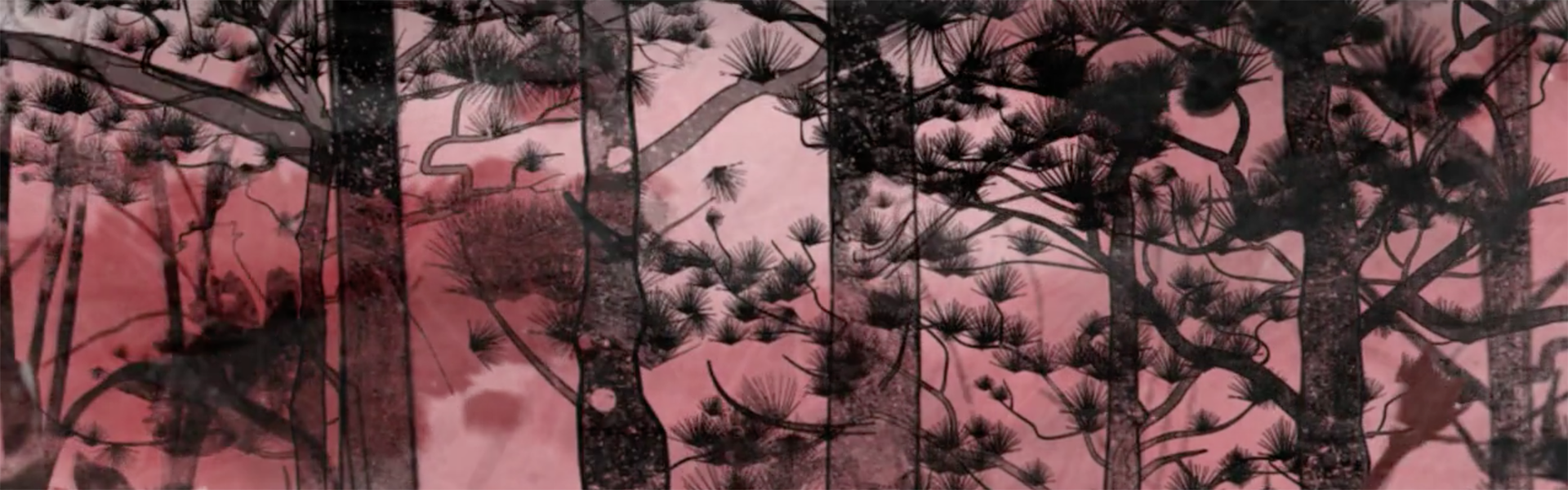
For example, they started a rebrand for Nat Geo Wild with the concept of beauty, maintaining the sobriety and balance of the brand.
“We had a romantic vision of nature. We thought that an artistic language could convey the poetry and reflexive feel we were looking for,” says Florencia Picco, vice president of global branding at Fox International at the time, and now founder of creative studio Flopicco.
Eloisa’s pieces recreate different atmospheres, strung together through wind, water, flora, butterflies and other elements of nature.
“We found an elastic way to generate different environments and to unify them through a language of inks, strokes and textures,” says Iturbe.
“It was a rather abstract work, with the audio being key to creating the scenes,” says Lanciano.
Eloisa designed National Geographic’s rebrands in 2008 and 2012. The work included a plain graphic package, with the logo at the core of the brand’s entire look.
“In its reputation and history, National Geographic has always alluded to the excellent quality of its images and to how its stories are told. The convergence of these two aspects made it difficult to manipulate the brand,” says Picco. “It was a process carried out jointly with Eloisa aimed at approaching the image as naturally as possible, incorporating the shape of the logo and the images without disassembling any of the two things. The visual quality of the studio, its sensitivity and experience, resulted in a unique work.”
American Expansion
Incursions into the U.S. market became a milestone in Eloisa’s history, revolutionizing the studio’s method.
“We learned a different way of working, centered on the importance of the concept,” says Iturbe.
“We polished the way we were working; developing a new form of emphasizing the presentation or explanation of the work. What we considered simple could still seem overloaded or complex for our clients,” says Lanciano.
“However, it was a great achievement because, even contributing something very simple, we were able to propose something more daring, with colors that are brighter and more reminiscent of Latin America, which amazes this market,” says Iturbe.
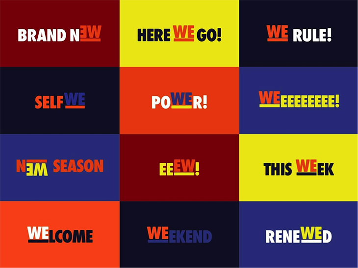
In this stage, projects for channels WE tv and Oxygen proved important for Eloisa.
For WE tv, the brand wanted to expand to target a male audience. Eloisa chose to highlight the word “We” by underlining it and positioning it within other words with positive meanings, such as aWEsome and poWEr.
For Oxygen, the objective was to incorporate elements of a previous rebrand to expand the channel’s daily communications.
RELATED: Bursting Visuals Bring New Energy to Oxygen
“With the refresh, we wanted to expand the graphic elements, but also give it a little more personality, to kind of boost that attraction to the whole look without it looking like a rebrand,” says Kaori Sohma, creative director and on-air and design at Oxygen. “Eloisa provided us a lot of assets to expand the elements through animation. This, along with the new shapes introduced, gave the whole network an additional boost and energy.”
To address the refresh, Eloisa mixed elements of the original branding—such as the letter “O” and the underscore—to design different patterns.
“The result was a combination of simplicity and cleanliness, on the one hand, with a color tone closer to Latin America,” says Lanciano.

Turning to the studio’s international portfolio, a refresh for Canadian channel YTV’s “The Zone,” a block targeted at children ages 6-11, stands out. The creative concept centered on a roller coaster as a symbol of fun.
“The roller coaster alludes to a world that moves in a certain way. From it, there came the package behavior, changes in speed, adrenaline and the slanted lines,” says Lanciano.
Local Impact
Although Eloisa has worked a great deal in the U.S., the studio also has designed packages for Latin America, such as Comedy Central Stand-Up.
“We were asked to produce branding on the art of stand-up, without showing the typical image of a microphone with a drop curtain, and with more urban, underground and New York-based aesthetics,” says Lanciano.
To create this atmosphere, the team used black-and-white photographs, taken at night in Buenos Aires with minimal equipment, and added a bold red to highlight the images.
Recent Projects
Among Eloisa’s recent work is a substantial project created for Universal Kids. In it, a “multiverse” concept captures the world of kids today, in which children are constantly performing multiple actions at once, coexisting with multiple screens.
“We wanted to define multitasking as something positive, which awakens kids’ imagination and their desire to do things,” says Iturbe.
The brief also requested multicultural branding, which inspired diversity and openness based on live-action material previously produced by the channel. The words and images of children repeated on-screen, the mixture of colors, and the multiplicity of shapes and lines that cross the plane were decisions made to illustrate this idea of “multiversality.”
Another recent landmark was a rebrand for RAI, a national media group of Italian free-to-air channels, which sought to look more modern. The studio found inspiration in several artists, such as Italian designer Bruno Munari.
“The rebrand was based on the logo, which is square and quite rigid, and we distinguished each channel with its color and the way in which the square turned, dived and transformed itself through animation,” says Lanciano.
For the future, Eloisa is still focused on television branding, but is looking to adapt to other types of platforms based on changes in the ways audiences consume content.
“Since the way of watching television is changing, now is the right time to rethink our channels and their structure,” says Lanciano. “Today, more than ever, we believe that branding is something that goes beyond the individual pieces; the most important thing is to achieve an identity and then think about what pieces can be used to transmit it.”
Version español: Creative Review: Eloisa Espanol