


__twocolumncontent.jpg)


Atlanta-based creative agency Creative Mammals is back with part two of its rebrand for E.W. Scripps’ new male-focused digital network, Defy TV, following on July’s brand launch of female-focused TrueReal.
Like TrueReal, Defy TV makes use of A&E’s library of unscripted content, including such series as American Pickers, Counting Cars, Pawn Stars and Forged in Fire that appeal to men.
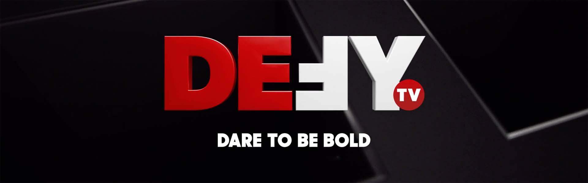
To let men know that this new free over-the-air network is for them, Creative Mammals leaned on a bold and straightforward palette of black, white, red and gradient grey, with the grey often serving as a neutral background along with the white and sometimes showing up as gunmetal grey and other times as a metallic accent.

“I don’t think there’s a more aggressive color than red,” said Robert Burroughs, Creative Mammals’ executive creative director.
While the palette is somewhat limited in scope, “it was easier in the sense of creating cohesion, but we also needed to figure out various ways to work with the palette so that it didn’t become monotonous,” Burroughs said.
As with TrueReal, E. W. Scripps had already created the logo for Defy TV, so the existing design in all-caps block letters with an upside-down and reversed “F” was delivered along with the initial brief. But after playing with it for a while, Creative Mammals added a 3D element to the logo, extending out the lines and deepening the background and textures to make it more dynamic.
“In the beginning, everything was very 2D and it felt flat,” said Burroughs. “But we also wanted to be careful about doing too much 3D because the in-house team needed to be able to work with it.”
Once 3D elements were added, however, the Scripps team wanted more so Creative Mammals ended up making them even deeper and bolder. And they also evolved into another key part of the brand identity.
“[Art director] Mike Batista came up with the idea of just having some background elements be in 3D, which allowed us to tie the logo back in to the overall concept but also create an easy-to-update system so the in-house team could change out show titles and tune-in dates,” said Burroughs. “The end goal was to provide them with a tool kit they could easily update without having to dive into After Effects or Cinema 4D.”
From there, Creative Mammals needed to choose a font that would work well with the logo. Both of the fonts that Creative Mammals ultimately chose are sans serif, with Sharp Sans Display No. 1 serving as the headline typography and the thinner, but still sans serif, Rift operating as the identity’s workhorse, handling detailed tune-in and other information.

“Our main goal when selecting typefaces for the brand was to find a balance between rugged and modern, without feeling exclusionary,” said Creative Mammals on its website.
Go here to see how the Creative Mammals team conceived of the entire brand identity, including the start of the process when the color palette was teal and gold.
CREDITS
Client: E.W. Scripps
Client: Defy TV (E.W. Scripps Networks)
Senior Director: Kelly Turner
VP, Creative Services and Marketing: Bryan Slonaker
VP, Creative Services: Larry Morris
Design Studio: Creative Mammals
Executive Creative Director: Robert Burroughs
Art Director: Mike Batista, Jules Verardi
Animator: Jim Roberson
Editor: Bridget Herbert, Chris Meidell
Marketing Strategist: Heather Bell
Producer: Katie Janse