Muscle-bound John Cena leads a stiff but show-stopping dance number set to “Do You Wanna Taste It” by Norwegian band Wig Wam in Sarofsky’s main titles for HBO Max’s streaming series Peacemaker.
Besides its work on this main-title sequence, the Chicago-based agency – led by Executive Creative Director Erin Sarofsky, Creative Lead Duarte Elvas and Managing Director/Executive Producer Steven Anderson – also created custom titles, typography and visual effects for creator James Gunn’s The Suicide Squad and for both volumes of Guardians of the Galaxy.
“We love collaborating with James. He is so unique and has a real vision… and we feel lucky to be on the same creative page with him so often. There is a trust and a shorthand built up at this point that we don’t take for granted,” said Sarofsky in a statement.
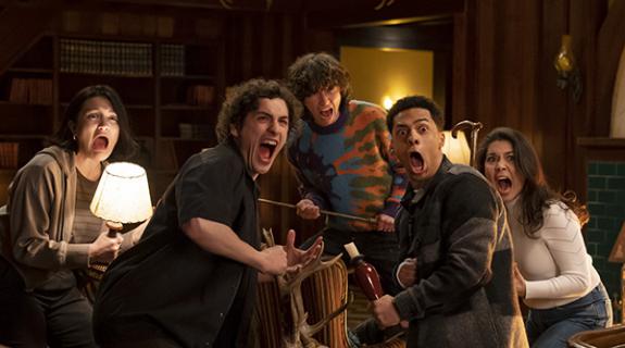
Peacemaker, based on the DC Comics character, explores the origins of a vainglorious man dedicated to peace at any cost. Gunn conceived and filmed a choreographed dance routine with the entire cast, while the designers created an accompanying typographic treatment for both the sequence and the show.
To figure out the aesthetic, Elvas and his team dove into glam metal logos and concert posters.
“A lot of typography from that genre, while stunning visually, is nearly illegible,” Elvas said. “As title designers, legibility is essential. When we discovered New Zelek, we were able to typeset it to do the job perfectly! It has the angular, geometric feel we were looking for, and the letterforms are clear and familiar enough that one can read the words effortlessly.”
“We also created a really cool treatment with a glowing outline,” Sarofsky added. “That look was painstakingly explored to match the set design and genre, and heighten legibility. It all looks so intentional and just as it should be, and that’s because of the hours put into making it just so.”
To complement the bold statements made by New Zelek in neon, Josefin Sans is used in white for all secondary typography. Discriminating viewers also will notice several moments in the dance sequence where the designers introduced subtle interactions between the dancers and the type.
As with Gunn’s other superhero action features, Sarofsky once again created custom title cards. For Peacemaker, this includes “previously on” and episode title cards to be used throughout the season.
Sarofsky generally designs and sets type with Adobe Illustrator, while After Effects is Sarofsky’s main tool to develop the overall look, layouts, and animation. For Peacemaker’s main titles, Sarofsky handled typesetting, visual effects and final compositing.
CREDITS
Client: HBO Max
Series Writer/Director: James Gunn
Editor: Fred Raskin
Choreographer: Charissa Barton
Production Designer: Lisa Soper
Producers: Simon Hatt, Peter Safran
HBO Producers: Bryan Caroll, Vicki Wagner
Post Supervisor: Josh Doughty
Agency: Sarofsky
Executive Creative Director: Erin Sarofsky
Executive Producer: Steven Anderson
Creative Lead: Duarte Elvas
Designers: Duarte Elvas, Chris Rodriguez
Producer: Dylan Ptak









__twocolumncontent.jpg)
