


__twocolumncontent.jpg)


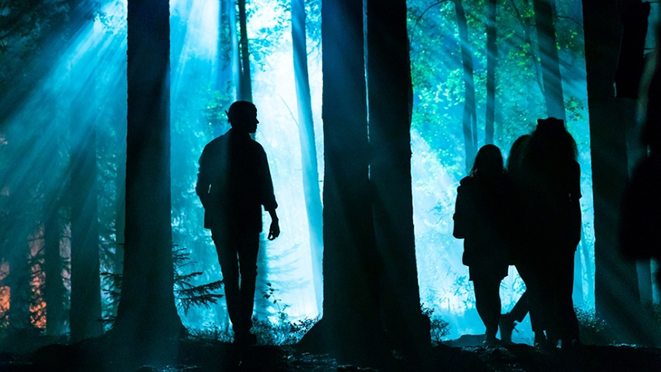
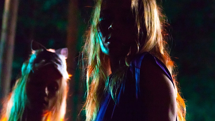
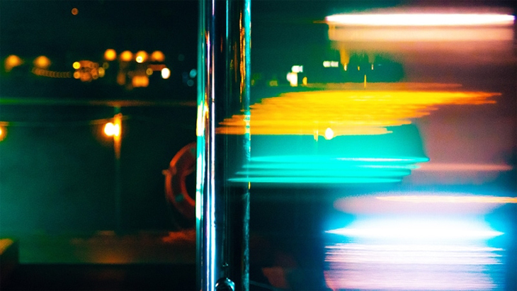
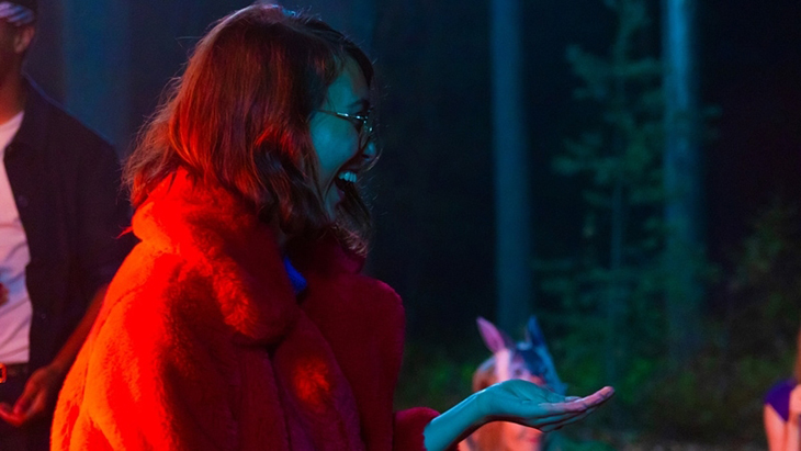
Gradients of color glide across the screen. Blues give way to greens across a misty pool at dusk; whimsical purples transition to pinks and reds; yellows and oranges cast a warm glow on faces laughing in a forest.
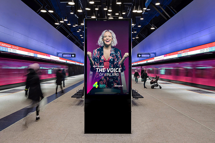
Inspired by the Northern Lights, CapeRock’s rebrand of Finland’s Nelonen uses bright hues and emotive imagery for an enchanting look at the region’s channel that aims to capture “the magic of big entertainment.”
That, in fact, was outlined in CapeRock’s creative brief as part of Nelonen’s strategy to become the leading television brand in the country.
“With a 20 year history, we were the market challenger for the first two decades, and finally managed to overtake our biggest and much older rival MTV3 a few years ago,” said Heini Häyrinen, senior vice president of marketing at Nelonen. “Now we are fighting side by side to be number one in the market.”
The name Nelonen means the number four in Finnish—stemming from its past as the fourth channel in the country—and the rebrand goes back to the channel’s promise of Entertainment is good for you, establishing a common ground that brings the somewhat distant and isolated country together.

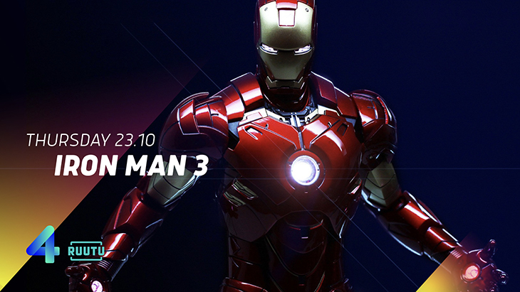
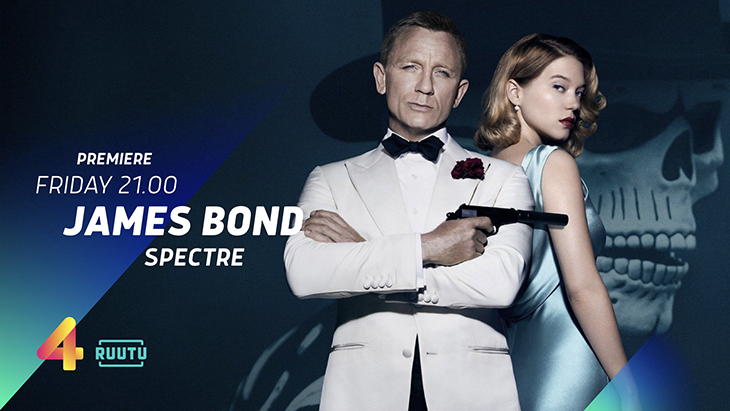
Playing with the diagonal line of the “4,” CapeRock added motion design to the 2D logo to create a kind of illuminated bridge that links from one piece of content to the next, establishing visual consistency on air, in promos and across digital platforms.
“Light is a key element of the visual concept, and we do suffer from the lack of it during our long and dark winter (which is just now starting to fade away to spring),” said Häyrinen. “The Northern Lights are just one aspect of light; in the summer the sun doesn’t go down at all, and we bathe in light.”
For CapeRock, this stood out as something special about the country, and emerged as obvious inspiration for the rebrand.
“The color scheme, the vibrancy; it’s entertainment that mother nature gives you,” said CapeRock Strategy Director Marco-Paul de Jeu. “We thought it was a real link, especially with the brightness it put into the brand.”
The rich pallet and contrast between light and dark gradients pack more expression and energy into the channel.
CapeRock focused on the green-blue shade as the main color to align with the brand’s heritage and to maintain recognition, while using the concept of community to bring more emotion into the mix.
The agency traveled to Helsinki to shoot footage in three different locations, creating idents that conveyed “special moments of people coming together, captured by the magic of the light; the magic of big entertainment,” de Jeu said.
Many of the places where they filmed tie into Finnish culture, such as the famed Allas Sea Pool and the deep forests where festivals often unfold—appealing to the younger viewers Nelonen wants to attract. The whimsical images, paired with a relaxed track that builds up to a reveal, triggers people to tune in, said de Jeu.
“People love to watch something beautiful,” de Jeu said. “A lot of brands sometimes forget about that.”
Tags: design promaxeurope2019 rebrand