The ‘W’ is a strong letter—a centered, balanced letter with visually appealing angles and the flexibility to extend across the screen or serve as a smaller, recognizable icon.
“That’s why we chose the ‘W’—to create a brand mark or a symbol that expresses the relevance and the core of the program,” said CapeRock Strategy Director Marco-Paul de Jeu of the creative agency’s rebrand of German broadcaster ZDF’s products program WISO.
Essentially a televised consumer reports show that offers investigations and reviews of financial and social services, Amsterdam-based CapeRock was tasked with bringing a fresh, modern look to the long-running program to make it more appealing to younger audiences on social and mobile platforms.
“Our aim was to create a brand for the program,” de Jeu said.
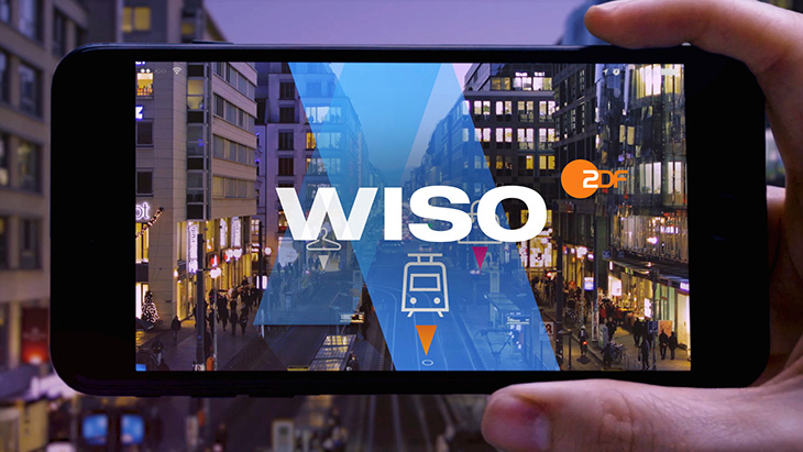

Designing for Social and Mobile
He and his team began brainstorming ideas, and sketching out three-dimensional graphics.
“We thought maybe the ‘W’ provides us with a shape that we can turn into an identity system,” he said. “We started to explore how it could work, how it could become more dynamic in its behavior.”
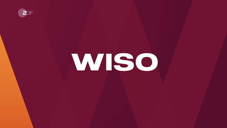
The agency honed in on the four diagonals of the letter, positioning them as the base of a grid for different motion graphic layouts. All movements start at the midpoint, expanding out from the center and serving as navigational guides to take viewers through the program.
“What I really like about this project is we created, in my opinion, a brand, which was before just a program name,” said de Jeu. “Now it’s established with a clear mark that’s part of the whole identity system.”
CapeRock also used the angled negative space of the ‘W’ to develop arrows that are used to help clarify and bring depth and perspective to some of the complex subjects the show tackles.
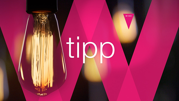
And the agency developed nearly 150 animated icons around specific themes the show addresses—such as technology, green living, telecommunications and transportation—to present the information in a more playful way.
The icons essentially serve as WISO’s personalized emojis, making them ideal for social and mobile as the program expands to new platforms and communication channels.
“It’s the language and style that younger people are used to,” said de Jeu.

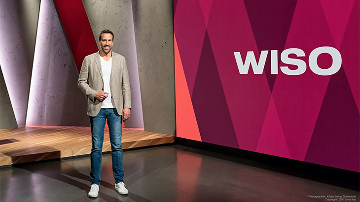
The updated design also extends to WISO’s newly built studio, which allows for more interactions between viewers and the show’s host Marcus Niehaves, such as an ability for him to answer questions that come in from social channels.
The rebrand took about a year to create as CapeRock worked closely with a small team at ZDF, and particularly with Niehaves, to develop a design that reflected his desire to provide journalistic, factual and relevant information to audiences.
“He had strong ideas about the points he wanted to make,” de Jeu said. “We put a lot of effort into getting all the details right.”
Incorporating Color and Music
CapeRock also developed a new color palette of dark red and orange—something striking enough to entertain and appeal to younger audiences, but not too over the top that it would distance existing and older viewers.
“We looked for a bold, serious color scheme that’s still fresh,” said de Jeu. “With the contrast and transparent layers we introduce, I think it works very well.”
CapeRock also composed accompanying music meant to add momentum to the program, creating a sound that falls somewhere between entertaining and informative.
“We wanted to find the right balance between creating some urgency with a little bit of a bombastic and electronic sound that also reflects finding the truth in everyday matters,” said de Jeu.
RELATED: CapeRock Redesigns German News Show ZDF Mittagsmagazin


























__twocolumncontent.jpg)
