


__twocolumncontent.jpg)


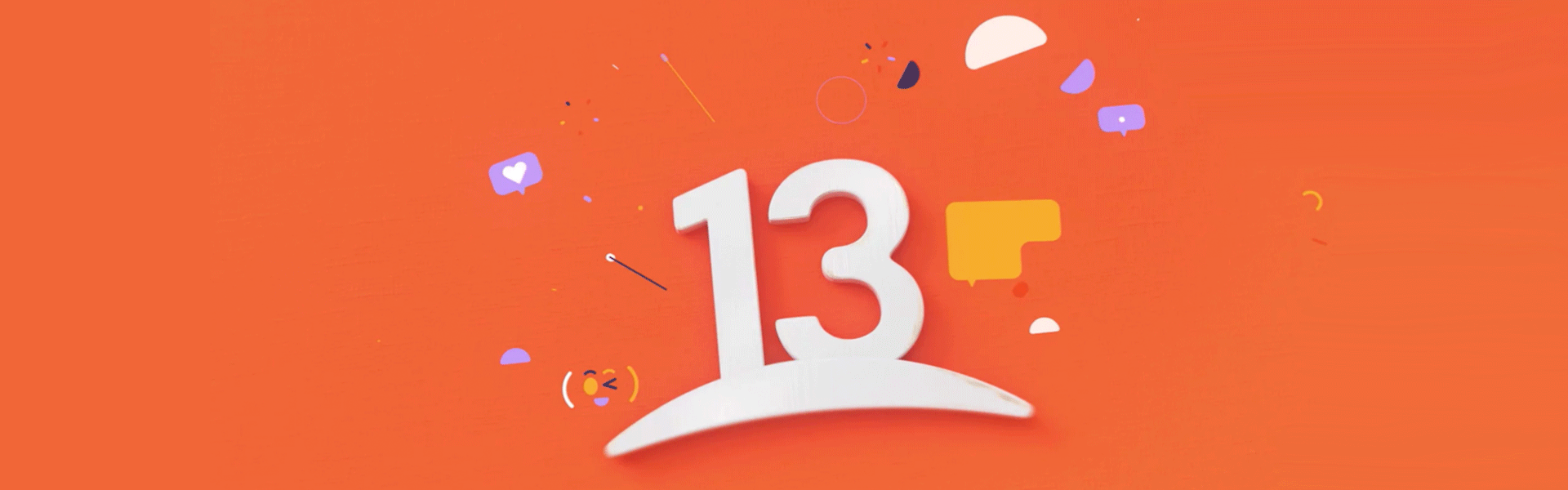
Canal 13’s new look seeks to hold the attention of a society that’s constantly in motion, and symbolizes the channel’s willingness to embrace whatever the future holds through a new horizon set in the logo, inspired by a quote from the film Into The Wild:
“The joy of life comes from our encounters with new experiences, and hence there is no greater joy than to have an endlessly changing horizon, for each day to have a new and different sun,” says M. Teresa Valdivieso Lecaros, Canal 13’s marketing manager, quoting the line from the movie.
The channel wanted to let its audience know it stands by them, sharing experiences from a broader perspective, according to Valdivieso Lecaros.
“For some time, we had been speaking to the audience only through our programs and we needed to communicate through the brand itself, presenting ourselves as a channel with energy that’s current and connected,” Valdivieso Lecaros says. “We wanted to deliver a very honest message, one that recognizes our history but trends toward the future, demonstrating we are more alive than ever.”
The move takes Canal 13 to the next level, opening it up to the world as it expands to become a more representative and diverse brand.
A Colorful Horizon
The line where the number 13 sits on the logo serves as the rebrand’s graphic basis.
In the previous logo, Canal 13 also sat on a horizon, but it was enclosed within a circle, limiting its dynamism.
“Now, we have given our horizon a true meaning, placing ourselves in a prominent position, while initiating movement,” says Valdivieso Lecaros.
Canal 13 brought in creative studio Feels to collaborate on the refresh.
RELATED: Creative Review: Feels
Sebastián Collazo, Feels’ CEO and creative and art director, explains that the work seeks to get as close to the audience as possible.
“The look evolved from a corporate image, to a channel that’s more on the forefront. We removed the sphere from the logo, so that it was no longer contained,” he says.
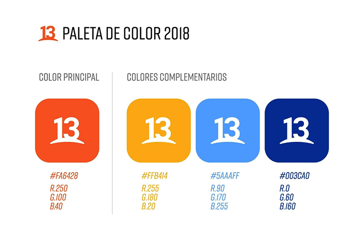
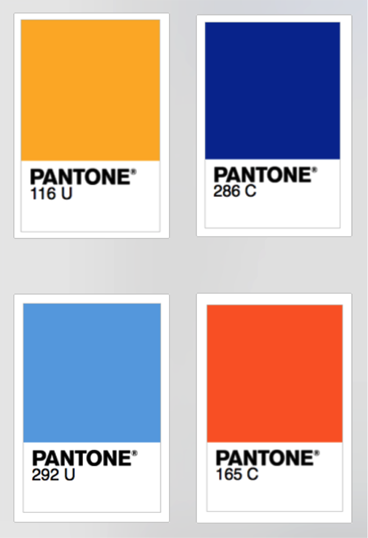
For the palette, Canal 13 retained orange and white—associated with joy, optimism, creativity, emotions and sociability—as its main colors.
In turn, the channel incorporated secondary colors to convey trendiness and freshness.
Yellow offers some of the same feelings as orange, but with a more informal, brighter tone that conjures images of sunshine, and projects warmth, positivity and happiness. This is the color that appears in the morning shows, self-help programs, biographies, sports, outdoor and food programming.
Blue and light blue serve as the brand’s disruptors, offering a sense of diversity. They allude to relaxation, intelligence, fantasy, nighttime, confidence and seriousness, and are used for newscasts, primetime shows, investigation, science fiction and religion programming as well as highlights and temporary changes.
‘We Are Here To Share’
The campaign also is structured around a new tagline: “We Are Here To Share.”
“This is a message that has always embodied us, and with which we are going to continue experimenting on all our media platforms,” says Valdivieso Lecaros.
A central spot integrates both ordinary people and network stars responding to the question, “What are we here for?” with the slogan as their answer.
“Through this concept, we want to invite the audience to share all the moments of their lives [with the channel],” says Valdivieso Lecaros.
The tagline becomes a call to action that plays into a communication strategy based on this notion of “sharing.”
For example, Teletrece hosts Constanza Santa María and Ramón Ulloa speak to viewers by saying “let’s get informed together” while Tonka Tomicic and Martín Cárcamo of Bienvenidos (Welcome) say, “let’s share good vibes.”
“With these IDs, we have created an animated graphic language that represents the people, conveying a feeling of being in constant conversation [with the audience],” says Collazo.
All of these components align to support Canal 13’s goal of leaving a mark in viewers’ lives.
“We’ve been doing this throughout our history and we will continue doing it. We create content that seeks to be in constant connection to people through new, inspirational, relevant and inclusive experiences,” says Valdivieso Lecaros. “This rebrand features a ‘13’ that’s full of energy, is connected, honors its history, and that is now projecting itself towards the future, where we all fit together.”
Version español: Canal 13 busca nuevos horizontes con la actualización de su imagen y logo
Tags: canal 13