


__twocolumncontent.jpg)


Come Oct. 27, truTV, the network once known as Court TV, is going for a “Way More Fun” look, rolling out a new multiplatform refresh, on-air revamp, logo update and a brand new programming lineup.
If this sounds ambitious, it certainly is and that’s deliberate. Instead of just refreshing its on-air look, the team at truTV wanted to go beyond a network rebrand to create a whole new perception of the channel, its online platforms, social sites, apps and content.
“We wanted to make sure that we made a lot of noise so people could feel the difference,” said Puja Vohra, SVP of marketing and digital at truTV. “It really was about the volume of change. It’s a big light switch – it’s not something we could have done in transition or slowly.”
According to Vohra, all of truTV’s departments were involved when scheduling the refresh, working with programming, scheduling, marketing and outside consultants to determine the perfect moment. That led truTV to the date of Oct. 27, and though marketing for the new look has slowly emerged over the past month, the network is eventizing the new branding by scheduling premiere dates as well as a network special to celebrate the change.
Hair Jacked, Fake Off, How to Be a Grown Up, Friends of the People and Barmageddon are all new on truTV’s schedule. The first four of those are set to debut during the week of Oct. 27, when the on-air refresh also rolls out, and according to Vohra, the network has several more projects in the works. The plan was for the new series to hit the schedule all at once, so viewers could immediately tell that truTV looked and felt different, both by the on-air visual changes as well as the content.
During the week truTV also will present “The New truTV: First Look,” a one-hour special hosted by Michael Carbonaro of The Carbonaro Effect, one of truTV’s most successful current series. The special, airing on Monday, Oct. 27, is available in a 10-minute version on all of truTV’s platforms ahead of the network debut, “working hand in hand to promote both the content and the environment,” said Vohra.
The new shows signal a focus on fun, entertaining content in an effort to get farther away from the Court TV brand and closer to a truTV that’s “Way More Fun.”
The new tagline, which accompanies a slightly altered logo, was one of the refresh’s earliest rollouts and serves as a solution to the problem of truTV’s perception as a brand. Vohra says that though the transition from Court TV to truTV was a successful one, that brand recognition had started to fade.
“A lot of truTV had become somewhat negative and conflict-oriented,” said Vohra. “We wanted to break out and be a place for fresh, new, innovative content. We wanted to do shows you couldn’t find on any other network.”
Using buzz words (entertaining, funny, comedic, smart, upscale and premium), the network, along with its creative partners loyalkaspar and Mullen, came up with the tagline of “Way More Fun.” Both Vohra and Chris Linn, president and head of programming for truTV, used the phrase “oasis of fun” as a foundation for the new truTV, going after a “funseeker” audience who wanted something different on television.
Daniel Dornemann, creative director at loyalkaspar, says the tagline also served as a mantra for the companies involved in the project: “Part of it was sort of staking a claim in fun and not hiding it in the message. ‘How can we infuse more fun into this?’ almost becomes a rallying cry for the entire company.”
In this, truTV is saying that it’s not only more fun than it was before, but it’s also more fun than viewers’ daily lives. In a series of spots called “Our Nights Make Your Days,” the network juxtaposes monotonous days and thankless jobs with the new truTV, an “oasis of fun,” according to Vohra.
“We don’t want to just say we are more fun, we want to show that we are,” said Vohra. “Smart, comedic, clever – you want to be those things, not just say you are those things.”
Putting the channel’s plan into action meant spreading the idea of brightness and vibrancy across its creative as well. Lively colors in the form of icons and show logos signal less serious fare than one might expect from the former Court TV. The idea extended past the logo to on-air slates created by Mullen with vibrant colors featuring acronyms like LOLSHIPAR (Laughing out loud so hard I pulled a rib) and WTFDIJS (What the fun did I just see?).

“It was a big shift from confrontational to more fun, lighter programming,” said Dornemann, adding that “the identity needed to support that new position and feel like a much brighter, more fun place.”
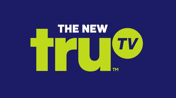
The logo followed suit, and while it looks similar to the old truTV, the team decided a slight change might make more impact. By moving the “TV” part of truTV upward and increasing its importance, the look literally elevates TV, which Vohra said was another subtle but meaningful move. “Our brand is a TV brand,” she said. “We’re on many platforms, but we want to elevate the TV in truTV – it’s really about the content above all else.”
“In our initial exploration, we talked about whether we wanted to change the logo, but the evolution of the logo made a bolder statement,” said Dornemann. “The circle with ‘TV’ felt like a period, almost like an afterthought. We wanted to elevate TV, to embrace it. TV is great place to be in right now, there’s no reason to hide behind it.”
When truTV first announced its plan for a refresh last month, the network also released a “Brand Manifesto,” which helps explain the new tone:
Tags: