


__twocolumncontent.jpg)


The world of sci-fi is misunderstood in many ways – sci-fi fans are not all introverted nerds, sci-fi viewers are not all men and sci-fi channels don’t just air Star Trek on endless loops.
Canada’s sci-fi channel, Space, has run into several such misconstrued stereotypes over the years and decided to take action.
In its latest brand refresh, Space wanted to send the message that sci-fi on television is so much more than aliens and vampires. Sci-fi stories have much more to say, and often these stories are based in the real world, not always in outer space.
The network began the process with a new look and feel a few years ago, adding a recent update last month that included new idents and on-air branding.
“The direction for our redesign two years ago was to take our brand from outer space with star fields and galaxies and ground it in the real world to focus on the phenomena that occurs all around us,” said Mike Stanley, Bell Media’s creative director of design.
So Toronto-based agency Tendril took Space from The Final Frontier down to the everyday world of science and wonder in a new set of on-air IDs sending the message that Space is an all-inclusive channel with high-quality programing and broad appeal.
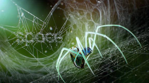
“We wanted to figure out the most interesting way to make the logo out of something that was an element inside the world of each of those IDs,” said Tendril Creative Director Chris Bahry.
“We loved the idea of trying to make a big, unexpected reveal,” said Tendril Creative Director Alex Torres. “When you look at the spider ID, you don’t even know it’s a spider at first, then toward the end we took people along this unexpected turn and surprise.”
Rendered spider legs played around the Space logo in its web in the first ID, bringing it to the classroom with the pencil shavings in a spot shot in live action.
Bringing the idents down to earth also allowed Space to boast about its wide-ranging sci-fi programming, with shows spanning each corner of sci-fi, including Orphan Black, Supernatural, Doctor Who, Face Off, Salem and Zachary Levi’s Geeks Who Drink.
“In the last few years we’ve invested into more original series,” said Stanley. “We’ve done a push towards co-productions like Orphan Black, Bitten, Killjoys. All have been really successful for us, they really resonate with our demo.”
Tendril’s Bahry also added that this type of programming allows the network’s color palette to be brighter and more upbeat than what one might expect with the sci-fi genre. Darker, more sinister looks not only bring to mind stereotypes about Halloween, but they also further the misunderstanding that sci-fi channels like Space skew male, while Space actually has a strong female audience.
It was just hard for the network’s sales team to convince people of that.
“Our core group of fans is a nice mix of male and female, but the perception of sci-fi genre channels is that they skew male,” said Stanley.

Each on-air ID was given its own distinct color palette, to separate them from one another and to give the network a lighter, brighter feel overall. Each of the main spots (the spider, the pencil and the robotic projector) was meant to feel grounded in the real world at its core, but with a touch of wonder that would “surprise and delight.”
“We didn’t go 100 percent sci-fi,” said Bahry. “There’s definitely always a foot planted in reality.”
And just weeks later, the Space refresh is living up to its goals.
According to Stanley, the new on-air look has given the network’s sales team the proof it needed that Space is effective with male, female, young and old viewers alike, saying that they’ve seen a “marked increase in sales.”
“We’ve become one of the more successful specialty channels as far as generating revenue,” he said.
Tags: