


__twocolumncontent.jpg)


With its eye-catching scenery, superstar outdoorsy personalities and TV-friendly competition formats, fishing has evolved into a complex global entertainment product in its own right. But to the World Fishing Network and its senior creative director Frank Russo, it remains, beneath all the froth and flair, a “sport about a rod, a reel and a line.”
For its first rebrand since launching in 2005, WFN sought to “keep things down to a bare minimum,” continued Russo. “Even when you’re at a tournament level when it comes to freshwater or deep sea [fishing], it all comes back that basic element regardless of the high-tech gear you have or anything else. We wanted to pull it back to where it all started from.”
To scale back, WFN began with its logo. Unchanged over more than eight years, its image of an angler casting into the water, was clearly “male-looking” said Pam Stinson, VP of marketing at World Fishing Network. “So we thought we were discounting other pieces of our audience like children and women.”
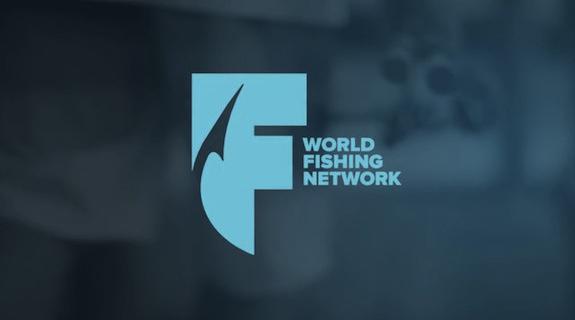
WFN brought in expert broadcast director Joel Pilger and his production company Impossible Pictures to help streamline the logo. Honing in on the “F” in “fishing,” Impossible turned the letter into the logo itself, pierced through by a minimalist rendition of a fishing hook. Having endured a year-long struggle to rebrand, the graphic finally gave the network something that “really spoke to our whole team,” said Stinson.
While the logo’s letter-based simplicity removed the stigmas of gender and age, the inclusion of the hook worked at an even deeper level, changing the brand’s visual point of view from the fish to the viewer . “Even fly fishermen use barb-less hooks so they can catch and release,” said Stinson. “[The logo reminds you that] fishing is an activity. So instead of showing a piece of a fish like a fin or an eye or a scale, putting a hook in the ‘F’ made sense, because of the human activity [it evokes] and the lure or a hook needed to enjoy that activity.”
Having found its logo, WFN continued to ground its overhauled graphical scheme in the simple authenticity afforded by the act of fishing. Cooling its previously orange-based color palette to one rich in deep blues and earth tones, it produced promo packaging steeped in the unfettered beauty of nature: a sunset on the horizon; an angler throwing his line into the ocean at the break of dawn; a rod framed by the endless sky.
Completing its increasingly universal look and feel, WFN called upon Stephen Arnold Music to marry the imagery with a “really authentic and raw” sonic identity, said Arnold himself, the company’s president. Though the new brand’s graphics are all tranquil beauty and minimalist typography, the musical directive from WFN requested something more traditional: good ol’ fashioned rock ‘n’ roll.
In an email to Arnold outlining the sonic feel WFN was looking for, a representative wrote, “We want our viewers to be able to identify with us as being their fishing buddy… That after spending a full day on the water, we hit the dock, downing spirits and swapping lies about the ones that got away. I like my rock ‘n’ roll to have the smell of whiskey and sin.”
Arnold responded to this by pulling together a live band . “At the end of the day,” he explained, “it just felt like if we really wanted to make this authentic, lets get four guys into the room at the same time and just lay this down.” Inspired by muscular rock groups such as The Black Angels and Arctic Monkeys, Arnold’s band of studio musicians churned out a churning, anthemic guitar-fueled theme that grabs the ears and doesn’t let go. The results, like nature itself, combine power with grace, fueling the brand’s stripped-down natural beauty on display with a driving power-chord melody.
“Original, sonically branded music plays a crucial role in defining and reinforcing a channel identity, and helping to provide immediate recognition for viewers,” said Chad Cook, VP and creative director of Stephen Arnold Music, in a statement. “World Fishing Network had a very specific vision in terms of the music for their new Network IDs and graphics. It had to sound authentic to their target demographic and capture the passion of the sport of fishing, while encompassing the whole outdoor experience.”
Tags: