Growing up in the ‘80s, Michael Waldron was a skateboarder, part of a community whose reckless collective image belied its resourcefulness.
“When you would get your skateboard deck, the first thing you did was customize it,” Waldron told Brief. “So you would put grip tape on it and then find paint pens and draw on it and come up with your own designs for your board, because that’s what separated you from everybody else.”
As a teenager dropping kickflips and ollies, Waldron probably wasn’t imagining skating would one day inform his work as VP creative director of art and design at TV Land. But for the network’s recent rebrand geared toward viewers in their 30s and 40s, he found himself inspired by the DIY spirit that infused his youth.
“Gen-Xers were kind of the first DIY group of people. They were the ones that went out and did things on their own,” said Waldron. “We wanted to do something that spoke to this audience and for us it was about making something that felt handmade and crafted versus repackaged.”
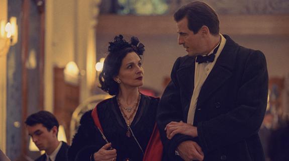
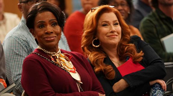
Previously, TV Land was probably known best as a comforting destination for reruns of beloved shows such as The Golden Girls and Everybody Loves Raymond, but its new, more tactile aesthetic complements recent programming inroads with an edgier bent, such as The Jim Gaffigan Show, Younger and Impastor. To help it create a visual identity that complemented what Waldron called a “huge shift from a content standpoint,” the network partnered with Roger, a production company whose knack for beautiful design is tempered by a “comedic edge about their work,” that Waldron felt would work well for a brand that still valued laughs, “but with a little darker feel.”
The tastes and values of Gen-X are definitely complex, but if any trait is consistent across the demo, it’s that it “can detect bullshit fast,” said Justin Meredith, the project’s creative director at Roger. “They only have a little bit of time in their day, they’re usually busy parents and only have an hour or two of TV time, [during] which they really love to unplug. And they want to go to a place that they feel cool.”
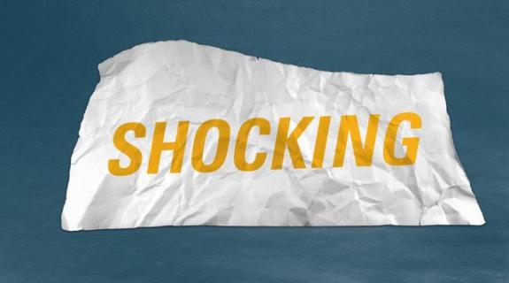
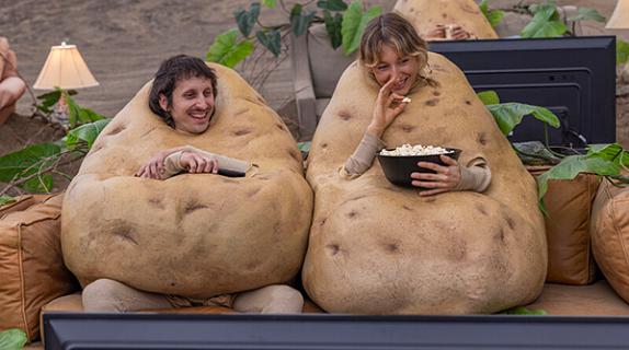
Roger envisioned that cool place on TV Land’s air as a comedy club. You might also plug in “punk club” to the previous sentence, or any place where “there are lots of fliers on the walls, lots of layers of things, posters, bands that maybe have played,” said Meredith. The goal was a textured feeling on-air, defined by layers of human-drawn, scribbled or pasted grit. Anchoring it all, a new, folded-banner logo is like the “piece you cut out with scissors and paste on a flier, then Xerox it with a bunch of handwritten lettering,” said Meredith. “We knew we wanted something that could always exist on its own, and could be like a tag or a sticker or a spray-paint stencil or something.
“If you had 50 of these TV Land stickers in your back pocket, you could slap them on the wall and they would be there,” continued Meredith. “Something of permanence that could hold its own… It can live on its own and it’s not super-complicated. It’s not calling tons of attention to itself, it’s just a simple unity that can go anywhere and is utilitarian.”

Meredith’s team actually produced the logo as a real-world object that could be crumpled, tattered and photographed against various backdrops and textures. Meanwhile, the new brand’s handwritten typography comes from Roger designer Maria K. (M.K.) Fabila, whose writing style “has so much expression in it,” said Meredith, “and it feels loud but it’s not too in-your-face.”
It’s also scribbly and off-the-cuff while remaining neat and legible, which is extremely important because the handwritten elements serve as a kind of information guide in the brand’s typography hierarchy.
“We use the handwriting for the biggest message,” said Meredith. “‘This Summer’; ‘Tonight’; ‘Wednesday’; ‘All new.’ We’ve started calling it the visual voiceover of TV Land… [as though] TV Land was the author of the navigation. It’s TV Land’s time to say, ‘hey, check me out…’ It’s guiding you somewhere, making you pay attention to something.”

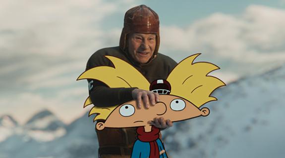
The design ecosystem around all that attention-grabbing writing is an intriguing blend of cut-‘n’-paste-style craftiness and sophisticated technological ideation. Breaking out paper, pencils, paint and scissors, Roger literally got their hands dirty in the service of the DIY ethos. Through the magic of stop-motion animation, torn and crumpled paper became backgrounds and transitions broken up with hand-drawn circles, boxes and arrows. The team even created one texture using a cheap black-and-white Brother printer. “We would just print out big black pieces of paper, and the actual drum on the printer that was going bad is the texture,” said Meredith.
Having tapped into skills learned in nursery school to create real-world effects, however, Roger’s delivery system for it all was as sophisticated as can be. To create a pipeline that could both deliver the handmade elements to TV Land’s in-house team and allow them to use those elements in perpetuity, Roger and its ace animator/compositor Ben Rohel (a “scripting wizard,” said Meredith) built a lower-third generating system from scratch using After Effects. The program lets the user select disparate parts from a series of modules, then combine them seamlessly into one fluid promo. One module, for instance, contains the brand’s signature arrows, circles and boxes, while another contains text-based options and yet another involves the shape and style of footage windows in which one might place a clip from an upcoming program.
“TV Land can create a bazillion different permutations with this little program that builds lower thirds, and they all look different,” said Meredith. “For a pipeline [in which] you need to make thousands of lower thirds, it’s a big deal for the team dealing with it.”

Ultimately, the new TV Land brand reflects a dichotomy unique to its target demo. Gen-Xers are both comfortable using state-of-the-art technology and can also remember a time when rotary phones were still the norm. They are riveted by the complexities of modern-day programming but still hold deep affection for a time when Three’s Company ruled the airwaves.
“It’s the world I grew up in,” said Waldron, “and there are other people who are doing the hand-drawn look on-air, but nobody really has a look or a package that feels this tactile or real. That was what was important for us – to get back to our roots.”
Tags:









__twocolumncontent.jpg)
