


__twocolumncontent.jpg)


French channel TF1 is arguably the most viewed in all of Europe and its media holding company, Groupe TF1, has been busy leveraging that position in recent years, consolidating the branding of a five-channel DTT portfolio around the TF moniker’s widespread visibility.
“In 2016, we decided to completely rethink and redesign our brand portfolio,” said David Sedel, director of creative services at TF1, “[and] make Groupe TF1’s multi-channel strategy more legible [as] a set of complementary channels belonging to the same family.”
Toward that lofty goal, 2018 alone has seen the launch of not one but two TF1-owned channels into the orbit of the parent brand’s home planet – the premium movie outlet TF1 Séries Films (formerly called HD1), and TFX, a reimagining of the general entertainment channel known as NT1 for the millennial generation.
With a “core target group” of ages 15-34, Sedel summed up TFX’s strategic goals as an “editorial pledge” to “keep calm and watch TFX.” It’s “the channel that embodies intensity without ever getting worked up,” he continued, with a slate fueled by “well-established major franchises” such as The Walking Dead and Grey’s Anatomy, and “daily reality TV” that offers “an IRL immersion in the life of French people.”
To package this heady programming stew into an on-air TFX brand, Groupe TF1 called upon Argentinian agency Superestudio, whom they had collaborated with once before – on TMC, a general entertainment channel.
Launched in 2016, Superestudio’s design for TMC offered an on-air vision of slightly twisted elegance that is worth revisiting for its sliding door, sleight-of-hand logo treatment alone.
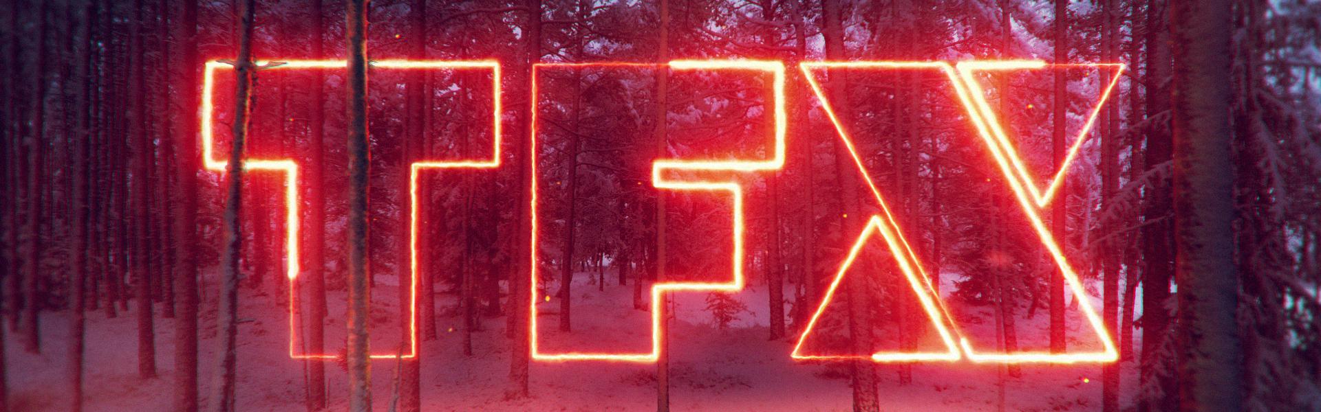
If TMC was an edgier TF1 brand for an edgier time, then TFX is a razor blade. “How sharp can a logo get?” ponders Superestudio’s case study for the project. The answer: “Very.”
Built around the X in TFX, the new brand lets the letter’s diagonal lines and corners radiate outward into an on-air landscape dominated by hard diagonal lines.
“Everything builds off that ‘X’ because it’s the letter that represents this channel,” said Ezequiel Rormoser, executive and general creative director for Superestudio. “The T and the F represent the mother brand, but the X makes it unique.”
In contemporary pop culture, an X of course has plenty of other symbolic value as well.
“The X Games, Netflix,” Rormoser offered, not to mention ubiquitous entities such as the X-Men, the X Factor, and the ultra-chic iPhone X. “The X represents millennials,” he added. “The idea is to build something edgy, attractive, with attitude… The logo has to be sharp but pop, the color palette bold and very vibrant, more related to this young audience.”
Superestudio’s early logo explorations approached the X through symmetric shapes, “but then we said, ‘Let’s make it more unique and not something so geometric,” Rormoser said. “We started to build a totally different X that was more dynamic. In the end we found out we could build it with two triangles and a shape in the middle, and that’s where we found it more interesting.”
Dissecting the X into three separate shapes – two triangles and a trapezoidal slash – gave Rormoser’s team ample wiggle room to expand the logo outward into different on-screen layouts. Sporting an “an italic type to match the brand,” the layouts are “based on close-ups of the logo,” Rormoser said. “The animation is very fluid and smooth.”
Meanwhile, “Vibrant colors pop on the screen,” he continued. “They make it friendly, mainstream and soften its hard edges. The combination between the sharpness of the logo and the pop color palette is what makes the brand special and related to the audience.”

While the layouts have a certain geometric rigor to them, the spots peppering the rebrand are wild and playful. In the end, Superestudio delivered 20 bumpers to the client, but each one has three different variations, which actually means they delivered 60 bumper executions.
All told, the bumpers are “the flashiest part of the project,” Rormoser said, and it’s hard to disagree given the eye-popping variety on display. “The idea was to use the brand as the protagonist for each bumper,” he continued. “We had this idea of building the logo in different environments and to actually have some hints for the audience [about the programming] with icons from pop culture and from movies.
Among other hints, careful observers of the bumpers will notice references to Star Wars, Kill Bill, the artist Roy Lichtenstein, Daft Punk, Planet of the Apes, La-La Land, as well as more general topics such as heavy metal, break dance, and graffiti.
“It was pretty fun to do 60 different executions, all different and all with high-quality value,” Rormoser said. “You will see 2-D, 3-D, live-action, mixed media. We were not stuck to any aesthetic in particular.”
Based on both TMC and TFX, the France-Argentina connection has borne sweet creative fruit, and it seems like it will continue to do so going forward.
“We are really proud that Groupe TF1 trusted us again with a rebrand of one of their channels,” Rormoser said. “We love the French market. The level of quality is really high – not only the brands, but the content. The French government has a lot of support for television, but at the same time there are standards of quality in place, and that makes French TV very high-level.”
Tags: superestudio tf1