When the time came for RTL Nieuws, The Netherlands’ leading commercial TV news service, to switch to full HD broadcast, the network seized on the opportunity, choosing to rebrand across all its platforms.
Editorial design guru Mark Porter, whose work on news brands includes an overhaul of “The Guardian’s” newspaper and online presence, was brought in for the job.
On the visual side, he collaborated with Smorgasbord Studio, whose creative director Dylan Griffith is the former creative consultant to the MTV World Design Studio and S4C, the Welsh-language division of Channel 4. Eighteen months later, the culmination of their work surfaced in May: a rebuild of every aspect of RTL Nieuws’ output, from logos and title sequences through on-screen graphics for news, weather and business, to the studio set, music and digital platforms.

Throughout the project, Porter told Brief, the goal was “directness and honesty in the design. A lot of broadcast design has a lot of eye candy – it’s about visual entertainment. But in this case the content is so important. It’s about delivering the truth about what’s going on in the world. The design is supposed to support that and create a platform for it but never interfere with it.”
We live in a world “where most TV news design is still stuck in the 1980s,” Porter said, a time when the Quantel Paintbox computer graphics system had arrived and made it easy to animate 3D objects on-air. TV news has yet to recover, with on-screen graphics that continue to be plagued by glossy 3D globes and other shapes flying in and out of IDs and title sequences, and lower thirds heavy with color gradients. “That seemed, to us, stuff that was interfering with direct communication of the news,” Porter said, “so we tried to strip it all out.”
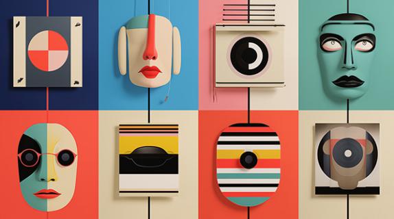
When Porter’s team was done stripping, what remained was the guiding principle of nothing but a frame, an elegantly empty shape that both creates space and selects what portion of the news channel’s output the audience gets to see. The frame motif manifests across the rebrand in ways that are both subtle and in-your-face. At the metaphorical level, RTL Nieuws takes a torrent of raw information and leaves what is essential, adding context and meaning. At a slightly more direct level, the sides of the frame split apart and are rearranged to create the network’s new logo. And at the bluntest possible level, the news channel’s new broadcast set features four giant, literal frames hanging around what is otherwise, save for a tiny looking desk, empty space.

Looking more like a modern art installation than anything news-related, the re-imagined set puts the focus squarely on the content, with the information provided by its presenters supported by visual supplementation on screens that “provide a fantastic opportunity but that have to be used responsibly,” said Porter. “We have to do good visual journalism rather than just fill them with entertainment.”
“People consume news more and more visually,” added Caroline Schnellen, marketing and communications manager at RTL Nieuws. “Old news brands have the presenter on-screen and a tiny screen next to him, whereas now you have all these big screens so you can support this information that you’re trying to bring across… That’s why it’s so strong and that’s why the studio is so empty. You have the presenter, the well-known face you trust… and then you only have the screens because it is about those visuals that support that message that we are conveying.
“The strength behind our new brand identity,” Schnellen continued, “is that it reflects journalism in functional design.”
Tags:







__twocolumncontent.jpg)
