


__twocolumncontent.jpg)


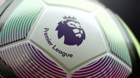
In February, Premier League unleashed a new visual identity and logo by DesignStudio offering a fresh take on its familiar lion mark and a bold new color scheme. Six months later, the fun has begun: The 2016-2017 Premier League season is in full swing, and we are seeing the transformed brand playing out on-air across a 380-match international programming slate.
“Delivering a vibrant and dynamic new graphical look for the Premier League was a challenge that shouldn’t be underestimated,” said Nick Moody, head of Premier League Productions. “They are entering a new broadcast term, and it’s their first without a title sponsor.”
That title sponsor would be Barclays, whose longtime contract with the league expired at the end of last season. From its presence in the logo to its color scheme infiltrating the league’s on-air studio environment, the bank’s influence on Premier League’s branding was substantial and its void created a major opportunity for revamping. The London-based DixonBaxi agency “was the obvious choice to revolutionize our on-screen graphics following a rigorous pitch process,” said Moody. “They interpreted our brief for something modern and dynamic and delivered from the very beginning.”
As it did with last year’s Eurosport rebrand, DixonBaxi has helped to humanize the Premier League, infusing it with a warmth and emotional depth that plays out across a dizzying array of deliverables, “from on-screen match graphics for the world feed to a match wipe and studio and [augmented reality] graphics for the Premier League Content Service,” said Moody. DixonBaxi also delivered 14 sets of titles, as well as stings, presentation wipes and even the title music.
Audio branding company and longtime DixonBaxi partners MassiveMusic revamped the sonic identity for the international broadcast, composing a stirring walk-on anthem and over-arching master theme that combine electronic music, classical instrumentation and location recordings from the field itself.
“Rather than just wanting to create graphics that move, we wanted to have an intent to it,” said Baxi. “They call it the beautiful game for a reason—there is an artistry to the way the game is played. Whether it’s a tackle, a pass, or a long shot, [the players] have a grace and an explosiveness to the movement. It was that contrast that we were really interested in.”
From its first pitch to the Premier League, DixonBaxi was deconstructing the movement of the game to explore a new approach to sports graphics it calls the “Field of Play” motion theory. The video below outlines this approach, which “abstractly communicates the idea that the different plays in the game create different lengths of time,” said Baxi. For instance, “a dribble and a pass is quick, quick, quick, long… That quite easily translates into the animation language, where you might have something that takes a long time and then there’s an inertia to it and then it all collapses very quickly.”
How this plays out during Premier League broadcasts is subtle but profound. With the on-field plays themselves guiding graphical behavior, the charts, player profiles, statistics and even the top corner score clock move in and out, up and down with a fluidity that makes the entire viewing experience feel like part of an organic whole. At the :28 point in the montage below, the system springs into action with a palpable sense of living and breathing. “There’s almost a human quality to it,” said Baxi.
The organic quality extends all the way out to the edges of the frame, where at times, translucent panels of color bleed off to the left or to the right.
“The graphics obviously have to live in that 16x9 frame,” said Baxi. “We wanted to make it feel more seamless… to suggest that actually we’re just focusing on one aspect but there’s more on either side. That gives a very subtle sense of scale, that we’re not hemmed in by the screen. That there is a bigger picture to all of this.”
Baxi said his team watched the motion theory video every week during the creative process, along with a complimentary “emotion video” that was about the “fans and the players,” he continued. “It’s not part of the deliverables kit. It’s just something between ourselves here and the client that we made to ground us in what we’re trying to achieve. We kept coming back to those [videos] over the 5-month process to remind ourselves that this is the DNA and this is the energy that we need to imbue everything with.”
It was important to keep both sides of the technical-emotional spectrum in mind because “there’s kind of a range of tonality” to the work, Baxi said. “When you look at the in-match graphics, they have to work really hard and not be obscure or abstract. They have to really do a job, so that was one part of it, but then we could dial up the volume tonally for things like the titles, which allowed us to be really expressive, to really stretch the brand in all directions.”
From DesignStudio’s new logo, vibrant color palette, striking image direction and other brand elements, DixonBaxi constructed more than a dozen show titles for Premier League’s on-air content for pre-game and post-game breakdowns, news shows and magazine programming with names like Netbusters, Fanzone and Matchpack.
Each title has its own unique flair, but all are “driven by this idea of ‘play to inspire,’” said Baxi. “The idea that it’s not just the players, but the fans and everyone that makes the Premier League… The celebration of the fact that this is really a global sport supported by upwards of two billion people around the world. That’s where you see these stills, the use of live action and game footage. But across all of it there is a very strong design sensibility—the use of typography, some of the editorial quality of the layouts. The craft of design kind of roots it back into hopefully a coherent experience.”
Full of unexpected changes in font size, density and color, and peppered with quotations, the typography in the titles was a chance for DixonBaxi to communicate more than just images in its search for sports’ emotional sweet spot.
“It was stories, it was engaging people with words that were potent and powerful, that almost feel like mantras and calls to action and rally cries,” Baxi said. “As with any sport that people really, really love, they know everything about it, so you can almost use the quotes, etc., that people really resonate with. They transcend time and become part of the myth of the game.”
Perhaps the most dramatic change in the revamped Premier League broadcasts is its on-air studio, the hub of the viewing experience. Designed by a Los Angeles firm called JHD, the new studio “almost feels like a Shoreditch or Williamsburg warehouse,” said Baxi.
Previously, the Barclays effect had it exuding a rather corporate vibe saturated in blues and general stuffiness. These days, it’s all big open spaces which allow for many different camera viewpoints. Presenters are not sat at desks but on sofas or stools, or standing, and they no longer wear suits. It’s a much more relaxed vibe, which plays well with the incorporation of DixonBaxi’s softer, more elastic graphics scheme. The space translates the agency’s Field of Play design language and motion theory into immersive content that supports the programming through features such as augmented reality, table-top touch-screens and floating stats.
“If you step outside of Premier League and just look at sports and sports graphics, it’s a very well-articulated space,” said Baxi. “There is so much beautiful, expressive, powerful visualization of what sport is, and I think the challenge for us was to make sure this felt distinct for Premier League, and felt entirely modern, but also really kind of change the game… That’s our big fight, to fight against the convention of sport. To say, ‘There are other ways of expressing this.’”
Tags: