


__twocolumncontent.jpg)


Since its inception in 2000, Oxygen has been a brand for young women, and that group, said Jane Olson, SVP of marketing for Oxygen Media, “tends to change very quickly.”
Indeed, The Great Recession, rapid technological advancements and the broadening definition of family are just a few of “the social trends and financial trends that have shaped and reshaped the way [young women] view the world” in recent years, said Olson. It seems to almost go without saying, and yet, she continued, that enormous faction of viewers wasn’t “seeing [those trends] reflected in their TV offerings. So we thought that was a real opportunity to be more relevant to them in a really unique way.”
Oxygen launched a comprehensive rebrand on Tuesday, marking a complete transformation across all of the network’s platforms, from an overhauled on-air design scheme influenced by modern forms of communication to a sleek new website tying together a raft of new digital initiatives. In September, the network announced a slate of original programming as part of the rebrand, including five new unscripted series, and in July it debuted its new logo and tagline, “very real.”
Those two carefully chosen words manifest literally in a refocused programming filter for Oxygen, which offers new female-centric reality shows ranging from The Investment Club to Nail’d It, but also reflect the findings of a comprehensive research study the network conducted to find out what millennial women really want. The results of that study uncovered a viewership that is optimistic following an era of hard times, but craves a “sense of authenticity in programming,” said Olson, which “informed both what our programming filter is and what I’ll call packaging; how we present ourselves and our characters to our audience. We wanted them to find our characters… not overly polished, not trying to hide their flaws but vulnerable, which makes them relatable.”
Creative strategic design agency eyeball [sic] won the pitch to help transition Oxygen into this more vulnerable space, working on everything from the new logo to a new on-air graphics package, to digital and social elements. Above all, said eyeball Executive Creative Director TJ McCormick, they helped Oxygen adjust “the tone with which they communicated with their audience… We helped develop a system of writing and communicating that worked on-air but also could translate off-air as well.”
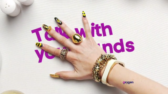
Airy and simple, the clearest evidence of this new system manifests in copy-dominated interstitials where a casual font (called Code Pro) turns “very real” into uplifting brand descriptors such as “real mornings,” “real moonlight,” “real late nights,” dropping lightly in against bold monochrome backgrounds. Linguistic deviations from the “real” theme dart in from time to time, such as hashtags (“#brekkie”) and other flights of whimsy (“cuddles”). The cumulative effect encompasses “the way that younger folks communicate these days,” said McCormick, “in that it’s all about short bursts of communicating… it’s about the way people text, the way they tweet and even the way they comment on Instagram or Facebook. It’s all very short and tight but also fun, mirroring contemporary forms of communication.”
The casual, conversational tone of the copy and its design is also a building block in the new brand’s sense of authenticity. Other blocks include IDs that find the logo or related images coming in blurry or too close, then quickly sharpening or panning back to reveal themselves as, say, “Oxygen on demand” or other brand-related terms. Meanwhile, an almost surreal sound design eschews background music for background chatter and atmospheric noise, as the voices of real people float behind graphics, briefly discussing their fondness of the network, why they enjoy VOD and other matters involving the act of watching television and, specifically, Oxygen. It sounds as though it would be irritating, or cheesy, but the effect is oddly calming, the illusion of sharing a room with other viewers comforting, if only for a moment.
“It’s about simplifying things,” said Olson, “about taking them apart, but it’s also about putting things together and making them make sense. And in a broader way, this sense of things being better together. The whole is better than the sum of the parts – that’s one aspect [Oxygen’s target] generation really responds to: This sense of community that they’re hungry for, and this sense of really wanting to make the world a better place.”
And of course, that ideal “filters down to how they edit their promos,” said Alex Moulton, executive creative director for eyeball and McCormick’s collaborator on heading up the rebrand. “In editorial style we shifted [Oxygen] away from trying to pack promos with lots of content and lots of flair, to just letting the content speak for itself. Letting the people on the show speak for themselves.”
As eyeball proceeded to shoot Oxygen talent for use in new on-air promos, many of the moments that would wind up making the cut were off the cuff or behind the scenes. “We had a lot of conversations about completely eliminating all the things that a lot of TV networks default to at this point,” said Moulton. “Green screen shoots… things that remove people from their natural environments… We did away with all that.
“If you see a little human moment,” he continued, “you have an affinity or those characters in ways you might not otherwise if it was either highly scripted or on a green screen… Our job as designer and people thinking about the brand was to get out of the way of the programming, to let the show speak for itself.”
Tags: