


__twocolumncontent.jpg)


In most cases, it seems, a product rebrands to address a perceived lack of something in its offering, or something that needs to be updated to keep it relevant to its consumers. So what then does a rebranding network do when its viewers are wanting for very little, if anything? For Finnish network, Jim, whose home country consistently and factually ranks among the happiest in the world, the answer was, as the great Sam Cooke once sang—don’t fight it baby, feel it.
“We Finns are a mellow, content nation and most of us really like our daily routines,” said Heini Häyrinen, SVP of marketing at Jim’s parent company Nelonen Media. “We wanted to mold Jim around this insight, to make sure it maintains its place in the daily lives of our viewers, reflecting how nice the everyday can be.”
When you’re living in a place like Finland, your everyday can be very nice indeed. It’s the ninth largest country in Europe but only has a population of about 5 million, which means that “there is a lot of space, a lot of woods and nature,” said Marco-Paul de Jeu, strategy director at Dutch agency CapeRock, which led creative on the rebrand. “People are relaxed.”
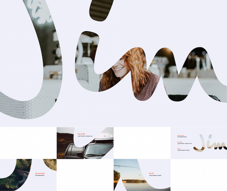
To tap into that sensibility, CapeRock, which also designed the previous Jim rebrand, has quite literally relaxed the network’s identity from the ground up. Once a pleasant but rather rigid mark composed of straight lines and curves, the new Jim logo is the branding equivalent of someone leaning back in a recliner and putting their hands behind their head. With the “J” leaning slightly askew and swooping in an upward arc opposite from the curl of the cursive “m” at the end, it even resembles a welcoming smile.
“We always try to design logos that are a little off, not totally imbalanced, a little weird, and thereby get their recognition,” de Jeu said. “That’s why we separated the ‘J’ from the ‘i’ and ‘m.’ You want to create a mark that people relate to and can like. With more corporate logos, people do not always connect to them.”
Having brightened the viewer’s day with a friendly grin, the logo proceeds to manifest across the on-air package, zooming in on crops of itself that become windows to content.
“The logo is very well-suited to use in animation,” de Jeu said. “There is already a certain rhythm in it that can be used very nicely in motion… The window is a nice way to connect the logo to content or imagery, showing daily Finnish life and the role entertainment plays in it.”
The finishing touch on the logo is its sunny orange color, completing a very simple brand palette that also consists of off-white and a deep navy blue. “The color palette feels both fresh and very warm at the same time,” de Jeu said. The orange hue also has a habit of popping up in a series of new Jim idents, adding a splash of brand love to simple scenes of daily Finnish life such as fishing in the river, enjoying a sauna or simply strolling in the rain.
While life is pretty generally pretty great in Finland, no place is perfect. As a far north country, “the wintertime is hard for them, with the short days and the darkness,” de Jeu said. “Around 3 in the afternoon it’s already getting dark, so people during wintertime come to the office early in the morning and leave early in the afternoon just to get home while it’s still light. It has a big impact on the people living there. That’s why orange was picked as a color—it’s positive.”
Tying the graphics together, CapeRock’s buoyant musical score is driven by a plucky guitar lick. It’s the sonic embodiment of the network’s new tagline, which translates to English as “Luckily it’s a Weekday.” The phrase calls out the ubiquitous role Jim plays in Finns’ day-to-day existence while also extending organically into other transitional copy, with the “Luckily” part of the equation immediately turning any moment into something worth celebrating.

“We wanted the slogan to be based on our insight of how much we Finns like our everyday life,” Häyrinen said. “Since Jim’s way of speaking is both straightforward and relaxed, we chose a very direct way of stating the almost-obvious: ‘every day is a good day.’”
Tags: