


__twocolumncontent.jpg)


Get ready for bold characters and new channels to take over Canadian kids TV this fall.
Earlier this year, Canada’s DHX ended a deal to carry Disney brands on its networks, thereby opening a gap for kids’ entertainment on its suite of channels.
So DHX did what any enterprising programmers would do and their launched their own channels, Family Jr. and Family CHRGD, serving kids ages 2-5 and 6-12 respectively, under the existing Family Channel brand.
In a relatively short amount of time, DHX worked with agencies Roger and Primal Screen to brand the two new channels under the Family Channel banner. The two new channels would operate in similar spheres as Disney Jr. and Disney XD, but they would need to look and feel completely different in order to signal a major change to both kids and their parents.

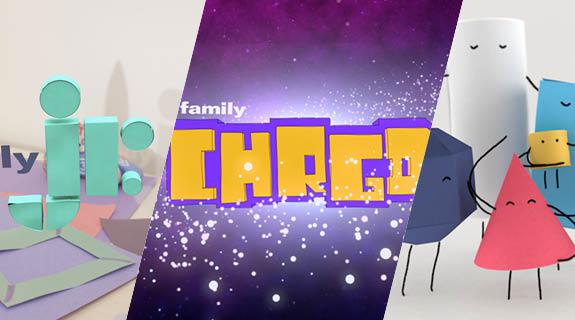
FAMILY JR.
According to Jason Gordon, creative director at DHX Television, the children’s TV market is crowded in Canada, so the first goal was to create two new networks that truly stood out on air.
For Family Jr., that also meant a French counterpart, so creating two new brands in one. Family Jr.’s French sister channel, Télémagino, carries similar programming but serves a French-speaking audience mostly in Quebec.
“We took the opportunity to really look into our audience,” Gordon said, “to see what things connected with both parents and kids. The world of imagination was really the thing we landed on.”
With the baseline idea of “Letting kids’ imagination take flight,” Family Jr. enlisted Roger to help creating a new logo and look for the network.
Roger decided on a simple, tactile, playful look for Family Jr., using elements that would invite kids to the channel in a fun way while also ensuring parents that it is a safe, engaging place for their children.
With imagination as their guide, Roger wanted to “engage with them in a way that works on their level” while also offering parents a “nostalgic quality, reminding them what its like to be a child,” according to Rich Scurry, creative director at Roger.
That led to a look full of texture, based on geometric shapes, building blocks and handmade elements familiar to kids in the age group.
“By being simple and bold in our look, it’s clean and inviting,” said Scurry. “We’re not overloading them with a lot of graphics that are loud and in your face. We wanted to establish that this is a place you can trust, that this is a place where you can stay.”
Those geometric shapes and building blocks also translated into the new logo, cleverly taking into account kids’ understanding of shapes (more so than letters) at the preschool age.
“The logo needed a tactile quality to it that’s fun, simplistic, smart,” said Rich Scurry, creative director at Roger.
Shapes combine to create “Jr.” as well as Télémagino’s logo, using similar, but rounder, shapes of the “J” in Jr. to create the “T” in Télémagino.

Another element of the playfulness and creativity of Family Jr. is a cast of characters that extend throughout several pieces of its branding.
“We really wanted something that felt imaginative and playful, felt kids would be instinctively drawn to and parents would love it for the joy and wonder it would bring their preschoolers,” said Gordon.
So Roger chose to tell kids’ stories through their eyes and through the eyes of animated paper-like characters.

“Creating characters that can go on adventures was really fun for us,” said Gordon. “Using paper as a foundation of everything works so well because a tactile substance – something that kids can relate to, using their imaginations with something accessible.”
Roger was also inspired by kids’ capacity for imagination and storytelling for this new group, who Scurry refers to as their “animated brand ambassadors.”
“We wondered, ‘What is it that children see when they’re interacting with toys and art?’” said Scurry. “They’re often telling their own stories with their own characters. It’s something we don’t necessarily see, but they’re able to create this entire world out of something so small and simple. We really took that to heart, and tried to visualize what kids are seeing and see things through their eyes.”
Those CG characters work on-air to tell stories “that can embody the spirit of imagination, friendship, kindness, ingenuity,” according to Scurry. They exist through IDs, bumpers and spots with live-action elements to invite kids and their parents to the space.
FAMILY CHRGD

For Family CHRGD, a slightly older channel serving a similar audience as Disney XD, the goal was to get inside the mind of a pre-teen for a look that is “silly and unexpected.”
Deliberately trying to break from the visual tone of Disney XD, Family CHRGD went away from a slick on-air look full of live-action elements in favor of a more accessible look that appeared handmade.

DHX worked with Primal Screen on its branding, who started out “trying to think like the core demographic which for CHRGD is primarily 13-year-old boys” and what would appeal to them in a TV channel.
“We focused on what would appeal to the age group, identifying the things we loved most at that age, and zero’d in on that feeling and energy and then channeled that into the visual language,” said Primal Screen Creative Director Rob Shepps.
Branding started with “a bold palette and big geometry to get the chunky style logo, then we overlay all that with electricity to really take it over the top.”
The logo goes on to create its very own figures, called “choppy box characters,” said Primal Screen Founder and Chief Creative Officer Doug Grimmett, who find themselves in “epic scenarios” played out on air.
“Kids at this age have a lot vying for their attention,” said Shepps. “We knew if we wanted to not only attract them but keep their attention, we were going to have to go big and then keep up that level of intensity throughout the packaging. Blending action based storylines with a sense of unexpected humor was the secret sauce.”

CREDITS:
DHX Television
VP, Marketing: Paul Cormack
Creative Director: Jay Gordon
Art Director: Nicholas Vitacco
Production Manager: Nancy McCreight
Family Jr. Branding: Roger
Family CHRGD Branding: Primal Screen
Tags: