


__twocolumncontent.jpg)


In the age of the 24-hour everything cycle, design trends can shift in the blink of an eye, and a television branding package can count itself lucky if it lasts for even a couple years. Which makes the German-produced magazine series Euromaxx something of a rare bird: an enduring international hit whose last on-air identity emerged in 2004, and remained almost entirely unchanged until a rebrand finally emerged this June, 13 years later.
Waiting that long is far from typical, but then Euromaxx is not your typical German lifestyle show. For one thing, it does not actually broadcast in Germany, but in 10 different languages around the world, sending out its quirky blend of food, fashion, arts and other reporting to Asia, North America, the Arab world, and just about every other global region except for the one that has Germany in it.
Which means Euromaxx’s broadcaster, Deutsche Welle (DW), was not hanging on to the branding just because the network was uber-fond of it, but because “it is really a challenge to develop a design for a show which has to appeal to a great variety of different cultures and respect cultural sensitivities,” said Holger Zeh, head of design at DW. “Usually,” he continued, “we do redesigns in more evolutionary steps, but after 13 years it had to be a more revolutionary change. For the viewer it will appear as something completely different and new.”
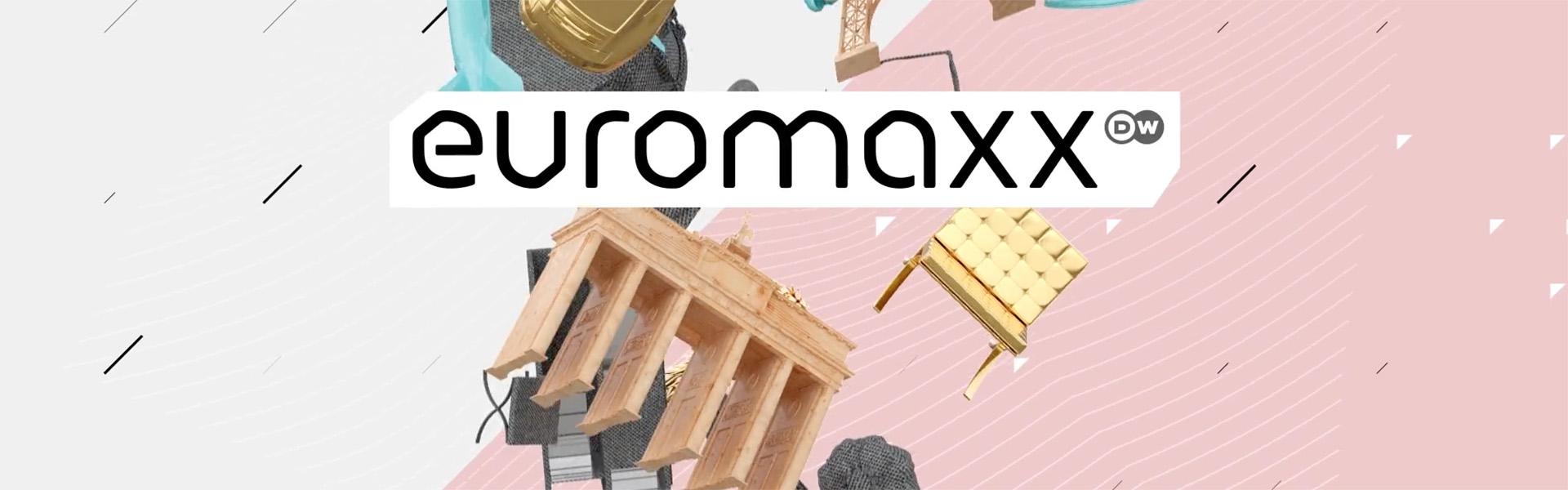
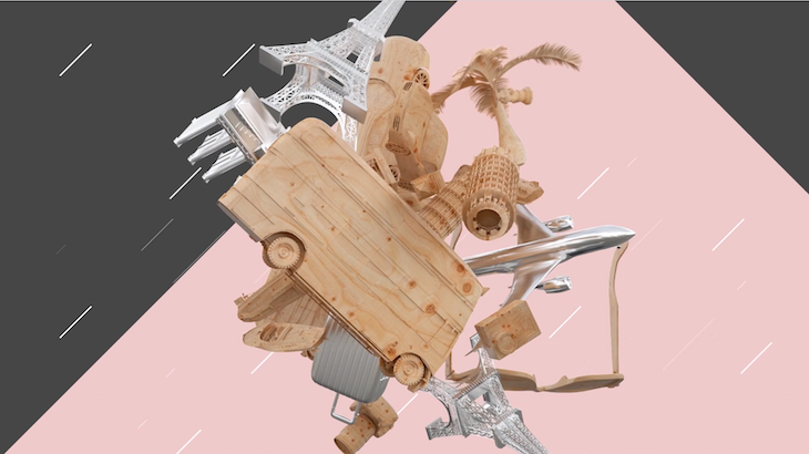
Compared to the previous branding, an amalgam of thematically appropriate objects that danced and twirled together, the new Euromaxx identity does appear dramatically altered. Where the previous manifestation spun out of real, stop-motion-animated objects set against a stark white background, the updated version is entirely 3D, set against backgrounds expressing an array of delicate hues and gentle patterns. It’s bolder, brighter and more complex in every way, but it’s also not so far removed at the conceptual level. It’s still grounded in objects that correlate to the themes of the show, including design and architecture (“Deluxe”), food (“A La Carte”) and travel (“Travelogue”). What’s revolutionary is the way in which these objects relate to each other.
“We threw the objects into a virtual space with software configurations where they can move according to physical principles, reacting to each other, always in movement,” said Gabi Madračević, creative director for Luxlotusliner, the Munich-based agency that designed the Euromaxx rebrand. The goal was to move the objects toward “creating sculptures with surprising perspectives, compositions and digital collages,” she continued, “just out of the natural beauty of coincidence.”
Redesigning Euromaxx was a full-circle experience for Madračević, who also helped engineer the show’s previous identity, while creative director at her former company, Velvet Media Design. More than a decade later, she would enter the pitch to upend her previous, incredibly enduring work with a guiding quote from the groundbreaking physician Gerhard Uhlenbrucks: “Today is our future memory, we should be designing accordingly.”
Rallying around that forward-thinking statement, Luxlotusliner crafted a concept that combines digital animation grounded in the nonsensical ethos of Dadaism with new retro digital design flourishes. The selected objects, ranging from musical instruments to cars, coffeemakers, fruit and furniture, are hardly abstract, but come wrapped in “contradictory textures,” Madračević said, “not the original or common, expected ones.” Thus, a London double-decker bus is made out of wood, a coffeemaker is made out of fabric, and a pineapple is made out of gold.
Euromaxx is “a cultural magazine, so we combined textures and objects to make new contexts,” said Jan Rinkens, creative director of animation for Luxlotusliner. Those new contexts were then made to interact with each other in beguiling and surprising ways, behaving in accordance with actual principles of physics, such as attracting and repelling forces, fluid-like turbulences, gravity, swarm-like behaviors, and even wind. “We tried to avoid to ‘design’ too much of the animation and behavior of the ‘sculptures,’ Madračević said, “but instead work more on the rules of movement to let the sculpture build itself.”
With the package in hand, the in-house team at DW can theoretically plug in new objects at will and continue letting them do their own thing within the identity’s 3D physical space, creating brand new, randomly generated digital sculptures for another 13 years or more. They can also quickly, and more probably for the foreseeable future, update opens, inserts, bumpers and more to align with the specific, intricate cultural needs of their many international partners.
“It’s a pretty nice modular concept,” Zeh said. “It leaves lots of open opportunities that we can further develop. Since this is a daily show, running six days a week, fans will see it very often and with all those different objects, you have the chance to see something new from time to time.”
CREDITS
Creative Director: Gabi Madračević
Creative Director/Animation: Jan Rinkens
Art Direction/Animation: Cay Fiehn
Art Direction: Iris Rinkens
Producer: Tatjana Živanović-Wegele
Project Manager: Thomas Menz
Head of Design, Deutsche Welle: Holger Zeh
Art Director, Deutsche Welle: Lars Jandel
Tags: