


__twocolumncontent.jpg)


When you’re dealing with food, things can get stale in a hurry, which helps explain why Scripps Networks’ Cooking Channel has put out its second refresh in less than three years even though everything seemed to be humming along just fine.
“Cooking Channel has been proving successful quarter over quarter and year over year since it launched in 2010,” said Bob Madden, SVP of integrated marketing for Food Network, Cooking Channel and Travel Channel, “and though we would never want to mess with what is absolutely working, we did want to continue to deliver on the freshness, fun and unique personality Cooking Channel has developed and to which audiences have responded so greatly.”
Developed in 2014, the network’s previous on-air look was swift and sleek, full of staccato beats and kinetic energy. The new package, designed by BigStar, warms things up considerably with vibrant photography and color palettes that are as eye-popping as they are mouth-watering.
BigStar’s aim was to not only infuse Cooking Channel’s photographic elements with new life but to make them “the main storytelling for the brand,” said the company’s president and executive creative director Josh Norton. To express something onscreen “that had a real tangible physicality to it, so when you watch the channel you’re tasting the flavor of all the different things that the Cooking Channel represents.”
But making photography pop off the screen required much more than just conjuring up beautiful images. The images in the Cooking Channel refresh have been carefully calibrated with other design elements such as color, typography and the all-important logo, and it is the balance of all these ingredients that turns them into something special. Indeed, breaking down the basic promo structure running through BigStar’s deliverables, it’s clear the final product is a triumph of editing above all else, or as Norton described it, the company’s signature “editorialized animations.”

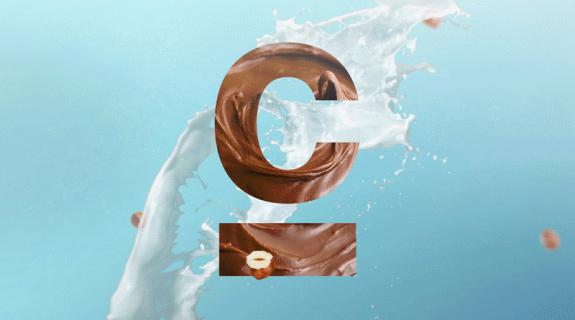
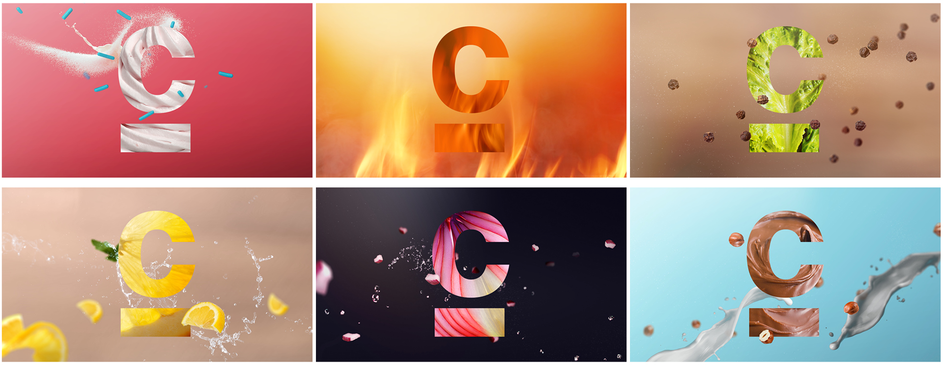
“In this package when you see a mnemonic upfront, you’re not just seeing one version of that idea, you’re kind of seeing three cut together,” Norton said. The gif above demonstrates that three-part visual harmony: 1) The network logo, reduced to its modified, underlined “C” carried over from the previous refresh, is filled with a crisp, vibrant photo of food such as lettuce, onion, red pepper or chocolate pudding. 2) “A medium such as water, flour or sugar,” Norton said, “is being tossed into the environment and interacting with the graphics.” And 3) a “floating element” such as chopped onion, peppercorns or sprinkles drifts through frame like a tasty, slow-moving weather front.
“Any one of those things, it wouldn’t be exciting enough,” Norton said. “Any two, not quite there. But when you put the three of those things together you’re able to really cast a spell and it all feels right and it all feels natural to the scenes and physical and organic.”
You might also add a fourth element to the mix, which Norton called “the secret to making those moments, those mnemonics, the animations and all the brand architecture really feel connected”: the color palettes.
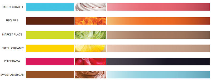
Representing taste profiles over programming themes, the seven palettes run the gamut from sweet to savory, stopping on themes such as Sweet American, BBQ Fire and Fresh Organic along the way. Each palette was conceived to embody the “beautiful, sumptuous sensuality” of food itself, Norton said, a process that, once again, was realized through a combination of details as opposed to a single, solid hue. “If you look at each palette you’ll see a base that’s a little bit neutral and then there’s this really vibrant color that lives on top of it,” he continued. “I would compare that to when you make a salad and then you put the red peppers on at the end and it makes the whole thing, the whole plate, come alive.”
Cooking is ultimately an activity that unites us all, and on which we all depend. “Every single person needs food, needs to eat to live,” Madden said. “The topic of food is not going to be a passing fad.” BigStar’s refresh has honored cooking’s central place in our collective table by crafting a brand that will be, as its website puts it, “no longer a frame for content, but an expression of experience.”
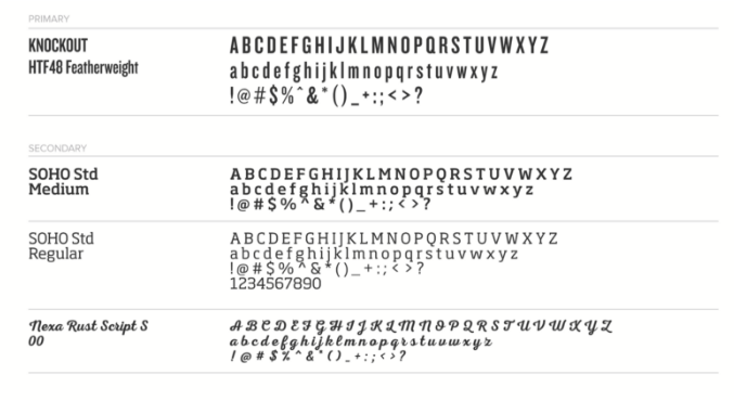
The feeling of being part of something now extends to Cooking Channel’s talent, who include the likes of Tiffani Thiessen, Rachael Ray and Bobby Flay. BigStar’s conceptualization of the IDs featuring these instrumental figures implements custom typography to reflect the written mediums of the food world, such as signs, chalkboard menus and labels, thereby “connecting to that experience of being around food in your kitchen or out on the town,” Norton said. “We found a lot of inspiration for our typography approach in real-world culinary culture.”
Bringing viewers even deeper into the respective worlds of the network’s personalities, the IDs “stay away from the typical cross-your-arms and face the camera style of talent photography,” Norton added. “We wanted to be in their kitchens enjoying food, and having a laugh… Just as we were creating what we felt like was a real, tangible experience with our graphic architecture, we wanted to have a real, tangible experience with the talent.”
Taken all together, the refresh is a reflection of Cooking Channel’s hard-earned position as a “true convergent experience,” Madden said, one that puts food and its makers on a glorious pedestal.
“Cooking Channel is a celebratory brand and we wanted to make sure that we came up with a visual language that is also celebratory,” Norton said. “I think that’s really the success of the package: Every time you see a promo, every time you see on-air space that is the cooking channel, it’s a celebration for your eyes and also your taste buds.”
Tags: