There’s a 3D printer in the office of London-based creative agency DBLG, which can come in handy when it comes to pitching on jobs. When a new logo design is involved, for instance, company founder and creative director Grant Gilbert has been known to print out a physical model of the proposed concept and leave it with the potential client as a friendly little parting gift.
So when Gilbert, working in collaboration with fellow creative director Steven Qua (AKA SQUA), went in to pitch ideas for the recent rebrand of British public-service broadcasting giant Channel 4, it made sense to take a similar approach. Gilbert and Qua had, after all, worked together on the network’s in-house team, 4creative, years previously, as well as on contracted projects since striking out on their respective owns, including the idents for Channel 4’s well-received 2014 campaign, “Born Risky.” And it was, after all, 4creative executive producer Shananne Lane’s clever idea to pair them once again for the pitch they were now preparing for. If ever there was a time for a friendly 3D-printed logo-treatment parting gift, this would be it.
Except for one little problem.
When it emerged from the madly brilliant laboratories of Lambie-Nairn in 1982, Channel 4’s industrial-strength logo had set a new standard for what a broadcast network could do with its branding, and while it had been tweaked slightly here and there in the decades since, a new version of it was neither necessary nor particularly desired.
Fortunately, Gilbert found a way to use the 3D printer anyway.
“Because the logo was so well-known in the UK as a structure and people understood the shapes,” he said, speaking to Daily Brief over Skype, “we reprinted some of these blocks.” He held up to his computer’s camera an object “print-out” recognizable as the physical rendition of one of the nine building blocks that make up the 4 logo. “And at the end of the pitch,” he continued, “we just threw the blocks on the table and said, ‘there’s your logo,’ and sat back. It was one of these kind of agency moments.”
The reel above suggests that what was proposed by Gilbert and Qua at that fateful pitch was a refreshed identity system that, rather than improve upon Channel 4’s great legacy of using its super-cool logo in super-cool ways, simply does away with the logo entirely. In actuality, “You can look at it from two different ways,” said Qua. “One way is that we went in and said, ‘let’s get rid of your logo.’ But I don’t think we said that. I think we said, ‘we keep your logo exactly as it is… but we’ll just use the logo to make interesting things.”
Said interesting things have already cohered in wildly interesting ways, such as in acclaimed film director Jonathan Glazer’s (Under the Skin) treatment of the concept, in which the blocks are so subtle across his series of bizarre and beautiful idents they are almost camouflaged.
…And in legendary graphic designer and typographer Neville Brody’s custom-made display font for the rebrand, which uses the angle cuts of the logo blocks as the foundation for its elegant letters.

…And even in idents for specific programming, such as this delightfully abstract spot for The Simpsons, where the simple addition of the titular family’s eyeballs to the blocks evokes the show’s spirit almost more powerfully than a more traditional promo might:
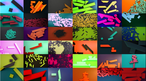
…But most of all, in the case of DBLG and SQUA’s contributions, where it all begins, and where Gilbert’s symbolic act of dropping the blocks on the table materializes quite literally across dozens of on-screen opticals… again and again and again, and never the same way twice. All the bits and pieces of the logo present, but in a different configuration every time.
The process of randomly generating the logo pieces into different arrangements was executed in Cinema 4D, utilizing a “very simple, dynamic system that any young kid coming out of college could potentially do,” said Gilbert. It involved creating a virtual rig where the camera is attached to a rotating background and the logo blocks get set in motion with its rotation and fall accordingly – i.e. however the laws of physics decree it. DBLG and SQUA ended up creating more than 50 of the shifting patterns “so you would very rarely see a repeat,” said Gilbert, leaving room for any number more to be created. “If we were left to our own devices we would do hundreds of these, said Gilbert. “That’s the plan. There’s a longevity to it that you can keep going… there’s not just one lockup and it’s gotta to do that each time.”
When the logo hit the scene in 1982, “they created technology to do that,” said Qua, “[using] computers nobody had access to, and they really pushed it. What’s funny now, when everyone in the world has access to technology that smashes that to pieces is, we’ve done the absolute simplest use of that technology possible. I think that’s a funny bookend.”
Even funnier, to some, is that the famous Channel 4 logo is now essentially gone from its on-air graphics. But that’s okay said Alice Tonge, creative director for the network’s in-house team 4creative, because “the fully formed 4 logo features in our off-air so it allowed us to push the boundaries on what TV branding could be on-air. We didn’t want to just tell people what channel they were watching with a big shiny logo, we wanted to remind viewers why they were watching. The channel 4 blocks are let loose to express the channel’s remit – to be irreverent, challenging, innovative and alternative.
The concept is even liberating at a practical level, freeing up space on the screen for information about what people really tune in to a TV channel for – the shows.
“The thing that’s important on the promos, we thought, was, ‘what’s the name of the show and when’s it on?’” said Qua. “So our logo just completely moves itself out of the way so you can see the name of the show.”
“For the first time ever in the stuff we’ve done,” added Gilbert, “we’ve been able to put [the information] in the middle of the screen. It’s always been shoved to the left or right or bottom or top because you have to put the brand in there.”
CREDITS
4Creative
Executive Creative Directors: Chris Bovill, John Allison
Head of Production: Clare Brown
Creative Directors: Chris Bovill, John Allison, Alice Tonge
Creative: Alice Tonge
Executive Producer: Shananne Lane
Business Director: Nik Windsor
Senior Producer: Louise Oliver
Designers: Tim Fellowes, Aimi Awang
Strategy: Nik Windsor, Olivia Browne, James Hamilton
Channel 4 Marketing
Head of Marketing: James Walker
Group Marketing Manager: Rosalind Godber
Concept & OSP
DBLG Studios
Creative Directors: Grant Gilbert, Steven Qua
Producer: Natalie Greenwood
Design and animation team: Jacob Vanderkar , Rita Louro, Jason G Wiley, Marcel Piekarski, Eduardo Escanho, Marco Savignano, Sam Trimitrimi
OSP Post Production Partners
The Moving Picture Company
Envy Post Production
TAG
Idents
A+/Academy Films
Writer and Director: Jonathan Glazer
Producer: Simon Cooper
Production Manager: Bugs Hartley
Director of Photography: Alex Barber
Production Designer: Chris Oddy
Editor: Paul Watts @ The Quarry
VFX: One of Us
Lead Post Superviser (One of Us): Emmanuel Pichereau
Post Producer (One of Us): Leila Nicotera
Special Effects: Asylum
Shaman Costume design: Chris Oddy/Kate McConnell
Audio: Johnnie Burn @ Wave
Music Composition: Mica Levi
Original score performed by Orchestrate
Fixer Bridget Samuels for Orchestrate
Font
Brody Associates
Creative Type Director and Designer: Neville Brody
Type Designer: Luke Prowse
Project Manager: Philip Rodgers
Designers: Jack Lewellyn and Chris Nott
Tags:








__twocolumncontent.jpg)
