UPDATED: Cartoon Network/Boomerang’s Jacob Escobedo and Susan Shipsky, and Art&Graft’s Will Mercer and Mike Moloney will share more about the process of the Boomerang rebrand at PromaxBDA: The Conference 2015. See them on Thursday, June 11 at 11:15 a.m. at the JW Marriott at L.A. LIVE.
ORIGINAL POST: March 10, 2015:
Turner’s cartoon classic network Boomerang has long been something of a complement to its bigger sibling Cartoon Network, offsetting CN’s original programming with Scooby-Doo, Loony Tunes and other old standards from the Hanna-Barbera, MGM and Warner Bros. animation libraries.
So when the time finally came to reposition Boomerang as a flagship channel in its own right, the challenge was “keeping it aligned with Cartoon Network visually,” but doing so without “compromising the sense” of its well-established sibling,” said Jacob Escobedo, VP of creative design for Cartoon Network Marketing.
Escobedo and the team began their challenging task by isolating the defining elements of the Cartoon Network brand, which they determined to be the logo and its unforgettable checkerboard pattern.

The Boomerang rebrand needed to channel that look and feel while maintaining its own powerful identity, and after “rounds and rounds of creative,” the team had still failed to hit on something that succeeded. A breakthrough came while Escobedo was on an airplane, working on his laptop. He started experimenting by making blocks out of the characters themselves, stacking them up and playing with different scenarios. Finally, he said, he was “getting somewhere [while also] linking back to the checkerboard.”
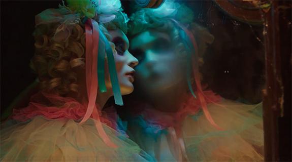
At that point, CN felt ready to hand Boomerang off to Art&Graft, a London-based design and motion studio whose eclectic body of work has ranged from a reinvention of Virgin Atlantic’s in-flight safety film to mesmerizing music videos for the British singer-songwriter Laura Marling.
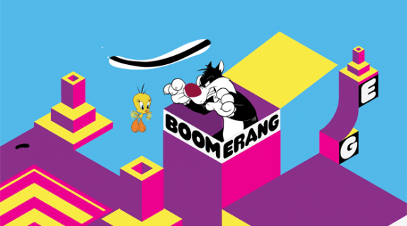
Art&Graft responded to the brief by grounding the block concept in an isometric grid formation that quite literally recalled the checkerboard pattern. It sounds very geometric, even limiting, but the opposite is true. With the framework of the design rigidly structured, the brand “exploded into this interesting evolution of playing with the blocks and seeing how far we could take it,” said Escobedo.

For Art&Graft’s part, the studio saw entire worlds, or “playgrounds” within the grid where Boomerang’s iconic characters could interact with the promo package’s elements.
“It felt like there was a lot of fun to be had there in that you could see these playgrounds as wide as landscapes or zoom into one cube and go inside it,” said Mike Moloney, creative director at Art&Graft.
A father himself, Moloney professed to being invited to “loads of kids’ parties” on a regular basis, where he has noticed that, inevitably, some sort of professional trickster is brought in as entertainment, such as a magician. Kids, he said, respond to situations in which “magical surprising things happen.”
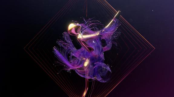
Looking to implement such elements across the Boomerang package, Art&Graft settled on a technique it coined “Diamond Events,” wherein a flurry of activity emerges from an isolated square on the grid (which, when rotated, of course becomes a diamond). Taken alone, these Diamond Events function as hypnotic tidbits of visual poetry.

Taken together, dispersed across the grid formation, the events create quilts of activity, dozens of panels morphing into different portals, moving staircases, spring-loaded traps and other delights.
As the package developed, Cartoon Network senior designer Petrika Janssen struck on a version of the Boomerang logo that, as planned, calls back to the CN look and feel, but also inventively uses that essential diamond shape to integrate with the promo package: In bumpers and idents, the logo serves as a button that, when pressed, triggers the explosion of activity in the grid surrounding it. If there’s anything a kid likes more than magic, it’s pressing a button and getting an exciting result.

Things get even more interesting when Boomerang content enters the picture.
Drawing on “loads and loads of reference footage from old cartoons,” Art&Graft honed in on specific movement sequences of characters, looking for moments of motion that could fit organically with the grid’s system of portals and passageways. In one, Tom of Tom & Jerry springs out of a box, gets whacked on the head, and falls back down again. In another, Daffy Duck runs frantically on a ball that just spins in place, keeping him from getting anywhere. One can imagine that in the original cartoon he’s doing the classic “log-in-the-water” routine, sprinting on a stationary floating log that just twirls beneath him. In the Boomerang promo package, that motion transposes seamlessly into the world Art&Graft designed. From there, Boomerang promo teams around the world can swap in whatever programming they wish into such moments, so long as the motion of the incoming character matches up with the arc of the element.

The final product is a Boomerang brand entrancing to children but with sophisticated design scheme that any adult can appreciate, which was important for a network loaded with retro characters that parents often know and love as well as, if not better than, their children.
Said Escobedo: “I think we came up with a pretty bold package that lives anywhere and appeals to any age group.”
CREDITS
Concept, Design & Direction:
Art&Graft
Creative Directors:
Mike Moloney (Art&Graft)
Michael Ouweleen (Cartoon Network)
Jacob Escobedo (Cartoon Network)
Lead Creative:
William Mercer (Art&Graft)
Producers:
Beth McQueen (Art&Graft)
Susan Shipsky (Cartoon Network)
Lead Designers/Animators:
Martin Salfity (Art&Graft)
Clement Bolla (Art&Graft)
Stephen Middleton (Art&Graft)
Jim Wheeler (Art&Graft)
Animators working as part of the in-house team at Art&Graft:
Martin Aggerholm, Jason Drew, Carlos de Faria, James Hatley, Jamie Hoy, Sebastian Livingston, Sam Munnings, Marco Savignano, Joseph Winston.
Music & Sound Design:
Bluetube
Tags:
























__twocolumncontent.jpg)
