


__twocolumncontent.jpg)


Viewers may not be able to pinpoint exactly why Oxygen feels different these days, but the network’s research shows they like what they’re seeing.
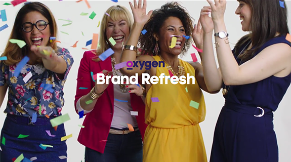
A recent refresh that elevated a major rebranding campaign from two years ago features fast-moving graphics and clips from Oxygen’s shows in a way that looks complex, but at its core is really rooted in simple, elegant design.
Short bursts of animation mix and match with quiet, systematic moments. Vibrant colors and geometric shapes are balanced by live-action scenes. It’s the perfect harmony of organized chaos, intended to appeal to Oxygen’s demographic of young, multicultural millennial women.
Yet music may not be the best analogy to describe creative assets bursting with visual energy.
The refresh was crafted to communicate Oxygen’s story with or without sound—mobile users often have their phones on mute after all—and works both digitally and linearly to maintain engagement across multiple platforms.
As Nancy Mazzei, vice president, creative and brand design at Oxygen says, nothing stays in one place for too long. Viewers consume in bite-sized information, and the refresh comes from that mindset.
“Our audience is constantly on to the next thing,” Mazzei said. “Everything is a swipe. Everything is a click. We wanted our graphics to move as fast as our audience is consuming.”
Spicing It Up
Fast, indeed. A few years ago the network noticed “the audience Oxygen once had was not the audience Oxygen was migrating to,” Mazzei said, and rolled out a bold rebrand in 2014. It included a new logo, the “Very real” tagline and a focus on culturally-relevant stories and diverse characters aimed at modern women in the 18-34-year-old range.
New York design agency Eyeball incorporated a bright palette, straight-forward typography and dynamic animation to bring a conversational, authentic tone to the brand. It established a new direction for the network, which was used as the foundation for the refresh that launched in February.
While Eyeball helped build a strong skeleton for the brand, the network felt it needed more meat on those bones. That’s where Kaori Sohma, creative director for on-air creative, stepped in. Her idea was to pack more punch via a less uniform structure and additional graphic options that diversified the spots. She emphasized circles in particular to play up the ‘O’ in Oxygen when it came to creating expanding patterns and animation.
“The graphic elements are like different spices for what you want to make,” Sohma said.
It’s a recipe Argentinian design firm Eloisa Iturbe Studio was all too happy to help whip up.
“It was one of our favorite projects of all time,” said creative director and founder Eloisa Iturbe.
‘Like a Cherry on Top’
She, along with creative director Martin Lanciano, were shown a mood board with strong, graphic elements that represented Oxygen’s vision, and asked to create a campaign that wove in more variety, texture and color.
“It was pretty clear what they wanted,” Lanciano said.
From the moment they stepped into the office and saw the mood board, they felt an immediate connection to the design the network had in mind, and knew the project was for them.
Lanciano and Iturbe created two proposals, and Oxygen picked the bolder, more playful option.
Sohma agrees the network and the agency had similar tastes. Oxygen pitched a creative brief with a lot of room for flexibility and interpretation to four different agencies, and Eloisa Iturbe Studio “nailed it,” she said.
“They really understood what we were looking for,” Sohma said. “They didn’t go too far away from what our brand was before, while still bringing in some fresh air, and maintaining the integrity of what we had.”
Sohma describes the duo as “true graphic nerds” with a good sense of typography and amazing attention to detail.
“I think they were quite impressed that we don’t do a few things,” Lanciano said. “We do it all.”
He and Iturbe enjoyed the creative process of trying out different ideas.
“We felt like everything was coming out naturally,” Iturbe said. “Once we defined what the system would be, it was very easy to come up with nice designs.”
They created tool kits for how to work with a wide range of options, like transition variations, end tags and different logos, allowing Oxygen’s in-house team to pick and choose elements that give each spot a unique feel, while maintaining an overall unified look.
Eloisa Iturbe Studio also created technical tricks to simplify the design and make it production-friendly. For instance, there’s often a lot of repeating text, so they made sure that a change to one word or one color palette would apply across the board.
The end result appears very artistic, reminiscent of a Kandinsky painting, with endless combinations of text, color and clips that flow seamlessly together to create distinct packages that connect to a larger vision.
The structure allows Oxygen to build episodic content into different spots for constantly transforming promos, while molding the material for digital and social platforms, and keeping everything fresh.
“It’s like a cherry on top for the network,” Sohma said.
Just The Beginning
Yet Oxygen’s viewers are continuously consuming and evolving, which means the network must follow suit.
This latest refresh is simply another step in a tenacious yet hazy direction. The network plans to keep the momentum going by staying on top of new trends, understanding what and how viewers are watching, and letting that information lead them to future content and marketing initiatives.
“Our hope is we’re going to be able to see what the next rung is by being tuned in to our audience,” Mazzei said.
Good thing the campaign is designed with built-in flexibility that can mature along with the brand.
“The next six months—I know there will be changes,” Mazzei said. “We can keep innovating on it.”
Tags: