


__twocolumncontent.jpg)


Keeping up with the ever-changing art of title design is no easy feat. That’s why Promax continues to bring back its classic creative panel discussion, “The Art of Title Design,” which offers best practices and the inspiration behind today’s most creative opening titles.
Led by Twinart, Inc., founders Lynda and Ellen Kahn, the session walked through the art of creating main titles that stick, spotlighting shows from Sony, Freeform, AMC, Netflix and HBO. Check out the spots below.
Sony Crackle’s The Oath
In order to capture the gritty, mysterious theme of The Oath, Sony Pictures Television tapped creative agency Imaginary Forces to develop the series’ main titles.
Although the spot went through several revisions, the team always knew it wanted to allude to the name of the show’s gang—the Ravens. Therefore, they incorporated several depictions of the all-black bird while still featuring the show’s cast.
“[We used] ravens as a symbol of how the gang interacts with each other. But in the end, there’s always one alpha,” said Kasumi Mihori, SVP, brand creative at Sony Pictures Television.
Freeform’s Motherland: Fort Salem
Cecilia DeJesus, designer at Picturemill, joined the stage to discuss the main titles for Motherland: Fort Salem, Freeform’s new series about an alternate history where witches served in the military.
While developing the titles, which feature a map, a timeline of witch history and military influences, Picturemill worked closely with showrunner Eliot Laurence to determine the best direction and accurately depict the show’s unique concept.
AMC’s Lodge 49
To depict the modern fable set in Long Beach, Calif., AMC tapped creative agency Prologue for the creation of its main titles.
Olga Midlenko, former art director at Prologue, says the team behind the titles considered everything when selecting imagery—the show’s setting, the central character, and even the snake that bites him. After seeing the first episode, specifically, the team realized an important element that needed to be threaded throughout the titles.
“At some point, we realized the swimming pool was a main character that we needed to show.”
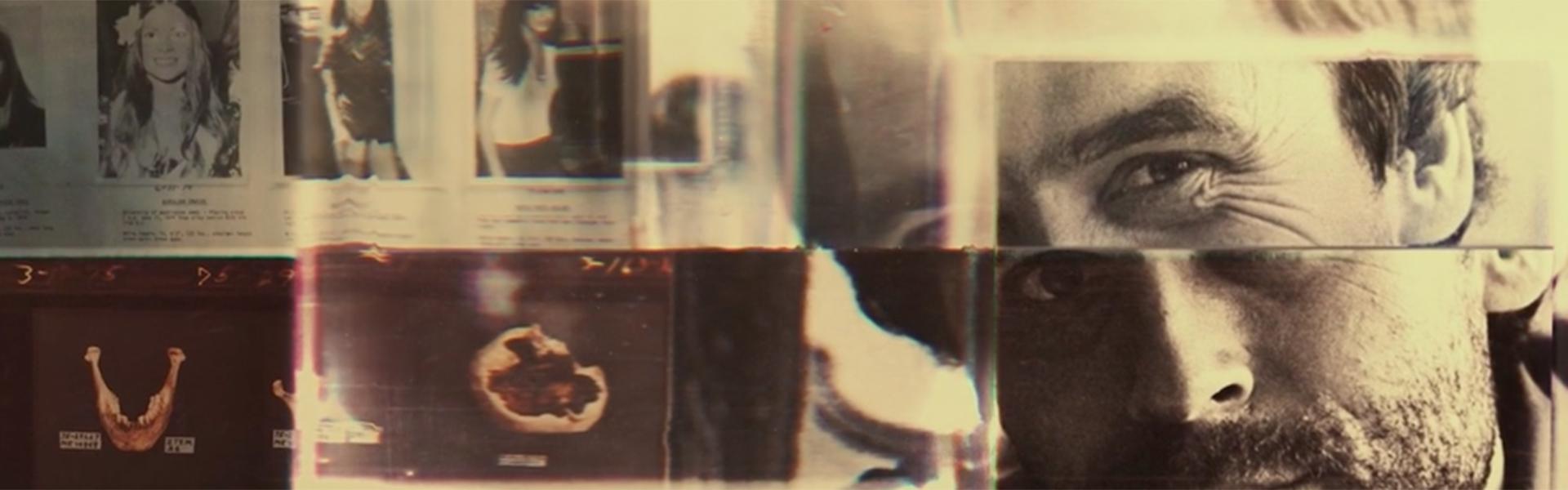
Netflix’s Conversations with a Killer: The Ted Bundy Tapes
Developing the main titles for a dark, true crime docuseries proved to be no small feat for the creative team at Elastic.
“How do you tell the story of someone so horrible without making it look cool? It’s a moral dilemma in a lot of ways,” said Lisa Bolan, creative director at Elastic.
But the team, guided by director Joe Berlinger, dove head first into the project. They took everything into account—from Bundy’s tapes to his perspective of the world and women—when carefully selecting the titles’ imagery.
Early in the process, they played with the idea of using a collage of images related to Bundy’s narrative. Everything else eventually fell into place, like the use of a clear tape, distorted images and news headlines.
HBO’s The Inventor: Out for Blood in Silicon Valley
To depict Elizabeth Holmes’ obsession with revolutionizing blood testing, HBO Films tapped creative agency Elastic to create the bloodstained titles for The Inventor: Out for Blood in Silicon Valley.
With the show’s creators proposing contrasting elements to include in the titles, the process proved to be somewhat difficult at first.
“The challenge is to take all of this footage and make something great,” said Hazel Baird, creative director at Elastic.
In the end, the consistent revisions and changes were exactly what the team needed to “create [their] best work,” Baird said.
Tags: conference 2019 main titles