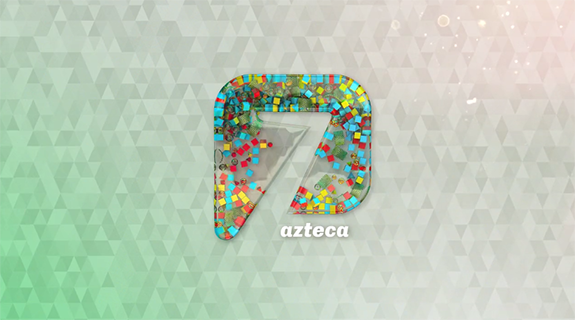
As part of Azteca 7’s brand refresh to capture young, contemporary Mexican families and highlight the network’s new focus on live programming, Argentine design studio Steinbranding uses clear, bold language to playfully incorporate the number “7” into marketing assets.
The renewal falls under Televisión Azteca’s umbrella campaign, La Nueva TV Azteca, which launched last year with new programming on its channels and a 2020 vision.
RELATED: TV Azteca México Renueva Su Imagen En Base A Su Fuerza Como Canal Nacional De Aire
Mexico’s TV Azteca Rebrands Around Strength of Free-to-Air TV
Owned by Grupo Salinas, Mexican media group TV Azteca operates two nationwide television networks in Mexico: Azteca 13, which targets families, and Azteca 7, which targets young, middle-to-high-income audiences, reaching respectively 97 and 95 percent of Mexico’s households. It also operates adn40, previously Proyecto 40, a channel offering general-interest programming.

Azteca 7’s rebrand aims to increase its penetration in the industry and reach a wider demographic.
“The client asked us to reposition Canal 7 both with the audience and with the sponsors,” says Guillermo Stein, president and CEO of Steinbranding.“The challenge at this stage was to include the new contemporary Mexican family in the products and graphics; this is a family that likes to be captivated by more direct and compelling content.”
There was also a need to keep the channel’s number, 7, and reinforce the idea of a new live programming schedule, “reflecting the network’s restless, youthful and bold personality,” he says.
With this in mind, Azteca 7 created a new slogan, less blah blah, which, according to Stein, helped position it as “a straightforward channel, which does not go around in circles. We expanded the idea of loading the brand with content, boosting the identity developed in recent years,” Stein says.
In the new image, the logo thrives on elements representing each program and the number 7 becomes the container of them all.
“The morphology of the logo defines the space,” says Stein. “The transparency allows this space to display the variety the channel offers its audience.” The work is designed around a graphic palette that, according to him, “is a daring proposal, positioning the channel ahead of its competitors.”
For example, in Enamorándonos (Falling in Love) — a show that connects contestants with viewers to find the perfect couple — the 7 appears in pink and red, conjuring Cupid’s arrows and the whisper of a kiss.
In Box Azteca (Aztec Boxing) — a program devoted to national and international boxing — several representative elements of a boxing ring fill the 7.
For the cooking show Cocineros mexicanos (Mexican Cooks), the channel’s logo is filled up with colorful food, such as sliced avocadoes and hot peppers.
In Más allá del chisme (Beyond Gossip) — a showbiz program — camera lenses and several keys of an old typewriter float within the 7.
In Entre correr y vivir (Between Running and Living) — a fictional series about legendary Mexican racing pilots the Rodriguez brothers, in which rivalry, envy and love collide — several action-oriented elements fill the number, including car wheels, Formula 1 helmets, traditional racing flags and sexy women’s heels.
The rebranding also included other series, such as the informative program Después de todo (After All) and Nada es lo que parece (Nothing is What it Seems), in which hostess Carolina Rocha tries to explain how emotions overwhelm humans.
Overall, Steinbranding achieved “a clear and direct identity” through which “the logo of the 7 reflects the range of programming, represented in icons and objects,” says Stein.
The rebrand, he says, turns Azteca 7 into “a channel open to new experiences, with a current language that sets trends.”
Version español: El refresco de marca de Azteca 7 se centra en las familias mexicanas modernas
Tags:
































__twocolumncontent.jpg)
