


__twocolumncontent.jpg)


Over more than 40 years of operation, BET has evolved from a single television channel to a global media powerhouse whose brand universe extends from BET Her to the streaming platform BET Plus, to the recently launched BET Studios, a venture offering equity ownership for Black creators of premium content.
It all adds up to “the only brand that represents the fullness of the black experience,” said Kendrick Reid, BET’s senior vice president and executive creative director of brand strategy. Which meant that when it came time to rebrand the network last year, it was clear that “we needed a canvas as deep and dimensional, as expressive and ever-evolving as black culture itself.”
Moving forward with such a project required a radical re-envisioning by BET’s marketing team and their agency partner, Sibling Rivalry. It demanded nothing less than an upheaval, a frank and necessary bout of soul-searching as the two parties sought to answer one, urgently existential question: “Do we want an evolution,” said Reid, “or do we want a revolution?”
It probably goes without saying that BET chose the latter.
So, how does one revolutionize a network that has already been revolutionizing entertainment for more than 40 years? From the BET Awards to Rap City, ComicView, American Soul, and beyond, BET has helped usher Black music, fashion, comedy, and politics to their deserved position at the pinnacle of American culture. How do you upend a force of nature that has already upended culture itself?
The answer sprang – as great design solutions often do – from the simplest of concepts.
“I wanted it to be a system, not a thing,” said Joe Wright, cofounder and chief creative officer of Sibling Rivalry. “I had an idea of a modular system where things could be swapped out. I wanted that system to start from somewhere very simple, which was a black square.
“Because what’s a black square?” Wright continued. “It’s a black canvas.
You know an idea has wings “when you can’t stop thinking of iterations on the idea,” Wright said. “You see the evolution of the idea unfolding in front of you. That’s always such a good sign for any kind of creative concept.”
A blank canvas, black or otherwise, is by definition an opening to endless possibility. As the branding framework for BET, it became “the idea of Black expression in all its forms,” Wright said. “We loved the idea of just putting the spotlight on black talent, black stories, and creators. The canvas can be whatever you want it to be. It can be a place to see and be seen, to hear and be heard. It offers up an almost spotlight kind of place where you can add as much or as little to it as you want to. It becomes a kind of holder, a container for the network. It can be minimal, it can be expressive, it can be angry, it can be loud, it can be quiet.”
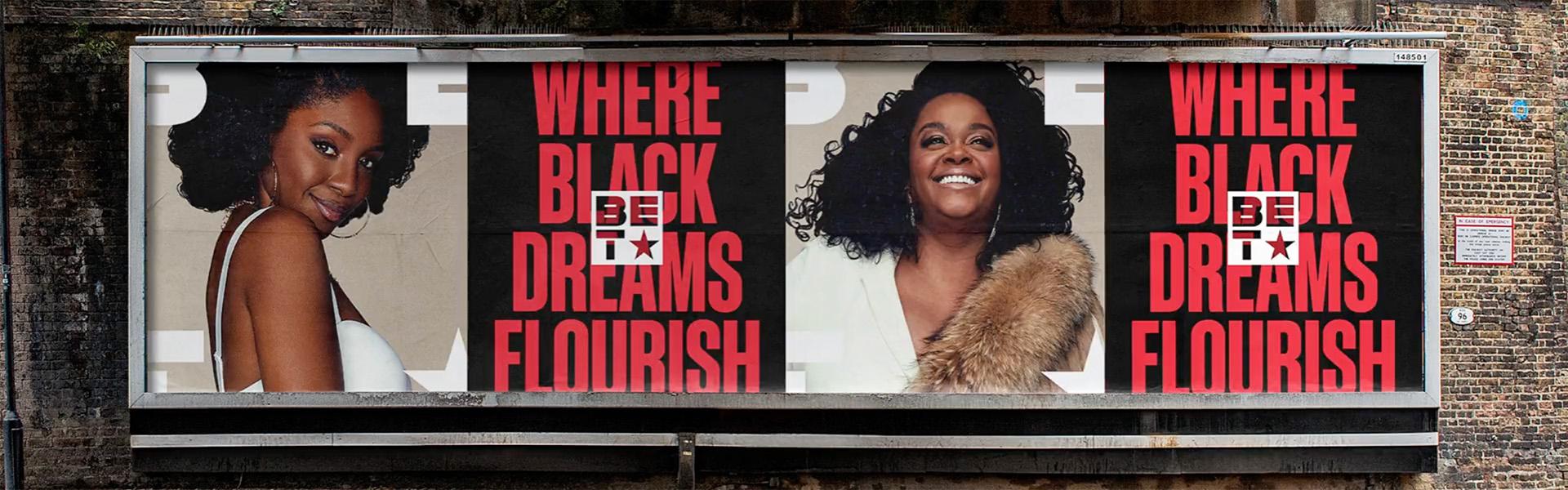
The Black canvas system begins and ends with the new BET logo, the neutral state for the brand’s identity across all its platforms and brands in the eco system. The new mark is one of the more dramatic upheavals of a familiar brand symbol in recent memory. To execute their vision, Sibling Rivalry tore the logo down to the studs and rebuilt it from the ground up, stacking its components on top of each other like blocks. The resulting arrangement places the “T” in the network’s name under the “BE”, breaking the viewer’s visual continuity in a radical way that really does feel, well, revolutionary.
“‘You broke the logo!” Wright laughed, summing up BET executives’ reactions upon first seeing the new mark.
“It definitely was like, ‘whoa,’ in the beginning for some of the senior leadership,” Reid said. “But eventually our president, Scott Mills, said, ‘You know, you didn’t destroy the logo. You actually liberated it.’”
And indeed, though the logo has been boxed into a seemingly rigid square, within those confines lies endless possibility. The familiar BET star – a staple of the brand since its beginning – remains, but now serves as a kind of placeholder where the network can “give all its sub-brands their moment in the spotlight,” Wright said.
In practice, that means the star gets replaced by a different icon for BET Her, BET Jams, BET Soul, BET+, or BET Studios.
“The brand is growing very rapidly,” Wright said, “and what’s nice is, if they add new divisions to the brand, you can easily add an update to the system.”
Black History Month, for instance, could have its own special icon replacing the star for that month – though a month-long duration is an arbitrary figure. The star can be easily switched out for a matter of weeks, days, or hours without missing a beat.
“What we created was this unbelievably modern, dynamic, flexible system that enables all aspects of the brand to feel united but individual at the same time,” Wright said.
None of BET’s past logo treatments feel dated – if anything their design quirks have a retro charm that feels hipper than ever. But at the very least, due in no small part to the star that has trailed the logo wherever it’s gone, “the BET logo has always been very bold,” Wright said. “We wanted to create something that felt similarly bold, strong, and proud. To bring a sense of love, joy, pride, and all of those inherent tent poles of the brand.”
Compared to the previous BET logo, Sibling Rivalry’s new rendition “couldn’t be more different,” Wright said, “yet it still has all the elements that the old logo had. It’s still got the star, it’s still very bold. It’s still got the inherent character of the existing brand, but it feels completely different at the same time.”
The logo’s extreme adaptability was crucial in re-envisioning a brand that fully represents the only media enterprise that represents the fullness of the Black experience. It modernizes BET, chiseling its power and relevance onto hard-cornered digital stone while simultaneously providing endless wiggle room to “come at future growth with a unified brand,” Reid said.
Perhaps the best part about the Black canvas concept is that it doesn’t just open up creative expression on BET, it opens up creative expression everywhere. The brand’s new hero tagline, “Where Black Culture Lives,” signifies an era of programming that goes “beyond entertainment to create opportunities for the community to create their own blank canvas,” Kendrick said. “It’s this idea of giving the brand over to our community, our audience, our viewers. It allows them to reinterpret the canvas and then present it in a light that is important to them.”
To help launch the rebrand, BET recruited 12 artists in eight US cities to put their own personal spin on its core assets and taglines. Their work resulted in BET Black Canvas (#BETBlackCanvas), a series of a dozen stunningly unique mural treatments that let BET meet people right where they were.
“We realized we can’t be about uplifting and celebrating and advancing Black love, joy, power, and pride if people don’t feel it,” Reid said.
And the mural project, “Wright added, is “only the beginning of taking it into communities, taking it to people, getting it off the screen, getting it away from the awards and the high-profile showcase element that the brand is very known for. We want to let people interact with the brand a lot more, go a little more grassroots with it.”
This organic integration with the physical world helps strengthen BET’s role as a place “where Black dreams flourish,” Wright continued, “Black canvas could be expression on any level. It could be an expression of the talent on BET. It could be an expression of musicians on awards shows, or through film or through music. It could be expression of the audience, expression of the viewer. The idea of the canvas is meant to encompass everybody.”
Tags: bet rebrand sibling rivalry