


__twocolumncontent.jpg)


As Warner Bros. looks toward its centennial anniversary in 2023, the entertainment studio unveiled a refreshed logo and brand identity, led by design firm Pentagram, to take them into the modern era.
“As they approach their 100th anniversary, they didn’t want to be a 100-year-old company,” NY-based Pentagram partner Emily Oberman told Daily Brief. “They want to be a company with 100 years of legacy while looking 100 years in the future.”
To start, Pentagram and Warner Bros. leadership “did a deep dive on the company’s wide set values and mission statement,” said Dee Dee Myers, EVP, worldwide corporate communications and public affairs for Warner Bros.
“Warner Bros. never had a specific ‘North Star’ for the entire company to say, ‘This is what we stand for. Here are our pillars, values, mission and position,’” Oberman said.
But after 140 interviews with employees at every level of Warner Bros., the new brand identity was summed up in six words: “We believe in the power of story.”
“…This really was kind of the emotional core of everyone we spoke to…they get up in the morning and come to work because they want to find a way to tell the best stories, whether it’s long form, short form, TV or games. It’s more about the story than it is anything else,” Oberman said.
This brand platform, described as the “rallying cry,” became the central theme as Pentagram assessed the old blue and gold logo (above), which hadn’t been updated since 1993. Not only did it feel “dated,” but it became difficult to use on digital platforms, Myers says.
After more research, however, both teams realized they couldn’t do away with the company’s famed shield shape.
“From the research that we did, and also from the emotional power of the shield itself, there was no way that this shield was going to go away….It would feel inauthentic to the company to suddenly have a whole new identity,” Oberman said.
“We realized that we could make it more modern without sacrificing the instantly recognizable equity that’s in the brand and what it stands for inside and outside the company,” Myers said.
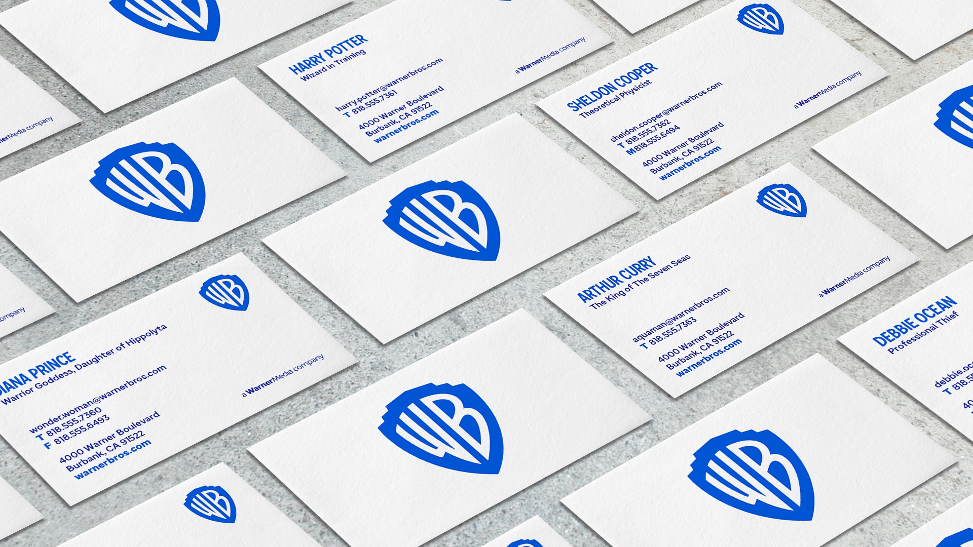
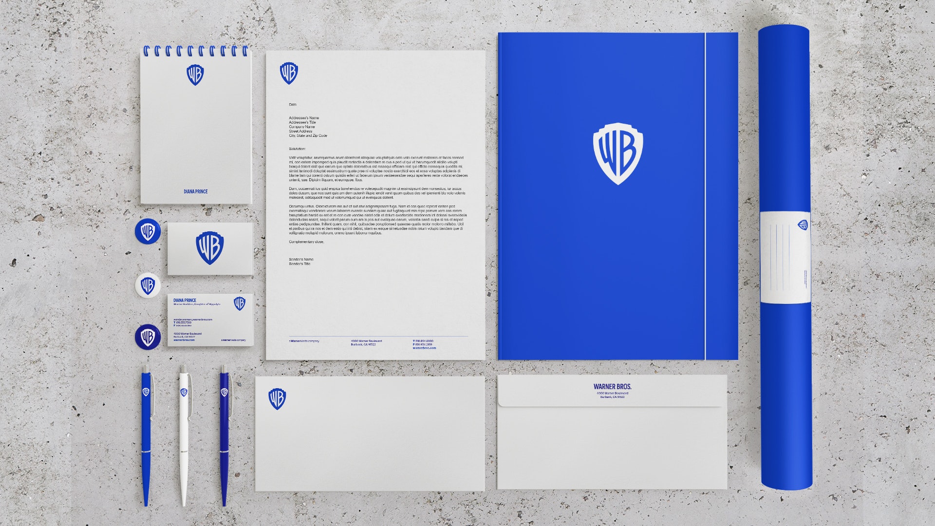
Instead, Pentagram focused on simplifying the iconic logo. The redesign switches the logo to white and a brightened blue, dropping the previously dominant gold. It also loses its sash while flattening and elongating the “WB” letters using the golden ratio.
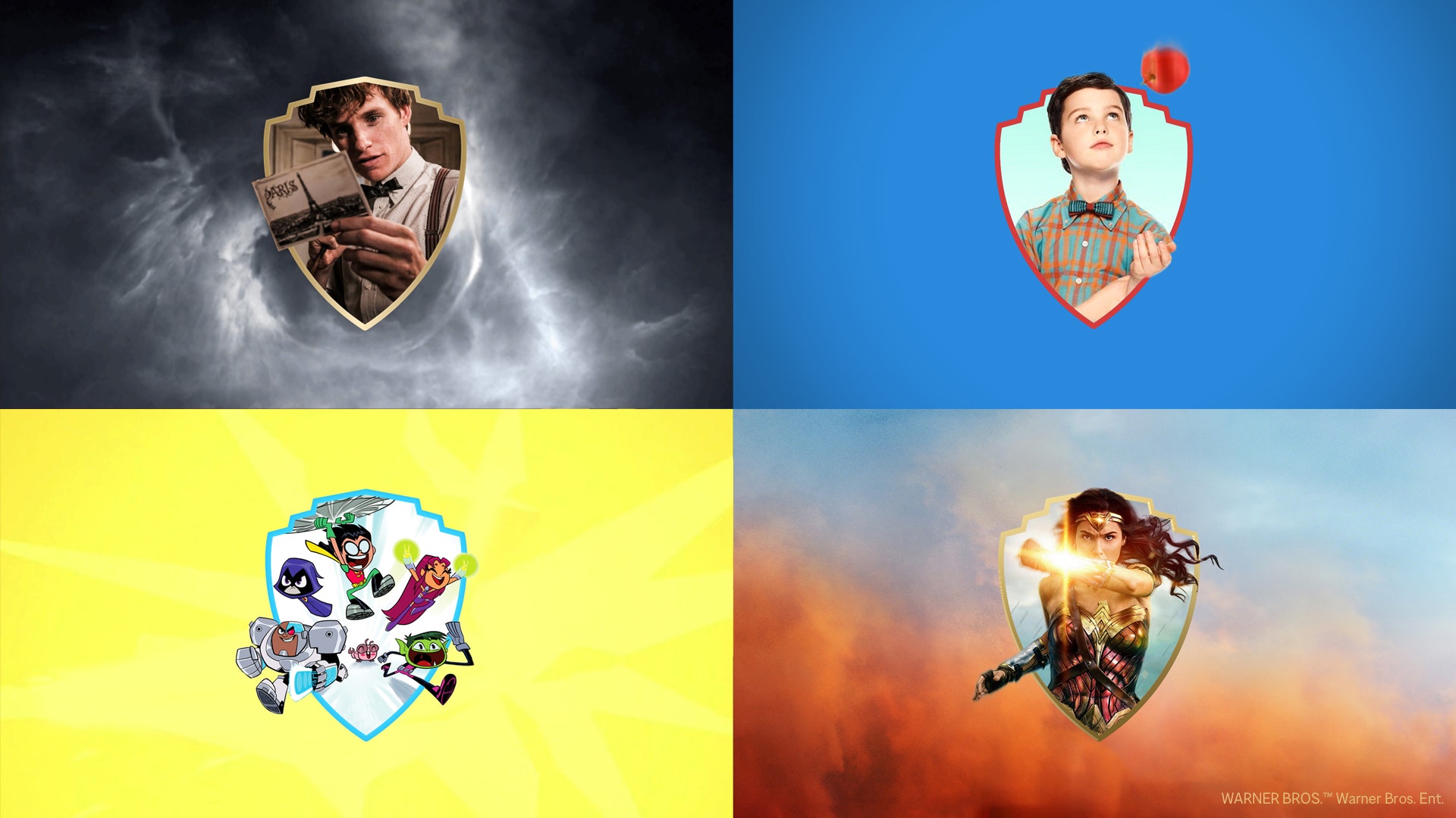
Pentagram also created a dimensional version to use onscreen for opening and closing credits. A third version, on the other hand, acts as a “window” for Warner Bros. to put titles such as Harry Potter, the Dark Knight trilogy, and Friends “more consumer-facing than they had been,” Oberman said.
“One of the things we’ve learned is that we don’t always get credit,” Myers said. “…This was a way to connect our IP to our brand. Plus, it just looks really cool when you see young Sheldon or Batman coming out of the shield. It’s like, ‘Oh yeah, that’s Warner Bros.’”
The redesign also includes Warner Bros.’ first typeface, Warner Bros. Condensed Bold, which allows for brand cohesion across all platforms and divisions.
“By creating the typeface, we’ve also created a system for them so that each division can have its own lock up, be prominent, be recognizable, and not feel somehow less important,” Oberman said.
After more than three years in development, the identity was officially unveiled to staff in a ceremony on Wednesday, Nov. 13. The new shield logo will be implemented onto screens in early 2020, however, Warner Bros. will slowly roll everything else out over time.
“It’s going to be everywhere,” Myers said. “It really is a process and as things move forward, it’s about figuring out what works best for the company.”
[Photos and videos courtesy of Pentagram]
Tags: pentagram warner bros.