


__twocolumncontent.jpg)


With its tale of an obsessive 20-something trying to find her missing friend, season one of TBS’ Search Party offered a tantalizing combination of murder mystery, arch comedy and quirky character study that defied easy description. But its key art also was instructive, as good marketing tends to be: a series of vivid, soft-lit, book cover-esque posters that expertly communicated that this show, at its core, was a playful contemporary riff on the Nancy Drew mysteries of the ‘30s and ‘40s.
RELATED: Paranoid Takes Hold When ‘Search Party’ Returns
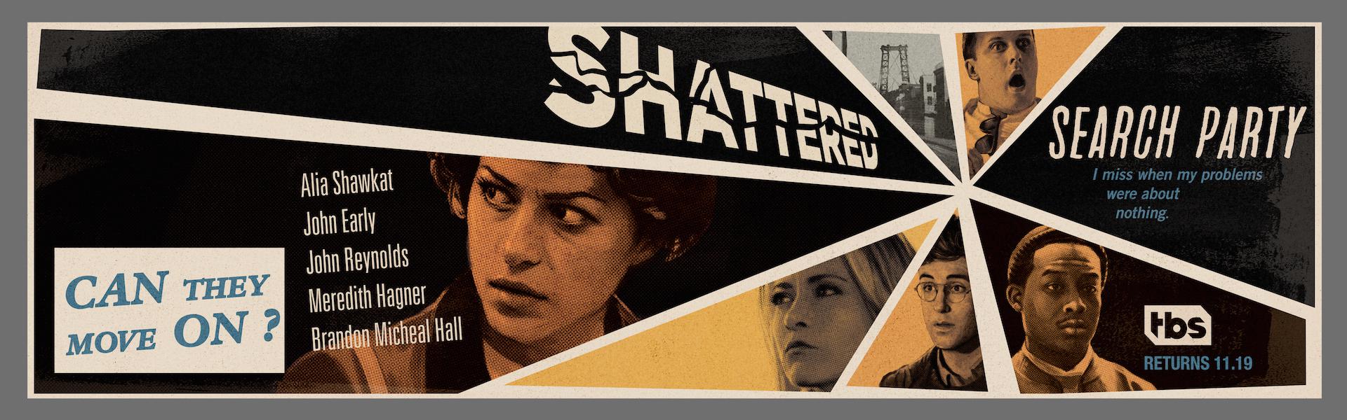
But if the first season of Search Party was a twist on a classic detective concept featuring a group of friends who got in over their heads, then season two, which premieres on November 19, “is about Dory, Drew, Eliot and Portia searching for themselves, living with the consequences of their actions from season one,” said Bret Havey, SVP brand creative director for TBS and TNT, and Kathryn Allen, VP, broadcast design at TBS and TNT, in a joint email.
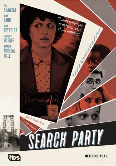
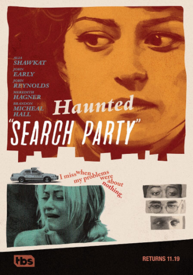
TBS’ recently launched season-two key art reflects Search Party’s fall from innocence with a 10-piece collection of posters that have evolved tonally from the first season’s shimmering mid-20th-century idealism to reflect the harder-edged, skewed paranoia that would define later suspense films of the ‘50s and ‘60s – a style pioneered by, of course, Alfred Hitchcock.
“If season one was about solving a mystery,” added Havey and Allen, then season two is more psychological thriller and what better way to represent that than a collection of art work inspired by the work of Hitchcock, the master of psychological thrillers?”
To nail the look, TBS’ marketing team once again collaborated with Sam Hadley, an England-based illustrator whose impeccable painting ability was behind the Nancy Drew vibe of Season 1. This time around, TBS also brought on motion design and live-action production company TBIK, which has a “keen eye for striking typography and design,” said Havey and Allen.
Researching classic films such as Vertigo and Psycho, Hadley found that movie posters from the Hitchcockian era were prints of master copies that were “literally cut-out collages,” he said, “and the type was put down physically as pieces of paper or print, so things were a little bit higgledy-piggledy.”
Of course, we’ve come a long way from crafting major entertainment marketing materials with actual cut-and-paste, but working with the digital version of such elements was still tricky in its own right. “That random feel was hard to do,” said Thomas Bik, executive creative director and designer for TBIK. “The imperfections were a hard thing to try and pin down.”
Though influenced by the stark design ethos of innovators such as Saul Bass, the Search Party posters are actually abundantly detailed. Each one is a singular piece with its own layout brimming with a rich cache of fonts, colors and imagery.
“They used lots of different typefaces back then that all sort of complimented each other,” said Jonathan Ouellette, creative director and designer for TBIK. “It might be a block-slab serif or an italic serif mixed with a really simple san serif and it was just all over the place. You should have seen the font guide that we had to put together for TBS. It took me two days, going through every single typeface that we used, what it’s used in, what weight, here is the link to where you can buy it, etc. It was quite a process.”
Additionally, even though all of the posters “have that retro feel, they all have different color palettes,” Ouellette said. “How do you make 10 pieces of art that all have completely different colors still feel like the same family?”
Hadley’s gift for retro illustration was a big help in that regard. His flair for realistically capturing show photography with digital painting tied together the disparate posters with a style as sophisticated as it is vibrant.
“As far as techniques go, it’s kind of the same as painting on a canvas with a palette but on-screen in Photoshop, much the same way as they would have back in the ‘60s,” Hadley said. “It’s more painterly. You can see brush strokes. On a small screen they look more realistic, [but] when they’re printed up large you would see they’re actually quite loosely painted, which is how they would have been painted in the era. It’s actually quite a pleasure to try and get the likeness but keep it quite free with the brushstrokes, and it gives them a bit of energy.”
Painting digitally also has the advantage, Hadley added, “that you can change the colors after you’ve painted it, so it’s possible to fiddle with things and if you feel like something doesn’t match with other things, you can tone it down or change the color slightly.”
Once the state-of-the-art techniques had been implanted to create vintage-looking posters, the vintage-looking posters were tweaked further to become state-of-the-art animations. TBIK essentially made the key art into a living thing, transforming the posters into an array of intentionally rickety animations for on-air and online usage.
“Once we had all of these really fun key-art pieces we got to then take them and make them move,” Ouellette said. “We really spent a lot of time looking at how things moved back then because they weren’t doing it on a computer, so how do you recreate that? How do you fake frame rates? It was a fun exercise. We spend a lot of time animating stuff that’s very slick and smooth with very fine movements. “It was fun to break out of that and just kind of go crazy and not worry when things are a little bit off.”
Havey and Allen also had a great time working on this project, and the collective joy factor of all involved is palpable in the assets.
“Overall, it was a lot of fun to work with both artists on this show, to develop a look you don’t often see in today’s world,” they wrote. “It harkens back to a pivotal time, marking the emergence of minimalist graphic design that we have all grown to know and love.”
Tags: