


__twocolumncontent.jpg)


In the cutthroat world of main title design, Imaginary Forces, the creative studio behind the iconic opening to Mad Men, has remained successful for more than two decades. Indeed, after winning the 2015 Emmy for Outstanding Main Title Design for WGN’s Manhattan and last year emblazoning an open to Netflix’s Stranger Things that will probably outlive our collective memory of the show itself, the company may be more relevant than ever. What’s the secret?
“What has made us successful as title designers,” says Alan Williams, creative director for Imaginary Forces, “is just understanding the function of main titles, which is to make people want to watch the show. Not lead people back to my Vimeo page or to give me more followers from my little crowd of designers, but to make whoever it is who is watching that show want to continue watching.”
That’s one of those deceptively simple statements that seem like they could go without saying but are actually profound philosophical truisms that would benefit us all if only we could apply them. Williams is espousing the importance of setting aside the ego in order to immerse oneself in the needs of the project. It’s an endeavor much more difficult to execute than creative brilliance or technical wizardry because it involves exercising a hard-to-find human trait that lies counter to both: humility.
“There is a temptation a lot of times, with not just title design but any form of visual communication, to look at what is trending in that moment, whether it’s a particular software or a plugin or whatever it may be, and to let that be the driving factor behind the concept and the visuals,” Williams says. “At Imaginary Forces we’ve always tried to let design and story drive the visuals that we do and not what is trending and available and right in front of us. To really look outside the box.”
There is “brand empathy” involved with really “looking at what a showrunner has been working on” and “trying to understand what that show is,” Williams says. There is a “humbleness” in “stepping away from what we may think is cool or what feels comfortable to our aesthetic and to really break down what exactly the essence of show is. What makes this show this show?”
He calls this movement away from the self “method branding”: The act of ensuring that “every single step is through the eyes and the vision of that showrunner and the essence of that brand.” Once you’ve researched and figured out that essence, only then can you “repackage it and rearrange it in a way that makes people see it as though for the first time,” Williams says. Only then can you abstract the world of the show in that imitable way that distills its vastness down to a :45 or :90 title sequence.
Before he even starts thinking about the stunning visuals that will appear in the end product, Williams undergoes an extensive period of simply immersing himself in the project and people that he’s working with.
“I can’t emphasize enough the importance of really understanding and researching what it is that you’re going to be abstracting,” he says, “and listening constantly to the vision of the showrunners and the producers and what they see that the show is supposed to be.”
To line his memory banks with deep pockets of rich creative ore, Williams applies a curator’s mentality to everything he encounters.
“I’m a huge proponent of just observing and collecting,” he says. “When people ask me where our ideas come from I always say, ‘they don’t come from nowhere.’ Everything comes from somewhere else. If you don’t develop a lifestyle of collecting and curating, when the time comes to find a creative solution, you’re at the mercy of what’s in your memory.”
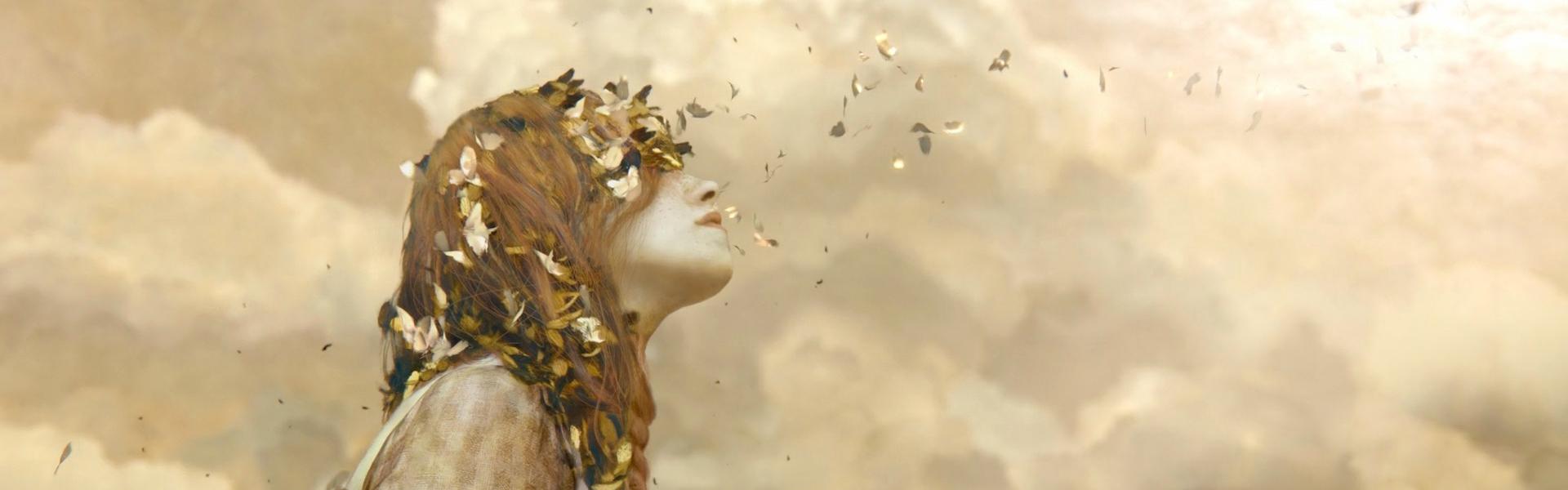
The main titles for Netflix’s recently launched Anne with an “E”, which Williams directed, show what can happen at his intersection of preparation and humility. Because the show is centered on a hugely realized protagonist and her ability to see the natural world, Williams found that “I couldn’t abstract anything that felt synthetic,” which meant he had to step away from familiar tools like Cinema 4D, where he felt most confident.
From there, observing and collecting led Williams to the website of Brad Kunkle, an artist who incorporates gold and silver leaves into enormous paintings, making them look changed depending on where one is standing in the room because of how the light strikes them.
“Looking outside the typical digital artists and resources in NYC, we wanted to find this very gestural, hand-painted, canvas look to speak to the humanity of this character,” he says.
The results speak for themselves.
RELATED: Imaginary Forces Picture-Perfect Main Titles for ‘Anne’
Anne with an “E” saw Williams finding an unexpected pathway to a look one might expect for that show – one grounded in earthy, organic textures. But the act of stepping out of your comfort zone can also yield the opposite: an expected pathway to unexpected results. Imaginary Forces’ main titles for Starz’ 2014 drama Black Sails, for instance, is all computer graphics, and yet the content of the open could never have been predicted.
Looking to eschew the goofier brand of buccaneer promulgated by Disney’s Pirates of the Caribbean, “Starz wanted people to see something different when they saw the show, something more historical,” Williams said. “That forced to us to figure out how we could take the core of what this show is and make people see pirates in a new way.”
Looking at the architecture of the day “with the pristine churches and cathedrals and these very baroque environments,” Williams said that the team at Imaginary Forces started to wonder what might happen if it inserted “pirates and the prostitutes and the underbelly of this society into that same aesthetic.”
When Daily Brief wrote about the Black Sails titles at the time, it called out their attention to detail and exquisite CGI craftsmanship. In retrospect, those elements still linger, but it’s their innovative concept that stand out. Why would you ever want to waste a perfectly good pirate saga intro by mashing it up with early-18th-century Versailles-style opulence? Because you might just get something that haunts your dreams:
RELATED: Sinking Into the Thrilling Title Sequence of Starz’ ‘Black Sails’
Twenty years in, demand for Imaginary Forces’ title design is greater than ever before, the industry changing in response to its work as the company’s process has remained resolute.
“I don’t think the way we’ve approached titles has evolved,” Williams says. “Marketing has evolved. Because we tried to make good titles, people in marketing have understood the value of that, so their marketing has changed, with titles being released before the show even comes out and behind-the-scenes content getting released in celebration of the sequence itself. We’ll just continue to try, five years from now or 50 years from now, to make visuals that make people feel something.”
Tags: