


__twocolumncontent.jpg)


Ever since the very first commercial films more than a century ago, main titles were a way to brand and market a film. Today, they remain a vital piece of prologue for a TV series, movie or video game, but they’re also an entry point to a show or network’s aesthetic and branding.
In Thursday’s session, “100 Years of Title Sequence Design” at The Conference 2014, Ian Albinson, founder and editor-in-chief of Art of the Title, laid out a timeline of title design starting at film’s conception, highlighting influential designers, studios and movies that have changed the industry along the way. Below is a look, decade by decade, at some of the biggest hits from 1900-2014:
1900-1920
At the birth of film, a main title sequence was a legal obligation by the studio to tell (very simply) the title of film, actors, director and other production and crew information.
“It’s taken on many forms, grown in complexity, but its core purpose has stayed the same,” said Albinson.
Along with the main credits were “intertitles,” which contained information needed to understand the rest of the film: introductions for people, scenes, some dialogue (still in the era of silent film). Design techniques were heavily borrowed from print, relying on hand-drawn lettering, a familiar format that audiences knew and could be easily understood. These were created almost entirely in-house at the studio’s art department until 1919 when one of the first title design companies launched.
1930s
With the advent of sound came some changes in design. “Citizen Kane” and “King Kong” were among the first where the titles were no longer limited to being packed into the beginning of the film – they began to become a slow segue into the film itself. Hand lettering was still popular, but main titles began to incorporate dissolves, situational typography (where a name would be placed on a sign, for example) or integrate a moving scene in the background. This is also the decade where filmmakers began to use main titles a few minutes into the film instead of directly at the beginning, which continued to seamlessly integrate the film with its titles.
1940s
“At this point, Hollywood was booming,” according to Albinson. Weekly theater attendance was around 60 percent (compared to 10 percent today) and studios wanted to focus on branding their products as part of the global phenomenon.
“This is done through marketing, advertising, and through the film’s titles,” he said. Because of the prevailing studio system, this was an affordable feat, often using rustic typefaces (westerns), bold, shadowed type (film noir, B movies) or literary backgrounds for the more mysterious plots. In such a saturated marketplace, these design aesthetics could set films apart, especially with their new rival: TV.
1950s
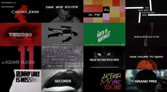
The ‘50s could be considered the birth of modern title design, according to Albinson. With artists like Saul Bass, there was a new focus on design as the studio system continued its decline, which allowed for more creative freedom for directors to hire outside of the closed-off Hollywood base. Bass, who Albinson says might be the world’s most recognized title designer, began his career with films such as “Carmen Jones” and “The Man With The Golden Arm.” His 40-year career went on to include some of Hollywood’s greatest filmmakers – Martin Scorsese, Stanley Kubrick, Alfred Hitchcock, to name a few. He was among the first to use the main title sequence as a true part of the overall film, and known for his combination of live action and animation.
The Title Design of Saul Bass from Ian Albinson on Vimeo.
1960s
This was the Bond era, which ultimately changed title design in movies. Maurice Binder created the open for “Dr. No,” a huge box office hit for Bond. “He set the graphic style for the rest of the Bond films” through today, initiating the iconic gun barrel, for example. Robert Brownjohn built on this tradition for the main titles for “From Russia with Love” and “Goldfinger,” where the origin of projection mapping on the human form can be found. Artist Pablo Ferro also came on the scene during this time, “a darling of madison avenue by the 1960s,” said Albinson. He created work for “Dr. Strangelove,” “The Thomas Crown Affair” and Steve McQueen’s “Bullitt.” “These redefined the medium and shaped a new era of graphic design before we hit the ‘70s,” he said.
Pablo Ferro: A Career Retrospective from Art of the Title on Vimeo.
1970s
With the ‘70s came a new wave, gritty look to film that made its way to those film’s title sequences. And the independent film movement meant more B movies and future famous filmmakers working on a budget – Coppola, Scorsese, Lucas, for example, who didn’t see main titles as a general budget concern, “so the role of the title sequence was reduced to its most basic ingredients,” said Albinson. We also saw more realistic programming on TV influence their titles as well as throwback titles, which referenced the greats of the ‘50s and ‘60s. New companies also began to spring up that focused on technology for design. Richard Greenberg and his brother, Robert, of R/Greenberg Associates took advantage of this, expanding on existing typography design techniques for more complex results.
R/Greenberg Associates: A Film Title Retrospective from Art of the Title on Vimeo.
1980s
This was when main titles began to incorporate more detail. As Greenberg was starting a computer-assisted design revolution, the film industry saw a blockbuster revolution – big-budget films like “Star Wars” kicked off a marketing domino effect, where branding and title design became priority for Hollywood films going forward.
1990s
“With changing technology, there was a paradigm shift in how feature films are produced,” said Albinson. Designer Kyle Cooper, who began his career in the late ‘80s at R/Greenberg Associates, continued through the 1990s and “reintroduced the power of main titles for movie goers.” Films like “Se7en,” “Mimic,” “Donnie Brasco,” “Gattaca” and “Mission Impossible” marked the new era of title design.
2000s
As production value went up and up, the higher standards of film made its way to TV, with more affordable technology and audience demand creating a more competitive industry in main title design. Premium channels like HBO began to commission work that rivaled the film business, and at this point, video games began to embrace title design for marketing purposes, “reaching beyond demographics to get a more cinematic sensibility,” Albinson said.
2010-Now
“With the small screen revolution and beyond,” according to Albinson, there is a new focus on the statement and technique of titles, rather than the technology needed to produce them. “Titles have become a brand experience,” in every sense.
Tags: