


__twocolumncontent.jpg)


“The Bridge” premieres on FX in one week, and before it has even aired, it’s turning heads.
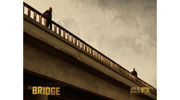
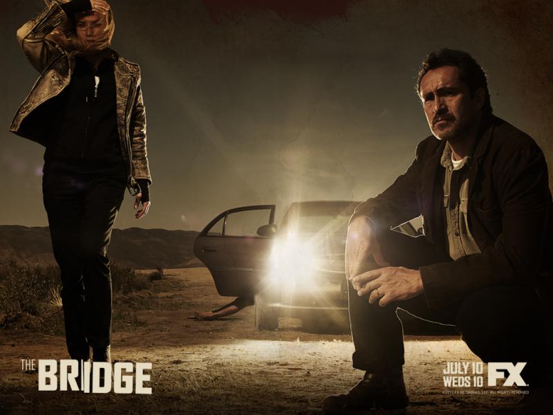
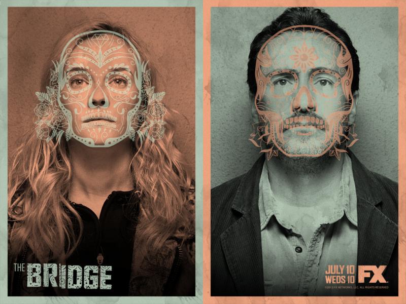
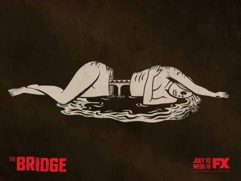
FX’s new drama/thriller about tension at the US/Mexico border has had some dark and unnerving promos, like the one below, and has added stark key art to really worked in its favor, proving that 20 seconds can say a lot, and print will never be dead.
The teaser spot above, “Crossroads,” was one of the first things to hit the air for “The Bridge.” It’s short, spooky and without the marketing message at the end, only lasts 11 seconds. The show’s YouTube page started filling with like-minded teasers, all dark or lacking in color, and all made to watch more than once. Another spot is below.
With the curiosity factor alone, FX knew it had drawn people in with these short spots. The network released more than 10 of these similar one-word-titled spots over two months, and formulated its key art to draw the same reaction from “The Bridge” fans.
Image like the one above are used as the show’s simple, stark and curious print ads in a wide media buy. They also lack in vibrant color, and they definitely make one take a second look. These images as well as the one below have done a solid job in the curiosity play, and stay with FX’s strategy to pull the viewer in with stark images and a nod to southwestern art.
Tags: