


__twocolumncontent.jpg)


Working with NYC-based Thornberg & Forester, NBCUniversal’s E! has pivoted its brand from keeper of all things pop culture to fan of all things pop culture, reorienting itself as a more inclusive, authentic and welcoming destination.
“We’re honored to launch the latest generation of the E! brand,” said Scott Matz, owner and executive creative director, Thornberg & Forester, in a statement. “Trends come and go, but pop culture continues to evolve, and E! is at the epicenter. Now is the time to share the lens with celebrities and tastemakers, inviting viewers to feel like part of the E! family. It was crucial to design a system that celebrates vibrance, diversity and inclusion.”
With celebrities able to use social media to stay more connected to fans than ever, E!’s role in the pop-culture ecosystem has evolved. The network used to consider itself a gatekeeper – letting fans know what was hot and not and chasing down trends. Now E! Is focusing on amplifying voices, creating an inviting destination and opening up to new voices and new perspectives.
To convey this shift to consumers, the brand came to T&F with a strategy deck and positioning statement, looking to bring new life to the brand while leaving the E! logo untouched. Over several months, the teams worked together on strategy, development, design and production.
To lay the groundwork, T&F sharpened E!’s brand proposition, basing it on five core principles: Be a BFF, Be Open, Be Fluent, Be Current and Nostalgic (at the same time), and Be a Fan First.
After building a mood board that helped develop the brand ethos and look, the teams determined that the new brand should cover a fan’s journey from red carpet to recliner, from going out for a night on the town to staying in and watching favorite rom-coms with friends.
To establish those two tones, T&F started by establishing the fonts. For all top-level messaging, E! Is pairing two fonts: serif Moret, for a classic look, or sans-serif Muller Narrow, for a more modern approach.

Hybrid and Muller were chosen as the workhorse messaging fonts for informational text, including body copy, tune-in, and lower thirds.
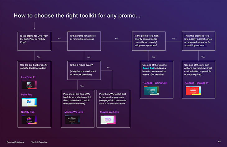
As T&F designed the master brand system, the production team developed sub-packages to accommodate any, and every, promo. With E! content including original series, movies, and red-carpet events, a generic package was also developed in two flavors – “going out” and “staying in” – to promote these different types of programming. With several sub-package toolkits to select from, T&F crafted a “how to choose” schematic to ensure every E! promo is properly generated.
‘Going Out’ spot
‘Staying In’ spot
E! Original Series spot
Being able to adapt all of the assets to any platform was a priority throughout the process, with T&F devising a toolkit to accommodate that need.
“As always, T&F delivered an especially user-friendly toolkit—one that flexes as necessary to accommodate a bespoke aesthetic for unique IP while otherwise remaining true to the master brand,” said Rob Edmond, creative director, NBCU TV & Streaming in a statement. “By clearly baking both the rules and the ways in which we can break those rules into the style guide, T&F set our designers up for repeat success across all platforms.”
T&F also emphasized amplifying diverse voices throughout the brand package. The team constructed an ecosystem of motion-graphics elements rooted in the E! logo, using familiar but bold brand colors and clean typography.
“From the earliest discussions about goals and intentions, through building mood boards and shaping ideas, all the way to design iterations and execution, the T&F team operated like an extension of our internal E! creative department rather than a separate group,” said Jonah Birns, creative director, NBCU TV & Streaming, also in a statement. “Our work together was cohesive and collaborative, T&F took sometimes difficult feedback in stride and was able to help us pivot through the approval process on a lengthy assignment.”
Tags: e rebrand thornberg and forester