


__twocolumncontent.jpg)


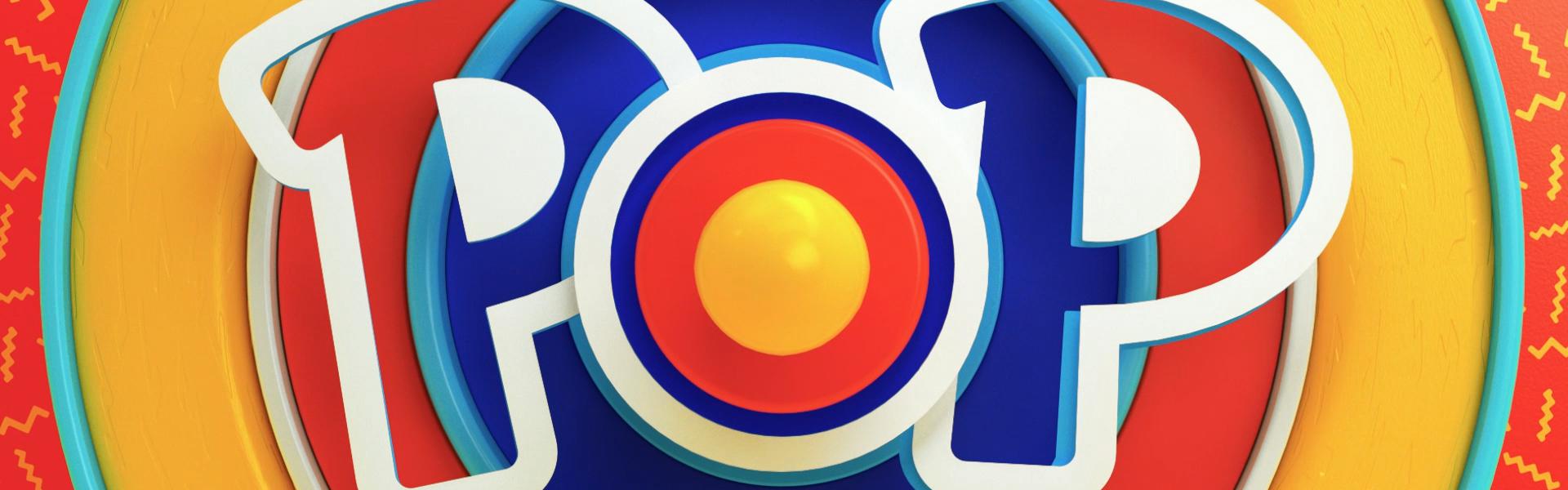
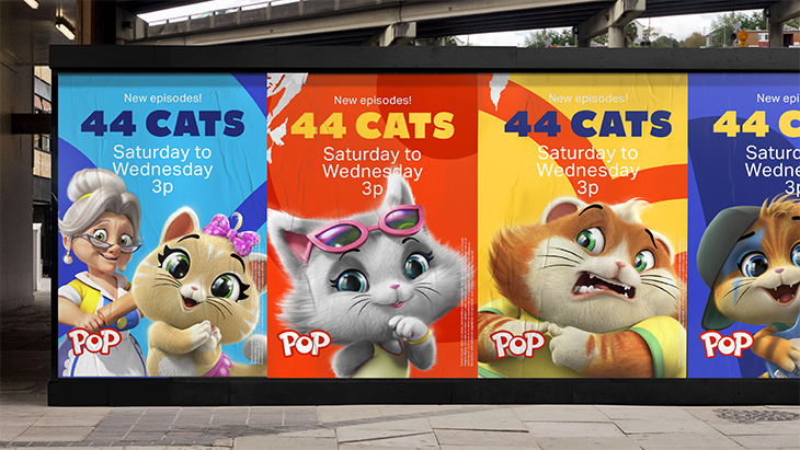
Buenos Aires-based design agency Superestudio has refreshed the UK’s leading kids’ commercial channel brand, Pop, using bold graphics, bright colors and lots of familiar faces.
The channel, which is home to some of the country’s biggest kids’ shows, leads the market for boys and girls aged six to ten. The refresh therefore had to leave space for content and well-known titles, while giving fresh life to the channel brand itself.
“Putting the logo at the center of this brand refresh meant we could work with and strengthen an already well-recognized brand element,” said Executive Creative Director Ezequiel Rormoser. “We used the logo as the gateway to everything good that happens on the channel. And then we added more ‘pop’ to bring everything to life.”
“Key to creating a stand-out refresh was taking a bold position when it came to personality and tone of voice. The brand is designed to feel fun but also to have a cheekiness to the on-air energy,” said Fabio Ardemagni, director, creative centre UK for Pop.
RELATED: Creative Review: Superestudio
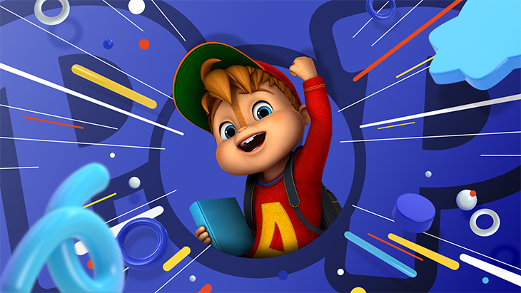
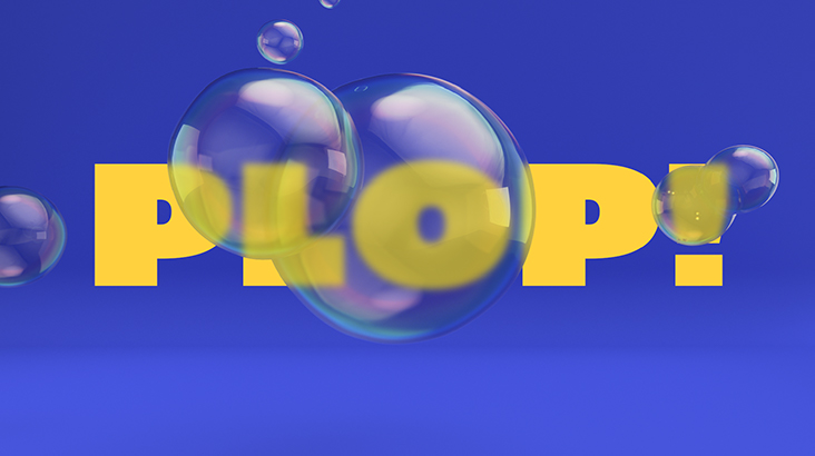
In addition to using type and animation to support the brand’s energetic personality, the design team played with onomatopoeia to bring an added level of fun and impact to the graphics. Reproducing the sounds of the words visually gave an exuberance to the overall brand feel.
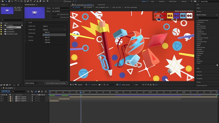
The kids 6-10 target audience is notoriously hard to reach by TV, so it was important to provide elements that would not get tired and that could be regularly updated to add freshness. Due to this, the team at Superestudio developed a massive icon library— that can be changed through a very user-friendly After Effects toolkit—for the brand to be regularly updated into many different variants within the structure of the brand guidelines.

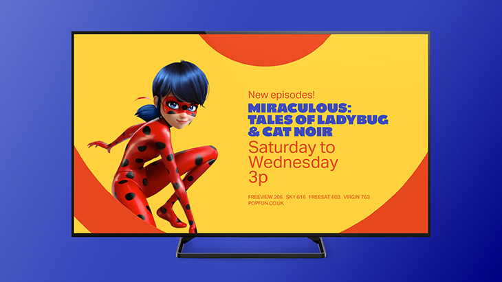
It was also essential that the refreshed branding worked across all the different platforms on which the channel is featured. Creating a Pop universe wherever the audience chose to turn up was kept front of mind during the process of designing for the website, Pop Fun, Pop Player, all social media channels and print.


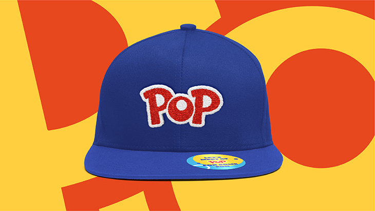
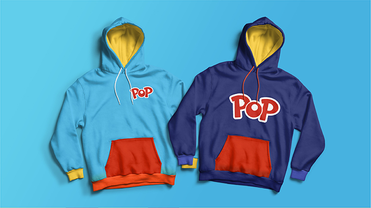
Merchandising was the final piece in this refresh puzzle where Superestudio created Pop apparel—including hats and hoodies—for every occasion.

For more on Superestudio’s brand refresh of kids’ network Pop, visit Superestudio’s website.
Tags: brand refresh pop superestudio