


__twocolumncontent.jpg)


Since its inception in 2002, Buenos Aires animation and design company Superestudio has, in its experimental work, relished opportunities to mix live-action with motion graphics. But it “hasn’t had too many opportunities to develop [those elements] in commercial work,” said Ezequiel Rormoser, Superestudio’s creative and executive director. But this year, after revisiting a pitch for Nat Geo it first made in 2011, Superestudio got the chance to create a series of evocative, surreally beautiful IDs that also happened to be “almost 100% live action.”
With motion graphics dominating most promo design work nowadays, Nat Geo sought a more elemental feel in the new IDs, something that would “unite emotion with the physical world,” said Mariano Barreiro, branding director at Fox International Channels, and Florencia Picco, VP of branding and creative at Fox International Channels, who spoke with Brief in tandem over email. Working with Superestudio, Nat Geo wanted to “combine the literal with something poignant and expressive,” they continued, “to ignite the senses, to evoke emotion, and inspire experimentation.”
To that end, Superestudio’s four ensuing IDs use raw materials to create the warm, tactile feel of physical environments, while also employing different filming techniques to create a dreamy, abstract quality. Even the Nat Geo logo itself is an acrylic model that was filmed in live-action, as opposed to being inserted during post-production. “We wanted the real logo interacting with real things,” said Rormoser. “The main purpose was to make the brand feel real.” (A fifth ID, featuring balls dropping over a painted version of the logo on the ground, was in fact created with motion graphics due to the difficulty of the camera movements involved.)
In one of the IDs, which plays off Nat Geo’s space programming, the network’s logo was suspended in front of a backdrop resembling a dark sky. With the camera rolling, two crewmembers hurled thick, blue and pink powder (imported from India) across the small expanse while two more crewmembers rained down different kinds of balls from above, including marbles, translucent rubber balls and even edible cake pearls. Each take took approximately 1.5 seconds, but was shot with a Phantom camera, recording at 1,000 frames-per-second. When slowed down and played back, the different sized balls and powder seem to hover in the air, creating layers of multi-textured debris that very much resemble the planets, rocks, and strange tricks of light that might be found in some distant corner of the universe.
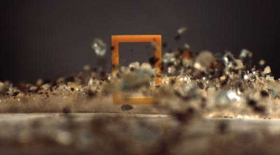
In another of the IDs, one drawing from Nat Geo’s adventure-themed programming, Superestudio brought in materials that were almost entirely edible, including caramels, coffee grounds, flour and honey. After scattering these materials across a flexible plastic sheet, crewmembers shook the surface to make them jump into the air. The resulting Phantom footage, when run in reverse, created a lifting effect, as though rocks and dirt and other earthy substances were rising up and around the Nat Geo logo, its power calling the spirit of the elements.
Of the four IDs, Rormoser said the most technically tricky was the one based on Nat Geo’s programming that delves into subcultures. Again using earthy materials, the ID plays almost like a sequel to the Adventure ID, the risen particles now flying around the logo as though caught up in a hurricane. At a symbolic level, the clip seems to be blowing the viewer into a literal whirlwind of upcoming exciting programming. At the technical level, no wind was involved at all. Instead, Superestudio constructed a box that could be affixed to the Phantom and spun by crewmembers on the outside. With the logo locked into place inside the box, and joined by loose bits of glass and other particles, the structure was spun as the camera rolled. As the center of gravity shifts, the loose particles shift from one side of the box to the other, floating like magic across and around the logo.
By choosing not to rely on motion graphics, Superestudio discovered new ways to create special effects that feel warm and tactile on the screen, something computers have not yet found a way to emulate. For Barreiro and Picco, such bold experimentation is a “a strong and smart way to combine the literal with something poignant and expressive, which represents what Nat Geo is all about.” Though abstract and lushly beautiful, each of these new IDs also finds a way to remain “simple, real, pure [and] direct, while at the same time inspiring and beautiful,” they continued. “That is the National Geographic spirit of exploration.”
CREDITS
Emanuele Madeddu, VP, Creative & Consumer Marketing, National Geographic Channel International
Florencia Picco ,VP of Branding & Creative, Fox International Channels
Mariano Barreiro Branding Director, Fox International Channels
[Images courtesy of Superestudio]
Tags: