


__twocolumncontent.jpg)


Each letter in the word ‘norte’—Spanish for ‘north’ symbolizes a new way to approach entertainment marketing for Barcelona-based Norte Estudio. When founding the creative studio and production company, creative directors Txema Alguacil, Salva Borrego, David Fernández, Xavi Pablo and Marc Teixidó merged their own interests of live action, art direction, design, storytelling and technique, and chose the five-letter name Norte.
“We liked the connotations and values behind the word norte,” says Borrego. “The rest of the cardinal directions derive from the north; it is the path towards which everything drives.”
“It is the cardinal point of reference,” added Teixidó. “And, we wanted to break the trend of using English names.”
With that in mind, Norte’s logo places the N above the rest of the letters, just as north would read on a compass.
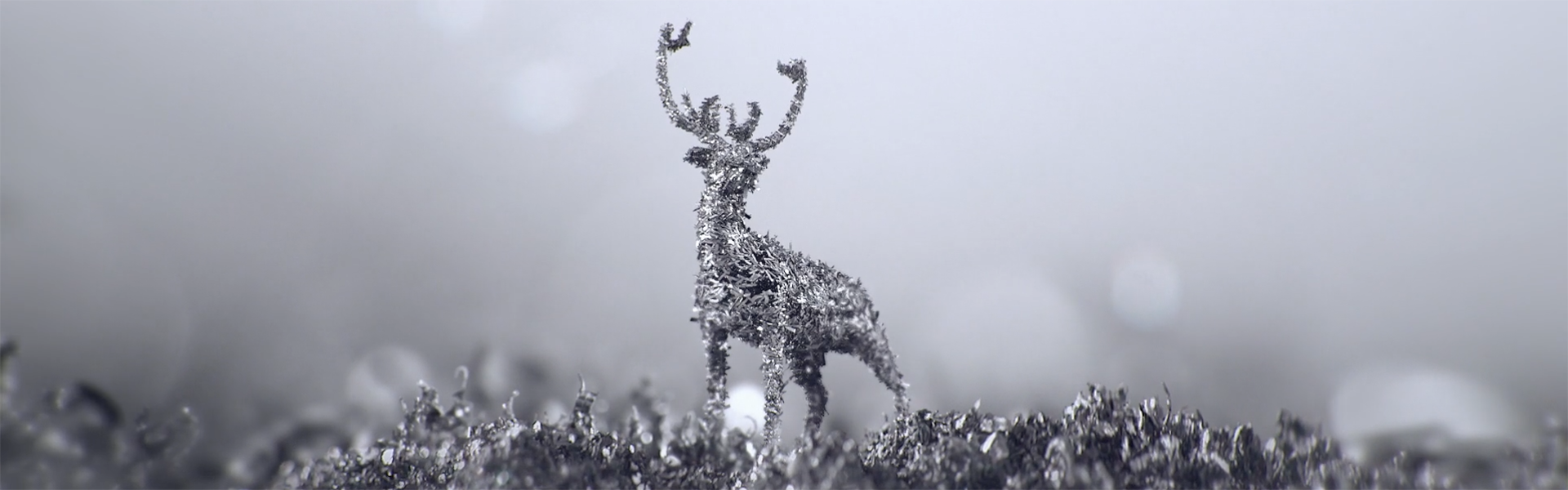
The five executives met while working as freelancers in the entertainment industry. With the goal of finding their own voices, three years ago they started their studio with a personal project, Ferro.
“With five different perspectives, it is not easy to find a unified voice because our minds are open on many fronts, but it ends up being much more positive,” says Alguacil.
The piece was based on research on magnets that was intended to evolve creatively into the studio’s corporate image, but ended up as a separate spot that showcases the studio.
“Ferro fits very well with the name of the studio and the search for a direction, given that we entered into the core [of the industry] without having a completely clear path,” says Pablo.
“We came up with interesting worlds, and from there we thought about creating a story without any literal explanation, so that you could extract your own idea,” says Fernández.
Finding its Direction
The studio’s first project was for The Basement, a multipurpose space in Barcelona. Through interactive stages, it demonstrated the adaptive capabilities of the place for different events.
“This project represents the path we chose to follow at the beginning, combining different techniques such as live action, which we wanted to dive into; post-production, which was our field of expertise; and art direction,” says Borrego.
Another of Norte’s significant projects was branding for Barcelona’s public TV channel Betevé. The studio won a joint pitch with studios Folch and Goroka.
“We wanted to renew an obsolete image that had not changed for 12 years. In an increasingly digital and multiplatform world, we needed a brand that was not ‘telecentric’ and that would serve any environment,” says Sergi Vicente, director at Betevé. “The winning project successfully interpreted it, suggesting a realistic adaptation of the media that did not require a lot of resources. It had to be ‘a manageable’ brand.”
“The matter of consuming the content via different devices, while maintaining the same identity, required a graphical cleaning-up,” says Alguacil, so Norte Estudio developed a style guide to address specific animation curves and other branding guidelines.
“We built the animation project based on digital navigation elements,” says Borrego.
“The new brand, and all of the ‘liquid identity’ elements, centered on a number of concepts: logo, typography, colors, image system. “We already liked it then, and we like it more and more now,” says Vicente.
As part of the rebrand, the channel’s name of BTV was changed, verbalizing the abbreviation to Betevé.
The studio also developed branding for Lògic, a cultural program at the same network, which features an artificial intelligence narrator. The work was jointly executed with Lavisual and Nil Ciuró—composer of Norte’s projects.
“We played with the idea of imagining that this artificial intelligence being were to learn human behavior from visual content. The branding is the result of disconnected images that the AI deciphers,” says Borrego.
The pieces portray a universe that is disturbing but attractive at the same time—in which the obscure relationships of shape, texture and color are illustrated via split screens.
The spots are inspired by recorded scientific experiments through which artificial intelligence can start to understand concepts related to nature and the evolution of humanity.
“We built an internal narrative for each image,” says Alguacil.
Another powerful TV branding project was the holiday campaign for Spain’s national channel laSexta, which Norte produced alongside creative studio Scpf. The brief asked for inflatable figures in the style of balloon artist Jeff Koons, but with a Christmas twist.
“We performed the entire character design, focusing first on the technical work to get the figures to inflate and then looking for textures reminiscent of Christmas ornaments,” says Teixidó.
“We were asked to introduce a classic nativity scene, but with a transgressive element,” says Fernández.
In line with this, the bumpers were accompanied by Christmas jingles in the style of trap music, and featured characters in unusual situations such as a muscular shepherd taking a selfie.
Norte also participated in the launch of Futuros (Futures), a debate program streamed on Facebook Live by Spanish banking group Banc Sabadell that speaks to the brand’s dialogue-focused communication strategy. The work was carried out with Scpf, with Norte undertaking the audiovisual portion.
“The simple line we had applied for Betevé pretty much fit the style of Banco Sabadell,” says Alguacil. “The concept design of the product resembled a TV brand.
Both Creative Studio and Production Company
A turning point for Norte was creating the branding for Sitges Next 2017, a festival dedicated to innovation in advertising communication. Norte was in charge of the production process and co-directed with creative agency Rosàs.
“The concept was based on the fact that we are all explorers of the future because we are all exploring the next second. From there, came the idea that time twists,” says Fernández.
The piece shows different moments in time in the same frame, evoking Stanley Kubrick’s 2001: A Space Odyssey.
As it grows, Norte seeks to promote its double role as a creative studio with the capacity to produce in-house—something that isn’t common in the Spanish market. An interesting example is Audio Invasión, a promotional campaign for an event sponsored by Audi Quattro, where the studio worked for advertising agency DDB.
For this project, the studio recreated ski slopes using stop-motion animation.
Another project that highlights this duel capability is The Blank Page, a brand manifesto for Spanish branding agency Morillas.
“We needed a partner that was not just a production company but also a creative agency,” says Agnès Mora, brand strategist at Morillas.
Norte based the creative for this project on a descriptive text that included attributes of Morillas, such as the courage to be a pioneer. The final piece represents the creative process, in which the challenge of creation is displayed as a labyrinth.
“We wanted to go back to the initial vigor of Morillas. It was a tribute to all those who faced the blank page before we did—not only its founder, Antonio Morillas, but the first graphic designers in Spain,” says Mora.
As it proceeds toward its future, Norte aims to continue reinforcing its ability to straddle creativity and production while looking toward developing new narratives.
Our dream,” says Pablo, “is to find the perfect hybrid between shooting and digital environments.”
Version español: El estudio español Norte forja una dirección creativa
Tags: creative review promaxeurope promaxeurope2019 promaxlatino promaxlatino2018