


__twocolumncontent.jpg)


Ecuador’s CNT Sports, a channel founded in 2017 focused on local soccer, turned to Argentine creative studio Steinbranding to develop the brand’s visual identity.
Featuring live and high-definition programming, CNT Sports was created to offer Ecuadorian viewers a 24-hour sports channel, said Enrique Arosemena Robles, former general manager at CNT and current country manager at Global News Group Ecuador. CNT Sports is owned by satellite TV company CNT TV, which in turn is owned by public telecommunications company CNT EP.
The project began in response to “the increasing demand of sports news and broadcasts in January and, particularly, of the National Football Championship,” Arosemena Robles says.
CNT entrusted Che Vera Producción Sólida with the creation and operation of the channel.
“In just two months, we were responsible for funneling all of the production, content, creativity and design efforts in the same direction, so that CNT Sports felt like an established and successful channel,” says Che Vera, director of the production company. “On top of that, its tone had to feel international and not just local.”
To develop that look and feel, the network called Argentine creative studio Steinbranding.
“The branding needed to be impressive; on par with standards of international quality,” says Arosemena Robles.
“The goal was for the channel to appear both friendly and serious,” adds Vera.

Inspired by Crests
When creating the logo, the studio was inspired by local and international soccer team crests.


“The crest needed to feel like it had a history, while [also] being modern,” says Vera. The idea was for the symbols representing the channel to have metal textures, so that our logo resembled a current version of an old coat of arms.”
Steinbranding chose the colors white, black and gray, with a touch of orange—almost gold—and cyan, which comes from CNT Sport’s parent brand CNT Play.
“This way, we could juxtapose the rest of the content, which was warm and colorful, for a very powerful launch,” says Guillermo Stein, Steinbranding CEO. “In addition, the colors black, gray and metal relate to power. They convey something hard and brutal, with mechanical strength.”
“There’s something about those materials that point to strength. We wanted it to be strong, impressive, and feel more masculine than feminine,” says Federico Reca, Steinbranding creative director.


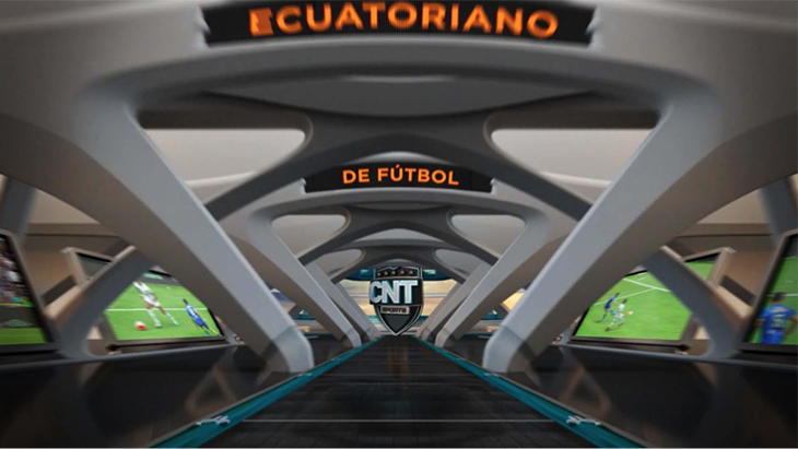
Each element in the crest is steeped in symbolism, and with a plate towards the front that incorporates names of programs and matches.
“This relates to [the concept of] a big screen,” says Stein. “It’s a crest with a huge monitor inside.”
The resulting graphics are composed of a system of interlocking 3D pieces.
“The crest includes a lot of information in its composition that later allows for each item to build upon itself: the ball, the stars, the jersey and the lines below. It is like taking the team’s jersey and displaying it in this space,” says Reca. “In sports, stars always represent something. In general, they stand for titles won, but in this case we wanted to represent the different regions that make up Ecuador.”
The entire promotional package is based on a hexagonal module, which originates from the shape of a soccer ball. The crest inspires the construction of a stage, expands into a stadium containing the flags of all the teams.


A Complete Package
Variations of that concept were applied to the graphics for the Ecuadorian Football Championship, as well as sports newscasts and opinion and debate shows, such as CNT Sports Noticias and En primer plano.
Steinbranding also designed technical elements such as the information screens, displays of the teams on the field, scorecards, the timer, and player changes and descriptions.
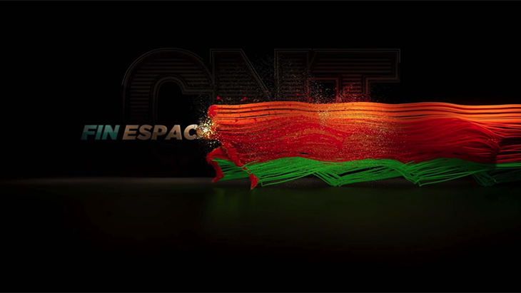
The package also included bumpers at the beginning and end of ads.
“We wanted a new artistic concept related to movement, for example, to the way a player sprints each time he wants to get somewhere on the field,” Stein says.
So, as the player runs, he lights up a logo in the background, leaving behind a multi-color trace.
“These are beautiful images, full of color, to announce the beginning and end of commercials,” he says.
An International Brand
The branding was established to drive awareness of Ecuadorian soccer, and to make it feel internationally relevant.
“Rather than portraying Ecuador at its roots, what’s presented here is international soccer,” says Reca.
In turn, Arosemena Robles says the look depicts “a modern channel, with cutting-edge technology and up-to-date information on local and international sports events.”
CNT Sports managed to exceed CNT EP’s expectations, not only in terms of visual quality, but also in terms of the number of new subscribers to CNT TV, says Vera.
“The quality of the programming, broadcast and graphics have met the goals for which they were created. We have succeeded in being serious while being friendly, and in being viewed as both mature and current. We are an accomplished brand.”
Version español: Los escudos de los equipos de fútbol inspiran la imagen de CNT Sports
Tags: