


__twocolumncontent.jpg)


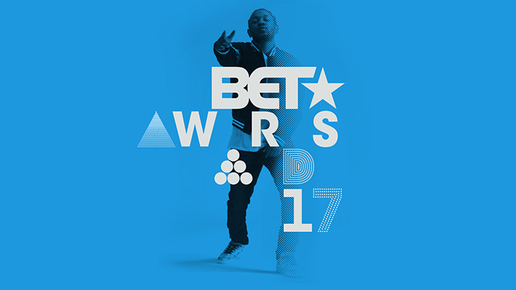
The BET Awards don’t just celebrate mass achievements in black entertainment—they celebrate with attitude. That’s something creative studio Sibling Rivalry made sure to capture in its extensive branding package for the 2017 event on June 25.
“The network has a bold voice, and whatever we did had to have that same sensibility to it,” said Sibling Rivalry Co-Founder and Director Joe Wright.
The agency used a halftone pattern that strikes a balance between tech and graphic design, establishing an aesthetic of vivid colors, unusual crops, and a typographic language to convey a contemporary, “street” feel that reflected the “no rules” internal tagline of the event.
Inspired by poster art, the flat, bright spectrum of pure magenta, cyan and yellow was also a nod to the CMYK color palette of the print world, and gave the imagery a fresh simplicity that allowed it to cut through the visual clutter and really pop on screens both at the live show, and on television.
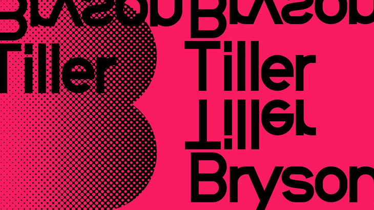
“Iconography was built with a precise circle pattern which allowed for mesmerizing motion that was both smooth and impactful,” Wright said. “The use of black and white and wavy animated type, combined with bright colors, felt as elegant as the stars attending the show.”
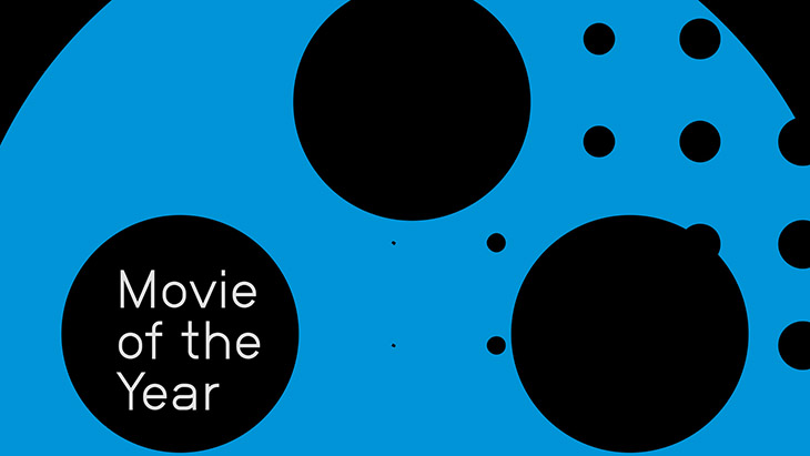
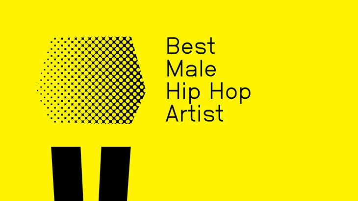
Sibling Rivalry also used a customized typeface to create three different alphabets that BET could mix and match when displaying logos, award categories and other graphical assets, all designed within an established rubric to keep the elements similar enough that the branding remained consistent and cohesive.
“The logo could potentially always be different; it made it feel like it was always changing, always moving,” Wright said.
The flexibility lent a more experimental approach to the event, said BET Design Director Josh Pelzek.
“It was fresh, irreverent and playful, and pushed the award show in a new direction,” he said. The branding helped “shake things up.”
“A large part of our brief was to communicate that the BET Awards was more than an awards show,” Wright said. “It was also a celebration of black culture, a night full of the best concert performances and a night everyone looks forward to and remembers.”
The creative partnership between Viacom-owned BET and Sibling Rivalry was “incredibly collaborative.”
Sibling Rivalry also created the branding package for the 2016 BET Awards, which paved the way for an even smoother process the second time around.
“The more you work with a brand, the more you understand a brand,” Wright said.
From a deliverable standpoint, the agency had a better understanding of how BET would use the elements they created. For instance, they had a designer in BET’s truck during the 2016 event for a first-hand look at the award show in action.
“We got to see behind the curtain a little,” he said.
Sibling Rivalry presented BET with six different concepts, and the network chose the one it did based on its boldness and versatility.
The package was also a quick turnaround that included a 3.5-week design phase followed by four weeks for execution. Wright was unphased by the speed of it.
“People have less time to change things,” he quipped. “You have to go with your gut.”
Tags: