


__twocolumncontent.jpg)


Telemundo’s new logo, font and refined color palette are designed to create stronger, more consistent presence across all its TV, digital and out-of-home platforms through a brand refresh by creative agency Red Bee.
The refresh builds on Red Bee’s previous work on Telemundo’s “Together Unstoppable” brand campaign that debuted in July during the 2018 FIFA World Cup. As a leading Spanish-language broadcaster in the U.S. known for Hispanic media and content, the campaign and refresh are part of a re-positioning meant to define the network’s direction for the future.
RELATED: Telemundo Unveils ‘Together Unstoppable’ During World Cup
“Our brand refresh complements how we are redefining Hispanic media and keeping pace with the evolving consumption habits of today’s Hispanics,” said Karen Barroeta, SVP, marketing and creative, Telemundo Networks, in a statement. “We set ourselves apart as the network that continues to defy norms and set a new standard in Hispanic entertainment with premium, original content across all platforms. Red Bee has captured all of that and more with this work.”
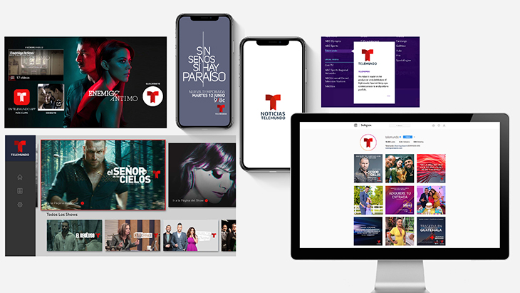
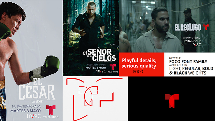
With a goal to continually drive attribution back to the masterbrand, following that launch Red Bee continued its dive into strategic new brand architecture and design system, shifting the network towards a model that aligns all sub-brands, genre brands and show logos under Telemundo’s “T” icon, and establishes a consistent logo position to lock into show titles.
“The Telemundo brand refresh set out to tackle some key issues and to position itself as a serious player in a competitive, changing media environment,” Charlie Mawer, executive creative director at Red Bee, said in a statement. “We wanted to ensure the genre-busting new shows from Telemundo were attributed back to their brand, so we focussed our efforts on developing a tightly-defined, clean brand identity that is consistently applied everywhere the brand is seen.”
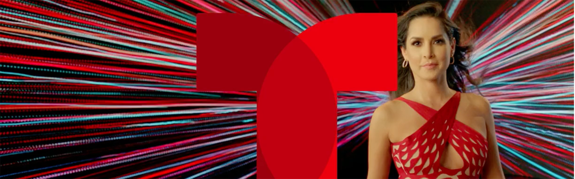
The agency was inspired by Telemundo’s original logo concept that shows “two worlds coming together,” reflecting its viewers’ shared American and Hispanic identities. And the simple, clean look of the updated logo is intended to work better in multiscreen environments.
The logotype also extends to a new brand font, Foco, and a refined color palette that plays up the brand’s heritage red.
And Red Bee created idents starring Telemundo talent designed to “burst with energy,” and embody Telemundo’s strong sense of movement and dynamism.
“Above all,” Mawer said, “every design element originates from the new brand position of an ‘unstoppable momentum.’”