


__twocolumncontent.jpg)


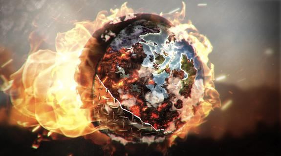
With just three years under its belt, Radley is a relatively young company among content and marketing studios. But that didn’t stop Discovery from bringing them in to handle its recent rebrand, an enormous undertaking that involved design, animation, sound and production for seven on-air 3D packages totaling more than 400 deliverables. With only eight weeks to design the core branding, Radley produced vibrant 3D graphics that dramatically transformed Discovery’s iconic globe into a living orb of energy, turning and churning through snakes, sharks, ice, flames, bullets and other elements that define the network’s adventurous identity.
Brief spoke with Antonio Cicarelli, Radley’s creative director of design, to learn how research changed Discovery’s branding approach, why network rebrands aren’t generally “explosive,” and the importance of being scared during the conceptual phase.
BRIEF: So, Radley’s graphics for this rebrand are really fun and propulsive. How did the concept for them develop?
ANTONIO CICARELLI: Discovery came to us with probably one of the best briefs that I’ve seen from a client. They were so well-prepared. They actually hired a consultant agency that helped them accumulate all this research on their audience and what they were finding is that [Discovery is] really a male-driven network. They wanted to own that and be realistic about their audience and who they are. They realized they wanted to focus on the globe and these elements that have been part of the brand for 25 years. So our conceptual process started there. Then, through 18 rounds of design, we developed seven packages that encompassed their programming and the essence of the brand.
You wound up creating seven graphics packages, each built around a different-themed globe. Talk about the elements you assigned to each globe.
Probably the one that is the most visible is the hero package, which is the traditional globe that’s been part of the brand for a long time. We basically revamped the globe and created a new one that has a much more 3D quality to it with these exaggerated puffy clouds that come out of it.
Then there is the ice package, the fire package and gold [package]. There was [a package] called Manmade with wood, nails, copper, tied into these shows like “Moonshiners” and “Amish Mafia,” so it had a more rustic feel. There was a water package to tie into a show like “Deadliest Catch,” and there was [one for] Shark Week, which was basically the same as the water package, but we had 3D sharks swimming all around it and chains and hooks and all kinds of stuff.
It’s pretty amazing you did all this in only eight weeks…
We would have loved to have longer, but it got going really fast. [Discovery SVP of Marketing] Lara Richardson flew out to LA, told us we had the job, and we were really excited. Then she said, “Come to Silver Spring next week and we’re going to have a meeting with the whole team.” So we went and it was the kickoff, and it got going super fast, almost at breakneck speed.
Radley Executive Creative Director Kurt Spenser was recently quoted as saying, “Our goal with this rebrand was to pursue ideas that were explosive… if the concept doesn’t scare and excite you immediately, you keep going until you spark those feelings.” What about this concept scared you?
Initially, we had this idea of what we wanted to create. It was sort of like, “We’re really excited about this, but I don’t know if they’re going to go for it.” On the client side, [Discovery was] very open to new ideas and letting us go with our instincts and create something new. I think what Kurt meant by “explosive” was, “Wow, you don’t always see that, especially in a brand.” In a custom package, you see the custom 3D and that kind of explosive feel, but in an entire network brand you don’t always see that.
Is that because across a network at large, they have to be safer/less “explosive” with their branding, or because the scope of a network just limits that opportunity to be explosive?
I think it’s both. It’s kind of a weird combination sometimes where you’ve got to have something that’s really usable and generic across the board, and then you have a lot of politics to deal with, a lot of people that have a creative say that wouldn’t normally have a creative say in, like, a promo. This [Discovery rebrand] went all the way to the president of the network. It extends to so many people that I think sometimes things can get watered down that way and in this case, it didn’t. It was really unique.
How has working on a project of this magnitude changed Radley?
It gave us confidence. To accomplish something like this is a pretty big feat for a three-year-old company. The blueprints are now in our pipeline for large rebrands, so going into the next one, we’re going to be a lot more confident in how we approach it.
Tags: