


__twocolumncontent.jpg)


The wait is over. Marvel’s most terrifying villain has invaded Netflix accounts everywhere.
Last month, Marvel and Netflix released their second Marvel series Jessica Jones, and chores and errands everywhere went unfinished over Thanksgiving while everyone binge-watched every episode. But one look at the promotional materials for this show and you immediately realize something is off. Jessica Jones does not look like a superhero production. For that matter, it doesn’t even look like a comic book.

Bold, three-dimensional type. Anodized steel. Chrome edges. Lens flares. These are the elements you expect to see when you see in the promotional materials for a Marvel property. While on the small screen these elements are represented to a lesser extent, the backlighting and lens flares – can’t stress the lens flares enough here, folks – are still at the forefront of the visual design.
While this approach carries a big-budget blockbuster production value, it does nothing to inform character or story. But that’s really okay. By now, people know what to expect from a Marvel movie: sweeping CG-enhanced set pieces, big explosions and tough, two-fisted action. If the plot of one movie is particularly edgy, the title may have a distressed feel to it, with some smoke and sparks added for effect, but beyond that none of the titles for their numerous film and television projects have stood out or differentiated themselves from one another.


Granted, when Daredevil premiered on Netflix earlier this year, the street-level hero fighting crime on his front door-stoop was handled with a bit more restraint. The steel rendered type treatment and lens flares were omitted in lieu of a grungy, unkempt, bloody knuckled approach. Even still, the promotional materials managed a bold, larger-than life heroic quality.

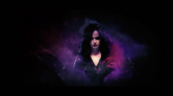
But what are we to make of Jessica Jones? Abstract watercolor portraits? Understated, sans serif type? Ink blobs? Collage? This looks like an art project. Why go in this direction? And why is everything purple?
The answer is David Mack.
Outside of the comic world, David Mack is a well-established artist in his own right, having published books on his own as well as collaborating with musicians such as Paul McCartney and Tori Amos. His medium is paint, but his style carries with it elements of mixed media and collage, rendered with a very raw and present quality. Looking at any of his pieces, you can’t help but feel that if you were to touch one, your hands would come away stained and wet.
In 2002, Mack did all 28 covers for Alias, the comic in which Jessica Jones first appeared. At one point, she was a costumed hero, fighting alongside the Avengers with a bubbly attitude and a smile on her face. Then some bad things happened to her, the aftermath of which left her physically beaten, emotionally broken and unable to carry on in the wearing the suit. All this happens before we meet Jones for the first time in Netflix’s series, and the first issue of the series has her trying to make her way through the world as a private detective operating out of Hell’s Kitchen.


The covers themselves rarely had much to do with the story inside. Rather, they served has haunting snapshots of the fragile and lonely state of Jones’ psyche. She is the subject of nearly all of them, often depicted in moments of quiet introspection, or alternatively caught with a distracted, far-away expression. Even in the cases where Jones is not directly the focus of the cover, her character is still the main subject. One such cover shows a pinboard of photos tacked to a wall, an obvious reference to her line of work as a private eye, but the photos are closeups of her face and the composition calls to mind the disruptive flashes of bad memories that pop into all of our heads from time to time.
Many of the covers are awash with purple, a reference to the man that is responsible for what happened to her. Independent of the book, these covers could stand alone as works of art. but taken together they contribute as much to Jones’ character as the story that follows them. Once that connection is understood, you begin to understand what Marvel and Netflix are doing in how they are promoting this show.
Because Jones’ story is a doozy. Her traumatic history has left her emotionally vulnerable, and she finds herself making bad decisions constantly. She always seems to believe the wrong people and as a result ends up in over her head. Every case she takes on seems to leave her with some feeling of regret about herself, her past or the world around her. Also, unlike other notable private investigators from pulps, her drinking problem isn’t nearly as charming. Were it not for the fact that she can throw a full-grown man through a wall and is damn near indestructible, she would probably be dead a couple of times over.
The first teaser released for Jessica Jones back in September placed the viewer squarely inside a Mack cover, moving from the clean, precise world of a camera lens interior to the violent, blurry, and booze-soaked world of Jones’ office and neighborhood. Purple floods the world around her silhouette and in a direct reference to a specific plot point in her story, we are told that “it is time the world knew her name.”
Subsequent teasers eased back a little, using the style only in artcards to establish setting, but just before the premiere, Netflix released its last bit of promotion of the series, and it is here where Marvel has gone full Mack, doubling down and diving straight into a darkly painted, noir world that hits all the right marks.
What makes this approach so commendable is that Netflix presents this level of detail despite Jones being a relatively obscure character in the Marvel Universe.
Studios often get skittish when trying to adapt characters that no one has heard of, and the temptation to make sweeping changes to the story in an effort to make the property more appealing to a wider audience is sometimes too great to ignore. While this is probably not the case here given Marvel’s “trust the source material” approach to its characters, they also have a well established template for how they promote their characters which they are ignoring in a big way. The fact they have recognized the impact of Mack’s work and seen fit to incorporate it into the show’s visual aesthetic shows a commitment to her character depth of understanding and that surprised even me.
Where Daredevil explored the rocky journey towards breaking into the world of costumed heroes, Jessica Jones explores the equally rocky journey involved in leaving that world behind. The cleverness of that juxtaposition is hard to ignore – and both Marvel and Netflix, the latter of whom seems to have taken on the task of showing the world just how spectacularly bad an idea trying to be a superhero is, should be rightly credited for it. I’m not certain whether Mack is involved with the promotion of the show, but that part hardly matters. Imitation is the most sincere form of flattery, and Marvel and Netflix’s heart is clearly in the right place here. I would not be surprised to see this style reflected in the show’s opening titles.
Nice Shoes’ Adrian Winter is a visual effects and motion graphics artist with more than 14 years of industry experience. From 2009 to 2013, he was the senior compositor and animator at Süperfad - New York. He’s worked at some of the leading motion graphics and post shops including Spontaneous, Imaginary Forces and Brickyard VFX. In addition, he also worked on-site for CBS at Super Bowls XLI and XLIV. Winter’s projects of note include ESPN’s X Games; an AICP, Clio and a Cannes winning spot for Durex; as well as Danny and the Wild Bunch, a short film blending live action and animation that’s made its way through many film festivals.
Tags: