The era of peak television is, by necessity, the era of peak television title sequences. On Wednesday at PromaxBDA: The Conference in Los Angeles, directors behind four memorable main titles from the past year delved into the process behind their compelling creations.
Anne with an E, Netflix / Title Design by Imaginary Forces
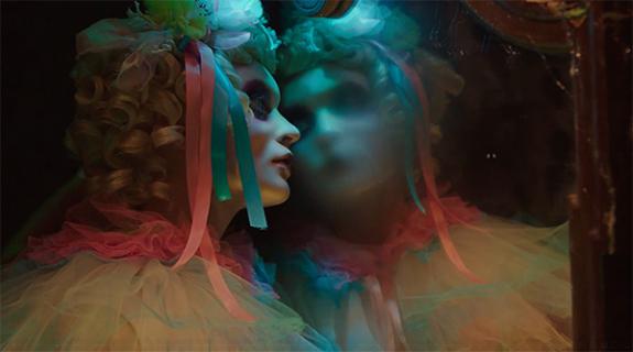
Discovering the Anne of Green Gables miniseries as a sheltered lad growing up in rural North Carolina, Imaginary Forces creative director Alan Williams fell for its heroine’s beguiling “balance of sensitivity and strength,” he said. Decades later, the opportunity came to create a show open for Netflix’s reimagining of the beloved story, and he jumped at it.
RELATED: HOT SPOT: Imaginary Forces Picture Perfect Main Titles for Netflix’s ‘Anne’
Working with the themes of nature and imagination, Williams sought to “distill those things to their most potent ingredients,” he said, embarking on a narrative through line from the chill and darkness of winter to warmer, lighter climes.
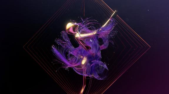
To “make it look like something you’ve never seen before,” Williams honed in on reflections of light in nature, the way “light emanates through a leaf – in camera it looks wondrous.”
Research on Pinterest led Williams to Brad Kunkle, an artist who incorporates gold and silver leaves into enormous paintings, making them look changed depending on where one is standing in the room because of how the light strikes them.
Incorporating Kunkle’s creations with images of animals, Anne herself, and branches inscribed with words from the books, Williams’ Imaginary Forces team crafted something unforgettable yet inextricably bound to the spirit of the show. The primary goal in title design, he said, is “something that will absolutely maximize the show. Fight the urge to go with what you’re comfortable with.”
A Series of Unfortunate Events, Netflix / Title Design by Stuart Bass
The depth and breadth of the stirring open to A Series of Unfortunate Events is especially impressive considering director Stuart Bass was simultaneously “cutting the whole series” as the show’s lead editor, he told the packed crowd.
In the book series that inspired the show, narrator Lemony Snicket tells the story of its brilliant, terribly unlucky children “from itinerant hotels 20 years later, trying to figure out how it happened,” Bass said, “looking through police files, old photos and artifacts.” Inspired by these narrative details, Bass incorporated them into his title sequence, crafting a backdrop of evidence walls in a room with a cool typewriter and other evocative props.
The goal was a “found footage feeling,” Bass said, which was “the exact opposite” of the show’s ornate sensibility founded on meticulously arranged frames and symmetrical compositions.
Bass was “working on fumes,” by project’s end. “How can you be creative getting three hours of sleep every night?” he wondered. “You somehow do it…”
Queen Sugar, OWN & Hulu / Title Design by Prologue Films
In conceptualizing the kaleidoscopic main titles for Queen Sugar, Lisa Bolan knew she needed to come up with something completely unique. “It’s a modern drama about a black family in rural Louisiana,” she told the crowd. “Not in New Orleans, not in the French Quarter. It’s like nothing else on TV.”
Bolan’s process led her to a concept she called “Meltdown,” which draws a line between the struggling family at the heart of the show and the sugarcane business at the heart of everything they do. Bolan wanted to depict the “process of making sugar” itself, from burning the crops to crushing them, boiling them, separating solids from syrup, putting the syrup in a centrifuge, and finally, drying it into the jewel-toned crystals that dominate the sequence.
Working with the cinematographer Alper Nakri, Bolan shot footage of sugar crystals from above and below, at a range of closeness that is almost microscopic, turning the tiny granules into gems on the screen. Parsing it into the title sequence, she took choice moments and flipped them in post, mirroring the reverse elements to create the kaleidoscope effect, aiming for “jewel-like compositions” that resembled broaches and other elegant memorabilia evoking family heirlooms.
“How do you abstract sugar and make it sexy and modern?” Bolan wondered. The question was rhetorical. The Queen Sugar show open is the clear and present answer.
The Good Fight, CBS / Title Design by Barnstorm VFX
The opening to CBS’ The Good Wife spinoff is somehow both intriguing and cathartic, as objects from a life of status and wealth explode in front of our eyes, one by one.
Brought in to the pitch process “kind of as an afterthought,” Barnstorm VFX owner Lawson Deming had very little time to craft a presentation. “I found myself in a situation where I couldn’t come up with any ideas,” he said, “so I let the show dictate what it wants its own sequence to be.”
What the show desired, it turned out, was a meditation on protagonist Diane Lockhart’s fall from the lap of luxury, and “the anger and violence of everything in your life falling apart,” Deming said.
To shoot the sequence, Deming had real-world objects built from glass and balsa wood, which were then wired with explosives and blown up on a soundstage. No cinematic camera was available that could shoot the footage at a slow enough speed to depict the explosions with any satisfaction, so Deming turned to a scientific research camera capable of shooting 1 million frames per second. Each slow-motion take “lasted three seconds during which 45 minutes worth of footage was recorded,” Deming said.
Heavy post-work was required to make the resulting images sufficiently elegant and beautiful, but the results speak for themselves, offering up a gorgeously chaotic kickstart to one of CBS’ most popular shows.
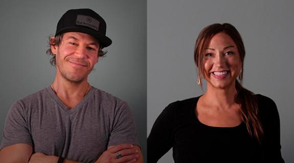
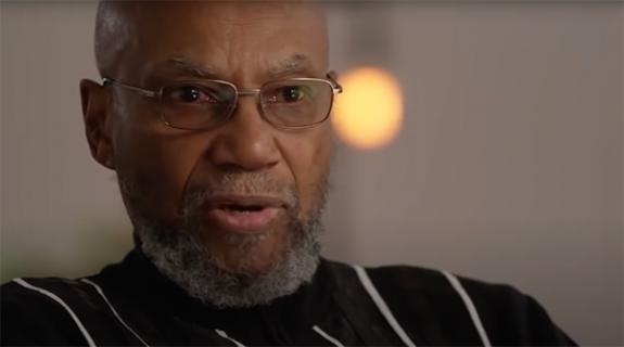
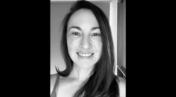
[Pictured: Lawson Deming, director of The Good Fight’s main title sequence; Image courtesy of ImageGroupLA]
Tags:

















__twocolumncontent.jpg)
