If content is the tile work making up the face of a network’s brand, then idents are part of the caulk that holds it all together. If of course that caulk was frequently beautiful, brilliantly creative, sometimes hilarious, and often inspiring.
With more TV channels than ever before, narrowing down the world’s great on-air packaging for a list like this is virtually possible. But we can at least safely say we loved the nine examples below, and that they held things together and then some.
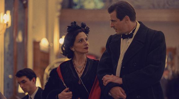
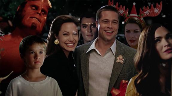
France’s Canal+ and London’s Studio Hansa teamed up for this delightful series of in-camera idents celebrating the premium pay channel’s 30-year anniversary. We couldn’t begin to tell you who any of the French celebs are who appear in them but it hardly matters – the sense of play and spontaneous creativity on display is mesmerizing no matter who’s involved. There’s also a staggering 40 of them.
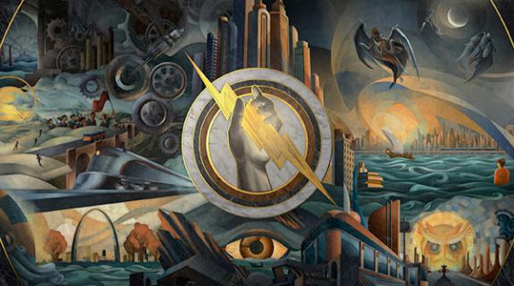
There’s something mesmerizing about watching the classic paintings in these Viasat History Idents come to life. The best ideas are the simplest and this is just a strong concept, executed with confidence and grace. It’s also something that could be repeated endlessly and never grow old.
These gorgeous, whimsical idents by Frame Copenhagen for Danish channel TV3 Puls show that the best 3D animation conjures a sense of real space, then populates it with tactile-feeling objects.
“It had to be contemporary and abstract but not alienating,” Frame told Brief in a jointly written email. “It had to be simple and elegant but not primitive or naive. It had to be bright and welcoming but not without impact. It was a female-biased channel but not in the stereotypical [sense] with pink fluff, bling or glows. It was for a city girl and the occasional male. And the main color was teal.”
We are a suckers for a well-used logo, and these idents by Interbrand and Sixty40 have a lot of fun with Sky Movies, New Zealand’s subscription movie network. Breaking the squarish “M” into triangles, the spots then animate famous movie scenes in the same rigidly geometric style, turning the three-sided shapes into the stars of the show. It’s great fun to watch.
Film4
Speaking of outstanding logo work, these idents by ManvsMachine for Britain’s free-to-air movie destination Film4 are another great pairing of a graphical signature with cinematic moments. Here the moments express feelings more than they do famous scenes, as the Film4 logo finds its way into the middle of movie-worth backdrops and the cameras roll… literally.
UKTV Gold
London agency DixonBaxi has always had a way with texture and we love the different sensations on display in these idents for UKTV Gold, which were part of a comprehensive rebrand for the comedy network. Whether squishy, pokey, crunchy or fuzzy, each little moment on display is beautifully captured and wonderfully silly.
TLC IDs
And more outstanding logo manipulations as Superestudio and Discovery Latin America transform TLC’s to embark on daily adventures around the world. Lovely little object collages transform into other object collages so fluidly and with such style, it appears effortless, which can only mean it must have taken tremendous work to pull off.
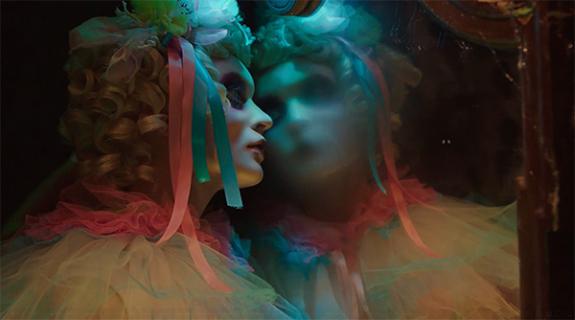
A+E’s Crime & Investigation Network found an eerie warmth in its chilly subject matter with a rebrand exemplified by a series of idents by South African creative agency Monarch. Through soft lighting, poetic storytelling and macro photographic quality, the spots have a dreamy effect, each one telling a little crime story of its own that hooks you in without ever giving any answers.
Tags:






















__twocolumncontent.jpg)

