


__twocolumncontent.jpg)


What better portal into a child’s unique world than a playground?
That’s the concept grounding the swirling, spherical IDs creative agency Adolescent developed to capture the energy of Universal Kids as it rebranded from Sprout in September.
“A key focus was how the logo could be more expressive, fun, playful, and overall have more personality,” said Man-Wai Cheung, CEO and creative director at Adolescent.
He, along with Adolescent Vice President and Creative Director Mina Muto, experimented with drawings and from Universal Kids’ existing logo to develop animations meant to capture the excitement of a young audience.
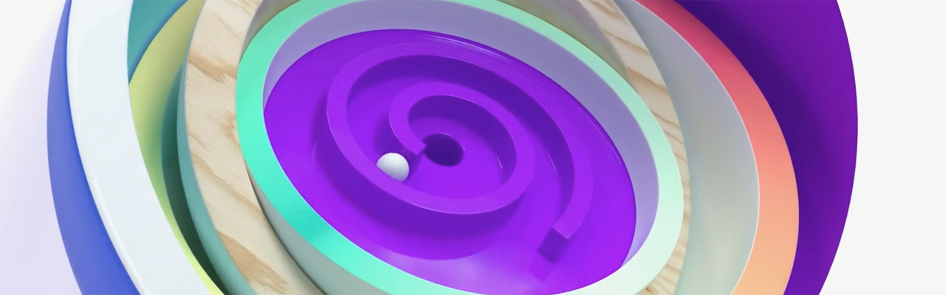
In one, a white ball rolls down a purple spiral, conjuring visions of an arcade. Another incorporates flipping notebook pages and splatters of paint; a third features glowing elements flashing from the center.
The IDs tap into some of the channel’s programming, including unscripted and lifestyle series, animated content, and proven international hits, as well as themes such gaming, wonder and crafts spearheading the launch of the channel dedicated to kids ages 2-12-years-old.
The debut followed NBCU-owner Comcast’s acquisition of DreamWorks Animation in August 2016 for $3.8 billion.
“We were doing it separately, but we almost felt like it was done in parallel, and we were creatively influencing each other,” said Muto.
RELATED: Sprout Grows with its Audience by Becoming Universal Kids
The IDs served as a sounding board for the rebrand itself, and emerged from a creative synergy as Adolescent bounced ideas off of Universal Kids —drawing inspiration from a color here, a sketch there—as the new channel took shape.
“It was such an open brief,” said Muto. “We had the freedom to explore the possibilities of different challenges and creative, and they were very open to cool and clever ideas, so that was motivation for us to keep pushing.”
Luciano Tapia, creative director of design at Universal Kids, described the collaboration, which took place over about four months, as a visual dialogue where the two companies batted creative concepts back and forth as the network crafted the vision for its brand.
“As we were seeing the IDs, we’d be asking, ‘how is this going to live with the amplified color scheme that we have?” Tapia said. “We’d see something and try it, and then shoot it back to talk about colors, and textures and figures.”
Adolescent layered the IDs with colors and gradients that brought a new dimension to the channel’s look, and aligned with the tone of the overall rebrand, said Jim Fitzgerald, VP, brand creative, Universal Kids.
“It kind of opened up a wider discussion about what we could do with the brand to give it more amplitude,” he said.
Designing the IDs
Adolescent approached the project by coming up with ways to add more dimension and playfulness to the logo.
Cheung and Muto began with “many, many sketches” just to get their ideas on paper, and even played around with the look of the logo itself—but eventually built animations around the original design.
“Creatively, we couldn’t help it,” Muto said. “We got a bit carried away and wanted to show the possibilities.”

Cheung wanted the animations to look high-end, without getting too glitzy or technical so that a simplicity that was accessible to kids would still shine through.
Color played a big part in adding personality to the logo, and Adolescent used different gradients for bold hues that pop.
The agency also made sure the IDs could be customized for a variety of assets, such as bugs, outdoor ads, and future IDs, by creating a toolkit that allows for swapping out different characters and personalities.
The boldness of the IDs helped fuel the strong characters and large typography that became a part of the overall rebrand, as Universal Kids began thinking about how their young viewers interact with the world around them.
“How do you feel a brand?” asked Tapia. “That’s what we are cast to do. By using these IDs, how do we get the sense of what the brand is?
The ‘Universal Scroll’
Inspired by kids’ use of computers, tablets and mobile phones, the network developed a visual language dubbed the “universal scroll” that emulates scrolling on a screen, and positions Universal Kids’ shows as attention-grabbing places for the audience to stop.
“Our programming is a great thing, so we wanted to put that loud and proud, front and center,” said Fitzgerald.
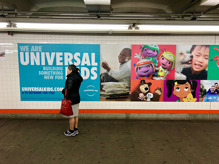
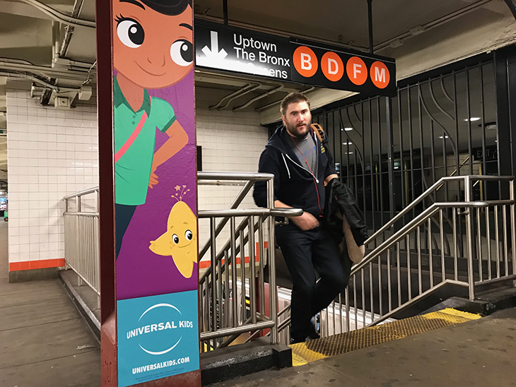
The linear column grid is based on the golden ratio, and works on-air, across social and digital platforms and as static images, and the IDs fit well into that structure, Tapia said. Soon after the rebrand went live on March 1, these visuals also kicked off a media spend in New York as the eight-person in-house team adopted the look across billboards, taxi tops, subway stations and print publications.
“It was really a great tent to see how solid this brand refresh had become, and how far we can push it and run with it,” Tapia said.
More recently, Universal Kids used the same system for a 24-hour YouTube masthead takeover.
“That kind of exploded to where we are now,” Fitzgerald said. “It’s quite exciting for us.”
The next step, he said, is using the graphics to develop a navigation system that pushes viewers to the on-air content, as well as expanding show offerings and ramping up marketing as the year goes on.
Tapia said he’s eager to showcase more of the branding, and explore its potential.
“The embodiment of a brand is something difficult to achieve,” he said. “It’s ethereal; it’s a feeling. It’s really a proud moment for us.”
Tags: adolescent universal kids