As Mega prepared to launch its new channel, MegaPlus, the Chilean television network tapped Buenos Aires-based studio Eloisa to develop its brand look from scratch.
The result is an editorial, elegant and contemporary look that reinforces MegaPlus as an independent, avant-garde channel.
Eloisa drew inspiration from magazines, newspapers, books, websites and Instagram feeds to “build a channel that did not look like a TV channel,” said Martin Lanciano, co-founder of the creative studio.
Through videos, animation, photography, original music, SFX, five IDs and more, Eloisa was tasked with reinforcing the channel as a standalone brand—disparate from Mega—which made the project easier in some ways.
“You get to make every decision because you think it’s a better fit for the channel, not because you have to keep something that was done before,” Lanciano said.
RELATED: Creative Review: Eloisa
For the IDs, specifically, MegaPlus wanted a new look for each time of day—morning, afternoon and evening. This required Eloisa to experiment with different colors, filters and creative details to capture the idea while maintaining a consistent brand look.
“We ended up doing three separate toolkits with some elements in common, but the colors are different,” Lanciano said.
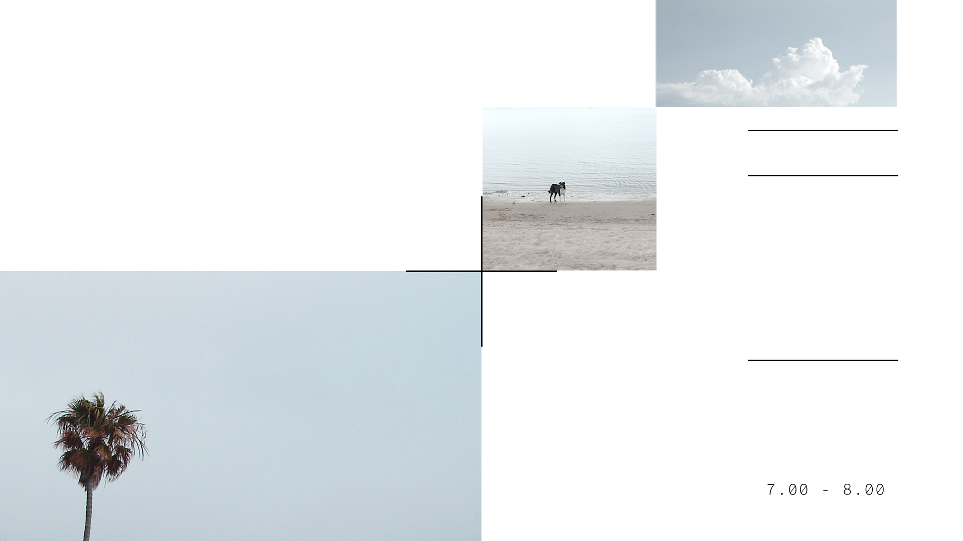
The morning look is inspired by the start of a new day, featuring white, light blue and other bright colors in its package.
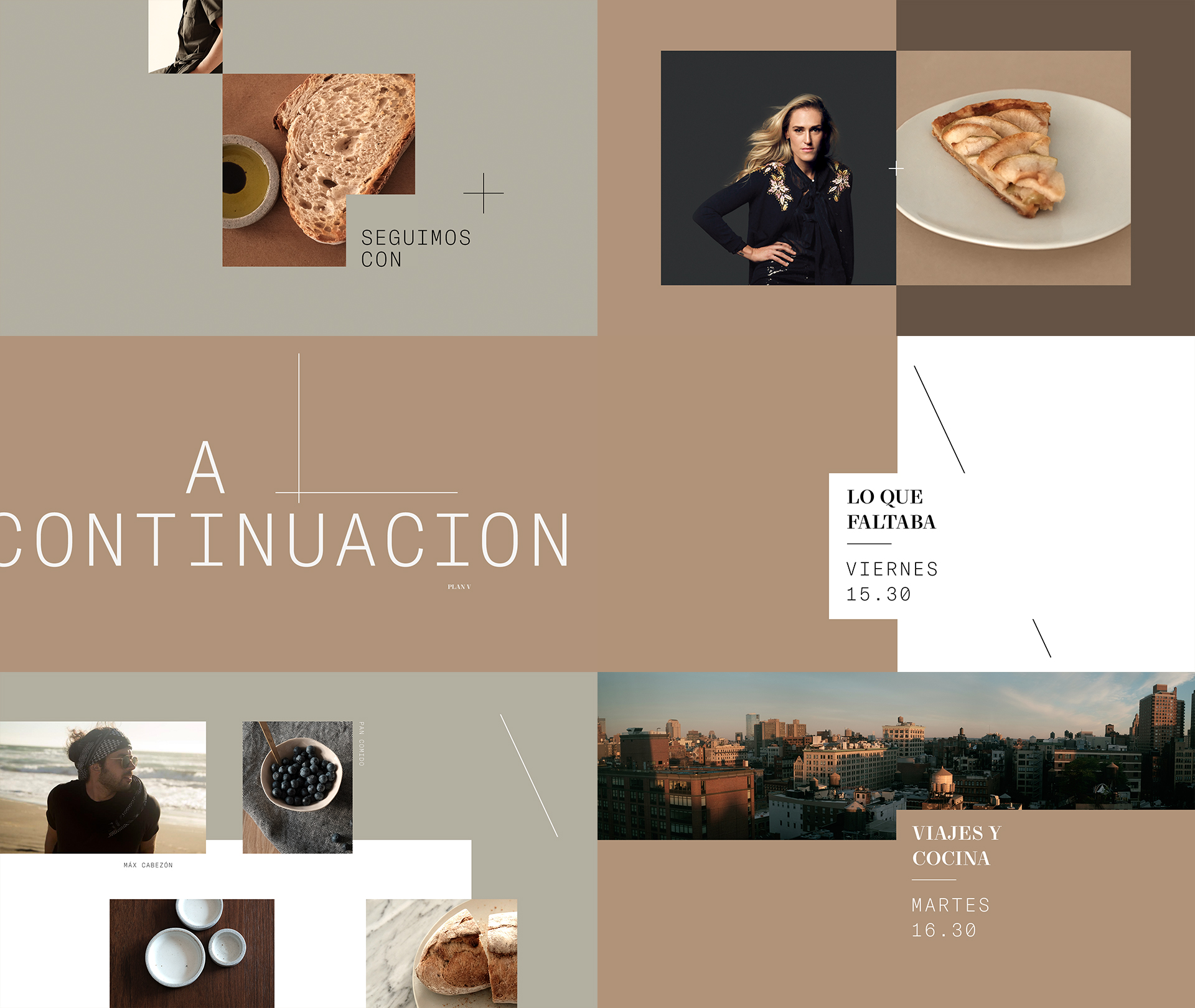
The afternoon comprises warmer tones, including the color brown and natural textures like wood.
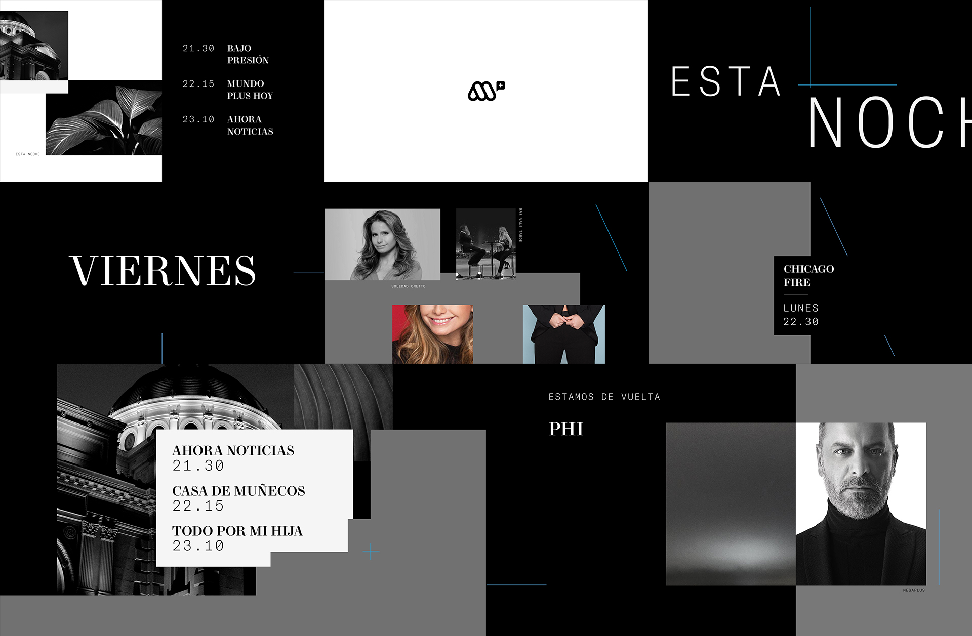
Meanwhile, the night look focuses on darker colors, slower animation and a more relaxed feeling.
Eloisa continued “building an atmosphere” by carefully considering every element of the images, including the filters, angles and wardrobe for each photo subject.
“[We] supported the editorial concept with the selection of images, but we also gave them color treatments to make them fit this atmosphere, because not every photo had one tone.”
They also considered the channel’s diverse slate of content, which comprises everything from cooking to lifestyle and journalism shows.
“That’s also why we went with ‘editorial.’ It was a way to unify the different people who appear on the channel,” Lanciano said.
As the project developed, Mega upped its original ask from five IDs to 10. However, Eloisa approached the task with excitement, viewing it as an opportunity to expand on their creativity and develop more work to be proud of.
“We were so focused and the idea was very strong,” said co-founder Eloisa Iturbe. “…it was easy to develop more and they felt they could develop more ideas [later].”
In the end, Iturbe and Lanciano were thrilled by the opportunity to take risks and capture Mega’s vision for the innovative channel.
“I always try to push the envelope and do things that are not like classic television graphics,” Lanciano said. “I think [this project] was a really good opportunity to do something really different.”
Check out more of Eloisa’s MegaPlus brand look here.

Tags: eloisa megaplus promax latino 2019

































__twocolumncontent.jpg)
