At ten years old, Miami-based 2C Creative was making a mistake that many companies make: taking care of its clients’ needs at the expense of its own.
“We spent so much time pleasing our clients that the thing that fell down the list was ourselves,” says Brian Eloe, 2C’s Denver-based creative director.
Chris and Carla Sloan started the company in 2004, and 2C stood for them: Chris and Carla. While that’s still part of the company’s legacy, ten years later there’s so much more to 2C that it was time for a change.
For the first time in the company’s history, it took what it knew about rebranding, and applied it to itself, redesigning its logo, changing its tagline and rebuilding its Web site from the ground up.
“One of our strengths is that we are very broad, we have a lot of capabilities and we are very strong in a number of areas,” says Chris Sloan, owner and chief creative officer. “We have a number of individuals who are specialists. The analogy is a department store. We wanted to start celebrating some very key disciplines within our shop, such as design, live-action, and brand integration. These are the boutique shops within the overall store.”
2C’s brand rebuild started with a very specific image: A child sitting on a swing set.
“Creativity at its essence is about the spark of imagination,” says Eloe. “When is there a better time in your life than when you are a little kid on a swing set? We found some imagery that really supported that creative spark moment that inspired everything that came after.”
Starting with the logo
2C started its work with its logo, which 2C decided needed to be completely redesigned. To help, 2C brought in Los Angeles-based miniCase, which specializes in designing broadcast logos, including Telemundo, The CW and Dr. Phil.
“We didn’t get too caught up in the existing mark because they wanted to go in a completely new direction and see all new ideas,” says Daniel Garcia, partner and graphic designer at miniCase. “We looked for the definition of the name and what 2C meant as far as the content and creative sides of the company go. We looked at things that alluded to this sense of depth and personality and did a range of exploration that went from more modular and rigid to more expressive and personality-driven. By working back and forth with the group, we arrived at a solution.”
One of the first things that the 2C team knew clearly was what they wanted the color of the logo to be: orange, which was the favorite color of the Sloans’ seven-year-old son, Calder, who passed away last April.
Besides standing as a legacy to Calder, “that color expresses vibrancy, optimism and good communication,” says Eloe. “All of that is why orange is the hero color.”
The color decided, miniCase focused on the logo’s form and font. The latter turned out to be an older, classic font called “éclat,” which in French, appropriately, means “burst,” as in burst of light or of an idea. The éclat font offers script and sweep, and felt both professional and playful to 2C.
“The younger, carefree feeling of it is very deliberate,” says Eloe.
Moreover, using the classic font assured 2C that it would be able to live with its new logo for a long time. From there, it was on to the logo’s new design.
“We looked at the literal interpretation of the company’s name,” says Garcia. “There are two different head spaces that you are in as a designer, and there are two different worlds that the design process goes through as far as content and creative. That’s a nice delicate dance of personality.”
That’s why miniCase designed a logo that’s circular and includes a hidden C inside the circle itself.
“It’s hidden enough where if you ant to see it, it’s there, but it’s not going to distract from the name of the company,” says Garcia.
“Our new logo’s got a grooviness to it, but it’s not so of the moment that it will age,” says Sloan.

2C also changed its tagline from “every project is a passion project” to “creative + content.” While 2C remains passionate about every project, says Sloan, the company wanted to broaden its marketing message.
Rebuilding the Web site
The other part of 2C’s rebrand was rebuilding the Web site, and for that, 2C turned to Milwaukee-based Flipeleven.
“For the Web site, we wanted to be different from all the other portfolio sites out there without being confusing,” says Eloe. “The goal was to create something simple and clean.”
“The way we were presenting ourselves online fell way behind the work we were doing,” says Sloan. “I joked that 2009 called and wanted its Web site back.”
From the beginning, Flipeleven wanted to distance 2C from its previous Web site.
“We wanted to take a chance with the site’s design and functionality to set them apart,” says Justin Schnor, Flipeleven’s partner and creative technical director. “We really wanted to push the technology and video in an interesting way.”
The front end of the new Web site is simple but functional. The series of slanted vertical panes allows a visitor to scroll 2C’s various campaigns. A menu in the upper right corner lets visitors dig deeper and learn more about 2C. And a cool function that Flipeleven included gives the site the ability to detect which device or browser a visitor is using and adjust itself accordingly.
“To me, browser-feature detection provides a richer user experience,” says Schnor. “We really tried to use the full browser rather than have the long scroll-y page thing. We wanted to let their work drive the design, rather than let our crazy design dictate the site. We tried to keep it minimal.”

Looking to the future
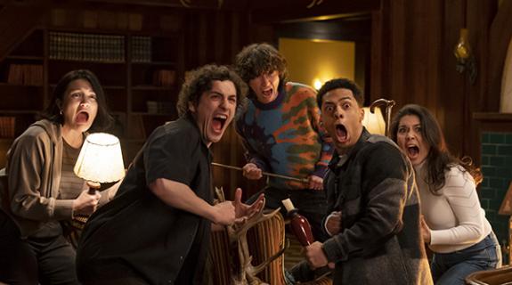
Rebrand behind it, 2C now can focus on the future, which is as busy as ever. 2C is shooting a launch campaign for one of Nickelodeon’s top-rated shows, Every Witch Way, a teen-focused novela. 2C also is creating the next launch campaign for Prospectors, the Weather Channel’s top-rated show. And it’s moving ahead with the content side of its business, producing such unscripted series as GAC’s Growing Up Gator.
Recently, 2C designed the third-season launch campaign for NBCUniversal’s The Steve Harvey Show, for which it also does daily episodics. 2C also produces spots for USA’s unscripted hit, Growing Up Chrisley, and new comedy, Benched. And it’s doing promotional work for Nat Geo, with the launch of Dr. K’s Exotic Animal E.R.
One of Sloan’s favorite campaigns of the recent past is the promotional campaign for the third season of HBO’s football reality show, Hard Knocks. “We did this interesting spot where players’ faces turned into footballs,” says Sloan.
It’s also building it brand integration business, with campaigns such as this, integrating Redd’s Apple Ale into Discovery’s Shark Week.
“We’ve seized on this notion of having people be more aware of both our high-concept creative and business-to-business brand integration skills,” says Sloan. “We’re trying to be a bit of a brand within a brand. At the same time, we’re not going to apologize for having scale.”
Cube image of Chris and Carla Sloan posing inside a jet engine courtesy of 2C.
Tags:












__twocolumncontent.jpg)
