


__twocolumncontent.jpg)


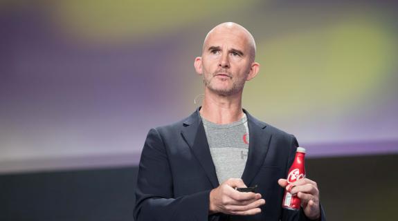
[Pictured: James Sommerville, VP of Global Design, The Coca-Cola Company]
In marketing, the fizzy brown liquid known as Coca-Cola has been a source of innovation and inspiration for decades. So much so that when branding guru James Sommerville was looking to shake things up five years ago as VP of global design, he had to ask himself, “What else can we do?”
The answer, as laid out by Sommerville in a stirring speech at PromaxBDA: The Conference on Thursday, was to get back to basics, by streamlining the visual identity systems of powerful yet disparate Coca-Cola sub-brands Coca-Cola Light/Diet Coca-Cola, Coca-Cola Zero and Coca-Cola Life and uniting them under one all-consuming creative campaign: “Taste the Feeling.”
Looking toward the coming years in what Sommerville called “a new world of mass intimacy,” having a lineup of “dissected brands didn’t makes sense.” In this age of instant access, consumers have a burning desire to feel inspired by Coca-Cola, supported by it, involved with it and, of course, connected to it. And no matter how extroverted you are, it’s a lot easier to connect strongly with one best friend than several.
What’s more, for a behemoth like Coca-Cola, which encompasses more than 200 markets, even having one extra brand to contend with – let alone several – requires a massive undertaking at every step along the marketing chain. Simplifying things down to the singular would, Sommerville said, allow Coca-Cola “to be much faster and more agile, to work like a small company.”
At the core of the Coca-Cola simplification process was a clear and powerful goal: “to own red,” Sommerville said. Sifting through the brand’s vast array of quality archival marketing, Sommerville honed in on the “Drink Coca-Cola” vintage-cool red disk icon of the ‘50s and ‘60s. This “heritage symbol,” he realized, could be “applied to all variables,” and implemented at “any level of innovation.” It was the “starting point for activations in different countries and cultures.”
While the red-disk identity system ensures that the same values and visual iconography will follow Coca-Cola wherever it travels, “Taste the Feeling” has emotional connection baked into its very words, resulting in highly cinematic spots that swell and burn with powerful sensation.
And slowly but surely, the four big Coca-Cola sub-brands (Light, Diet, Zero and Life) are coming together. Not too long from now, for instance, the familiar black-dominated Coca-Cola Zero bottle will reverse itself, turning entirely red with just a splash of black lettering to indicate the name. This is a trend that will repeat across the entire quartet. “For the first time ever we’re really trying to capture the iconic nature of the bottle itself,” Sommerville said. “We’re taking the ‘Taste the Feeling’ campaign to the highest level.”
Tags: