


__twocolumncontent.jpg)


In honor of its 30th anniversary, Warner Bros. Discovery-owned Cartoon Network is rolling out a brand refresh, updating its logo with a split-screen look and adding new colors to its palette.
Cartoon Network partnered with global creative agency Buck on the effort. Former Chief Marketing Officer Tricia Melton, a former Promax board member, led the brand refresh along with Jacob Escobedo, senior vice president of creative and design at Cartoon Network and Adult Swim, and Cartoon Network creative directors Candice House and Craig Gordon.
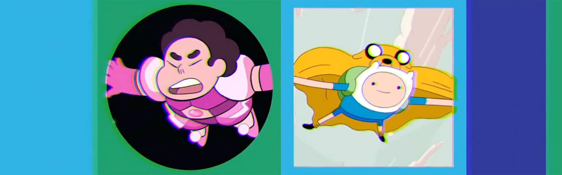
The refreshed logo is composed of two side-by-side squares that can feature various versions of the “C” and the “N” in the Cartoon Network logo or serve as mini screens that spotlight Cartoon Network content and characters. In the latter format, the C morphs into a circle and the N into a square. Inside those squares, run animations featuring the channel’s live-action content, like Harry Potter, and its animated fare, like The Amazing World of Gumball.
Cartoon Network also brightened up its already bright color palette. While its colors are still cyan, magenta, yellow and black at the core, it has now added a secondary color palette out of naturally overlapping hues. The color choices were intended to make the palette – and the network in general – feel more inclusive, Escobedo told Adweek.
READ MORE: Adweek
Tags: brand refresh buck cartoon network