


__twocolumncontent.jpg)


What began (following a slight and probably unavoidable post-Battlestar malaise) with critically acclaimed shows such as Helix and 12 Monkeys, has snowballed into a new era of high-end programming at Syfy, as recent events such as The Expanse, Childhood’s End and The Magicians have reconfigured notions of what science-fiction television can be.
In short, “we’re returning to high-end cinematics for good science fiction,” said Ben Cochran, VP creative director for the NBCUniversal network, which meant the time was nigh for a brand refresh.
Working with creative studio Sibling Rivalry, Syfy launched itself into 2016 with an overhauled on-air look and feel, from brand packaging to sound design to the communication of navigational information within promos and programming.
“Even the edits of our trailers are sharper and more stylized,” said Cochran, a point hammered home by the crisp, bouncy channel image spot seen above, a high-octane tour de force produced by 2C Creative and set to Haim’s surreal-yet-irresistible “My Song 5.”
“Someone asked me to describe what genre it was, and I had a hard time,” said 2C creative director Spencer Cordon, when asked about the song’s inclusion. “Indie-garage-hip-hop or something like that. It’s pretty funky but just cool, with fun moments to play with… The ‘honey I’m not your honey-pie’ lyric at the end, the way it’s pitched down, really adds not only to the great content but the fun that Syfy’s programming has. It’s beautiful, the new stuff, but it takes itself only so seriously.”
Which is another way of saying that “My Song 5” is the perfect choice for a refresh that aims to honor a new slate of high-end content without losing a sense of play promised by the words “Imagine Greater.” That tagline featured prominently in the previous Syfy brand manifestation, and “still applies” here, said Joe Wright, partner and creative director at Sibling Rivalry, “because there’s something in it that’s great.” However, the refresh now uses it sparingly, letting the programming and the elements that surround it “show ‘imagine greater’ more rather than say it,” he continued.
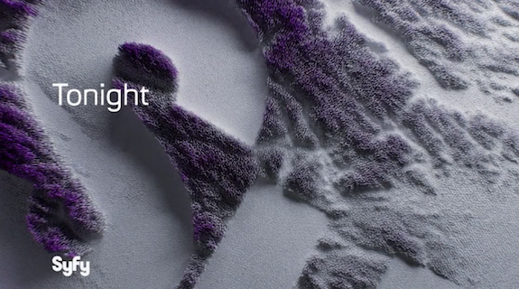
One of the clearest visual interpretations of “Imagine Greater” in the refresh comes via the treatment of the Syfy logo, which Sibling Rivalry did not alter. Instead, they found new ways to feature it in terms of size and scale, often creatively cropping it to make it feel like something new while retaining the equity built up by its familiar mark. For instance, in a series of powerful elements like the ident above and the endpage below, sections of the logo materialize out of materials resembling oil, vegetation or even abstract cityscapes. Such imaginative usages insure that these days, “you can get a hint of that Syfy logo anywhere and have it feel really natural and also dimensional without being a huge distraction,” said Cochran. “Even getting a hint of the full Syfy form is quite powerful, and clearly identifiable. So on everything from a really complicated logo ident to a watermark in the background of a sponsor billboard, it feels right at home.”
In its previous incarnation, the Syfy brand lived in a white space across the channel, with purple the dominant non-white color. Fixing to bring the logo into a more premium realm of Syfy programming, Sibling Rivalry embraced the purple full-on, fleshing it out into “many different tones within the package,” said Wright, with accents of silver and black working “as a kind of supplementary color palette.” The previous brand’s typeface has been preserved, but “we’re using a much lighter weight of it,” he continued, “and using it in a much more refined way and a much smaller way.”
In the end, Syfy was able to evolve from its previous aesthetic “Quite naturally,” said Cochran, “by trading in the blank canvas of our ambient brand space for environments that feel cinematic and defined but no less imaginative. Dimensionality and movement are still hallmarks of the brand aesthetic but we’re leaning hard into richer color treatments, rich photographic textures, and environments that extend well beyond the screen, or seem to.”
Tags: