


__twocolumncontent.jpg)


There are no hard and fast rules when it comes to creating a network rebrand, but there are some guidelines that generally apply in terms of workflow. When Viewpoint Creative won the bid to rebrand Venezuelan subscription channel Venevision+Plus, of the media conglomerate Grupo Cisneros, the Boston-based agency found itself detouring from the typical way of doing things, heading down a design road less traveled by, and that has made all the difference.
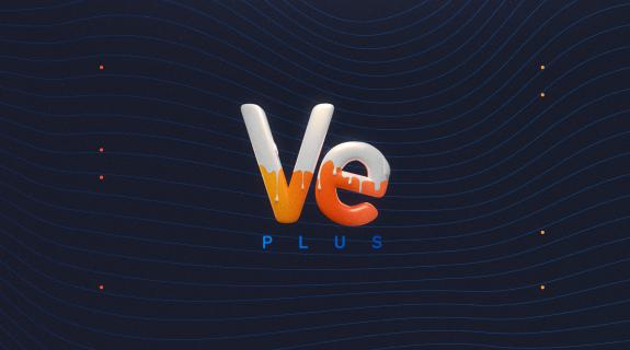
Viewpoint’s journey with Ve Plus was unorthodox from the get-go, as it eschewed its normal process of researching existing brands and design work during pre-production to dig into imagery of “nail art and makeup and lipstick and stuff like that,” said the agency’s art director Manuel Martin. Preliminary design explorations had unearthed a vein of “female comfort” for the channel, which specializes in soap operas, comedy and unscripted competition shows, and Viewpoint wanted to express that quality through a “sensuous, kind of gooey sweetness but more on the fun side.” Hence, the digressions into cosmetological realms, which in turn led to a most unexpected spark of inspiration.
Yes, it was Katy Perry’s video for “California Gurls” that ultimately “had that over-the-top, sexy, sweet, gooey candy vibe that we were going for,” Martin said. Naturally, the end onscreen product significantly scales back on the video’s wild abundance, but its core sensory elements are evident across the package, and particularly in the brand’s centerpiece, a new logo that is shiny, bouncy, and frequently coated with tasty-looking frosting.
The process of actually building the logo was as unusual as its conceptualization. “You usually start with a sketch, take that into a vector program and do a flat-color version,” Martin said. “Once that’s approved, you go into color versions and then you do type treatments, 3D treatments, animated treatments, etc.” Viewpoint, however, approached from the other end of the equation, crafting the logo’s “V” and “E” lettering in Cinema 4D, “then distorting it and treating it until we achieved the rounded candy-shaped version that we now have.”
Essentially, Viewpoint was working through a major part of its conceptualization process in 3D, which is not without its risks. “More work will go into getting that look, so if the client didn’t like it, it would have been like, ‘oh all right, now we gotta go back into 3D and figure this out,‘” Martin said. “Fortunately, we had discussed our visual concepts enough with [the Ve Plus marketing team] that we were pretty sure [about] the look they were going to go for.”
Reverse-engineering a 3D logo in this way poses some unique challenges. For instance, the brand’s new color scheme, which had been determined to be an update of the network’s already existing blue-and-orange motif, was radically influenced by how the logo was illuminated. To make any 3D object look natural, it is of course necessary to virtually “light” it within the given 3D program. But if you point a light at an object such as, say, a big, blue, three-dimensional letter “V,” the shade of that blue will change depending on what direction you’re coming from, how powerful the light is, and other factors. “When you’re lighting an object, you’re getting every tone of that color,” Martin said. “If you have lower lighting, like towards dusk,” for example, “that blue is going to go to another direction, like towards a purplish color. If it’s midday, your blue’s going to get a lot lighter.”
But perhaps the greatest challenge for Viewpoint was simply “shifting our mindset into this weird process we were doing,” Martin said. “Once we did that, we didn’t work with the limits that we would usually have for a brand. It ended up making it a little bit unique even though it’s a very simple-shaped logo.”
Communicating the offbeat particulars of the project to Ve Plus was made significantly easier by the fact that Martin himself happens to be Venezuelan, and developed the early stages of his career within the television industry there. “It really helped us when thinking about their demographic and their content because I have worked with Latin American audiences, I know how certain decisions are made” he said. “I could instantly connect with what this look would end up being, because it’s the kind of client I’ve always worked with.” And of course, “I could translate from Spanish, so that was helpful.”
Martin said he was “excited” by the prospect of working with Ve Plus because “I could bring my own experience into it.” While working on the on-air package’s background patterns, for example, he took inspiration from Venezuelan colors and textures that appear in nature, which are so vibrant that if you saw them “in a photo, you would say, ‘that photo’s totally Photoshopped,’” he said. In the end, these initial explorations were “almost painful to see because of the crazy contrasts,” he continued, and eventually, they were toned down to the gentle waves and polka-dots seen in the above image, which were modeled after feminine textiles and ocean currents.
For all of the fiery spirit often associated with Latin America, design within the region’s television industry can often be strangely staid. Compared with the previous Venevision+Plus brand identity, remnants of which are still visible on the network’s social outlets, Viewpoint’s rebrand is a major departure, turning a rather corporate look into something bursting with personality. The work has a playfulness that reflects how it was made, a journey that deviated from normal design routes and forged a new path to reach the final destination. “We didn’t even analyze it,” Martin said. “We just departed.”
Tags: