Before beginning work on a new rebrand, Sibling Rivalry creative director Joe Wright likes to ask himself what he calls the “Eternal Question”: Do the shows brand the network or does the network brand the shows?
“In today’s day and age, the shows brand the network,” Wright told Daily Brief, at least when it comes to the networks that are presenting highly cinematic content, such as Netflix, Amazon and HBO. “If you look at HBO their branding is not all that front and center,” he continued, “they just have fantastic shows and you know those are HBO shows.”
With high-profile, upcoming scripted originals such as The Alienist and Will joining a lineup of existing offerings such as The Last Ship and The Librarians, TNT has, in recent years, worked to join the ranks of those weavers of superlative narrative, and the time had come to brand itself as such.
“With a new slate of TNT shows, we wanted to create an innovative design package to support our content and network positioning as premium storytellers,” said Kathryn Allen, VP of broadcast design for TBS and TNT, “to create a premium look that was less graphic—cinematic, clean and distinctive.”
You might also say that it was time to let the shows brand the network, or to at least start “visually highlighting moments of the story through the TNT POV,” Allen said.
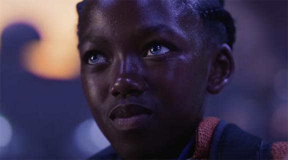
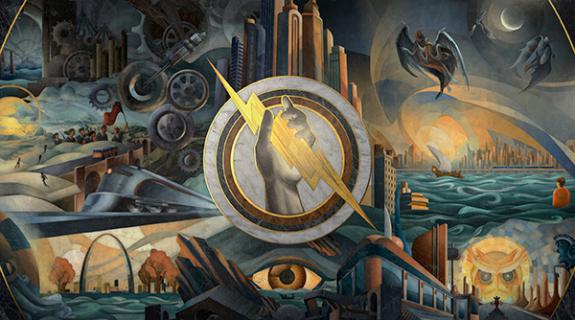
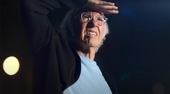
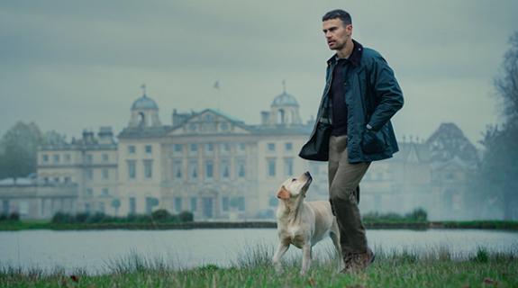
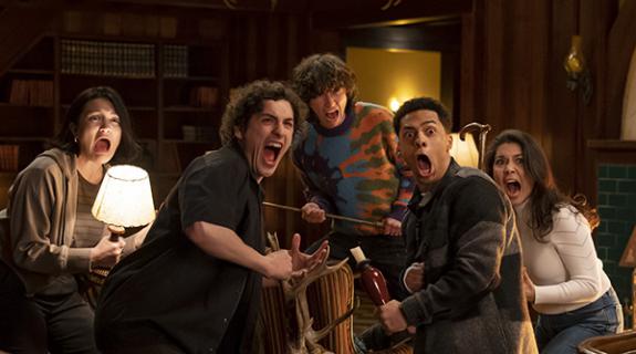
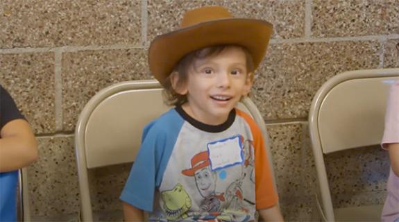
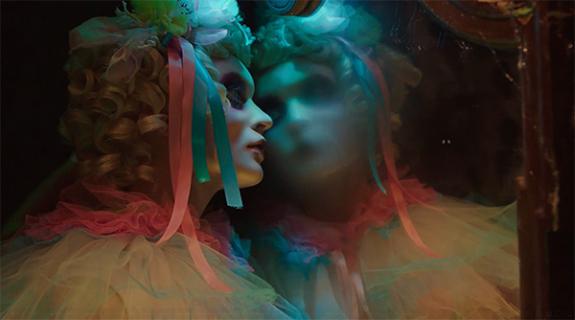
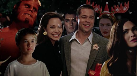
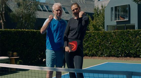
Sibling Rivalry won the pitch to perform this task with a concept that literally does just that, turning the TNT logo into a kind of lens in and of itself, and training it on powerful images from the shows. On paper, it’s a device that “you could look at and go, ‘oh but it’s kind of obvious – it’s a circle and the TNT logo,’” Wright said. But in practice this startlingly simple approach has a profound impact on the footage at hand:
It turns out that the extremely meta act of framing lens-captured imagery on a screen through yet another lens has the surprising effect of actually of bringing out “the emotional core of our shows and characters,” and making “a direct connection with our viewers through design,” Allen said. “For such a simple device,” added Wright, it also “offers up a lot of things we can do with it, and “holds a lot of playfulness inside of it.”
For instance, the lens can serve as a magnifying glass, which is, Wright said, “a very nice way of bringing the characters a little bit closer.” To that same end, it acts as “a kind of container for typography… [putting] type behind it so it acts as a magnifier for information.”
Another way, the lens gets used in the new brand is to “offset time in there,” Wright said, meaning that whatever footage enters in the circle is two to four frames offset from the surrounding footage. “It’s a very interesting way to make you realize that something is happening inside of this circle.”
More offsetting potential exists in, just like with a real camera, the lens/circle’s “de-focusing” capabilities, Wright said, which involves “refocusing the imagery either inside the circle or we keep the imagery inside sharp and refocus on the outside of it. That’s a nice way to then create a background to put typography to make it very legible.”
Sometimes, this manipulation of focus causes the lettering to materialize out of the background as though it is an intrinsic part of the original footage, rather than tune-in information and other details inputted by the in-house team after the fact.
“It’s like the type is always there but you can’t see it, then you rack focus and bring it in,” said Miro Sisma, art director at Sibling Rivalry.
This seemingly subtle effect not only accentuates the brand’s bold mixture of sans serif and regular serif type, but helps to seamlessly merge the connecting tissue of the on-air package and the shows themselves.
“The key thing is [that the package is] embedded with the imagery. It doesn’t fight with it, it just becomes an additional layer to it,” Wright said. “It puts the branding into the content.”
Subtle to a degree where it is often almost unnoticeable, the most important function of the circle may be as an editorial tool.
“This device is very dependent on shot selection,” Wright said. “You can’t just take this device and slap it over any shot. You have to find the shots that work.”
As a result, those talented TNT professionals who are implementing it on the promo side are required to “look at their imagery in a different way, because they’re having to look at it with the device in mind. That’s been one of the most rewarding aspects of it.”
Between literally positioning its greatest moments under a 35-mm-style lens and, in selecting those moments, uplifting the ancient art of pure editing, the TNT rebrand ultimately “talks to the very essence of filmmaking,” Wright said. “As much as we could, we wanted to keep the cinematic experience as pure and as consistent throughout the entire package, and that’s why we came up with this device.”
Tags:
























__twocolumncontent.jpg)

